텍스트 → 이미지카페 · 브랜드스타일 가이드
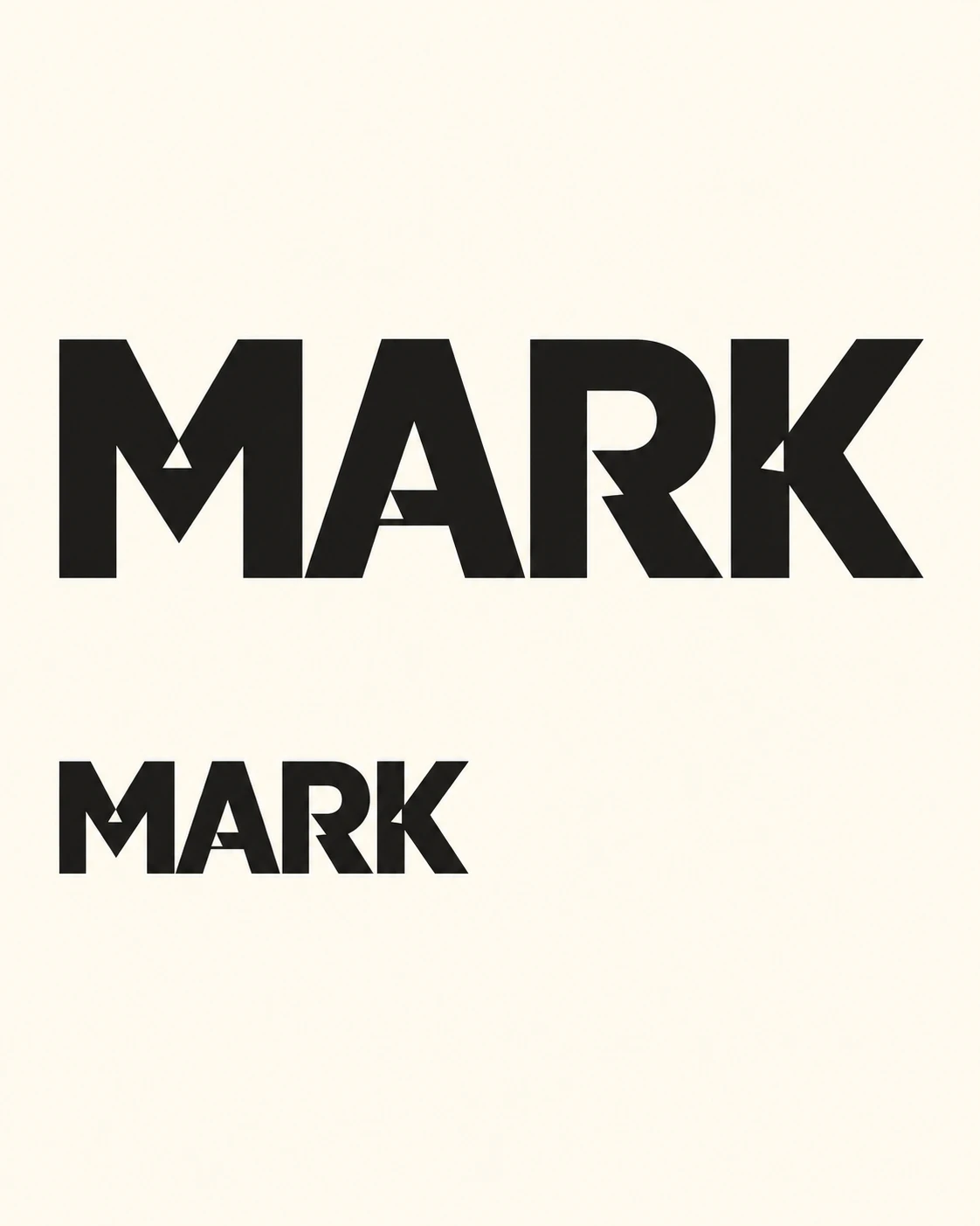
동네 도장 가게 · 잉크 트랩 워드마크
획이 만나는 곳에 작은 쐐기형 여백을 넣어, 굵은 글자의 접합부를 또렷하게 만드는 도장 가게 워드마크.
동네 도장 가게 · 잉크 트랩 워드마크
- 형태·선
- MARK를 굵고 수직으로 선 산세리프 획과 단단한 외곽선으로 구성한다. M, A, R의 좁은 획 접합부에 내부 여백에서 파고드는 짧은 삼각형 홈을 만든다. 홈은 여백 쪽으로 넓어지고 접합부 안에서 뾰족하게 끝나게 하며, 주요 획의 연결과 글자의 즉각적인 가독성을 유지한다.
- 색·명암
- 균일한 따뜻한 아이보리 바탕에 거의 검정인 단색 글자를 사용한다. 잉크 트랩은 바탕과 정확히 같은 색으로 만들어 글자 안의 열린 여백으로 읽히게 하고, 두 크기의 워드마크에서 대비를 일정하게 유지한다.
- 질감·재질
- 선명한 가장자리와 끊김 없는 잉크 면을 가진 깔끔한 평면 인쇄 그래픽으로 표현한다. 종이 표면은 차분한 무광으로 유지하여 각진 홈이 우연히 벗겨진 부분이나 낡은 인쇄 흔적과 구별되게 한다.
- 구도
- 위쪽 워드마크는 접합부의 홈이 명확히 보일 만큼 크게 배치한다. 아래에는 같은 디자인을 작은 라벨 크기로 반복하고, 넓은 세로 간격과 공통 왼쪽 정렬을 사용한다. 작은 글자의 접합부도 열려 있음을 확인할 수 있도록 충분한 해상도를 유지한다.
우선순위
읽기 쉬운 글자와 의도적인 쐐기형 접합부 여백을 우선한다.
피할 표현과 결과 확인
획을 끊거나 글자가 손상된 것처럼 보이게 하는 과도한 홈은 피한다.
두 워드마크가 모두 MARK로 읽히고 같은 열린 접합부 형태를 유지하는지 확인한다.
이 예시의 실제 생성 프롬프트
SUBJECT
One fictional neighborhood stamp shop named MARK, represented by one custom uppercase wordmark shown at two sizes. Both instances use identical letter geometry, with visible ink traps cut into tight internal stroke junctions.

COMPOSITION
A flat, front-facing identity reference on a warm ivory portrait sheet. Place the large MARK wordmark across the upper middle and one substantially smaller duplicate below it, aligned to the same left edge. Leave generous blank space around both.

STYLE GUIDE
1. Shape & line
Build MARK from bold, upright sans-serif strokes with firm outer contours. Cut short triangular openings from the interior white spaces into the tight junctions of M, A, and R; let each opening widen toward the white space and end in a pointed tip inside the junction. Keep the main strokes connected and every letter immediately readable.

2. Color & light
Use solid near-black letters on a uniform warm ivory field. Give the ink traps exactly the background color so they read as open spaces within the letters, and keep the contrast consistent across both wordmark sizes.

3. Texture & material
Render the identity as clean, flat printed artwork with crisp edges and uninterrupted ink coverage. Keep the paper surface quiet and matte so the angular cuts remain distinct from accidental chips or distressed printing.

4. Composition
Make the upper wordmark large enough for its junction cuts to be plainly visible. Repeat the same design below at a modest label size, with a broad vertical gap and a shared left alignment; preserve enough resolution to see that the smaller letter junctions remain open.

PRIORITY
Preserve the requested identity, count, action, composition and output settings. Apply the style rules within those constraints; a style reference must not replace the subject or layout. Within the style: Prioritize readable letters and deliberate wedge-shaped openings at the stroke junctions.

AVOID
Avoid oversized cuts that sever strokes or make the lettering look damaged.

OUTPUT
One image in a 4:5 aspect ratio. Include only the word MARK in its two specified instances; add no captions, annotations, measurements, or other text.

SELF-CHECK
Check that both wordmarks read MARK and retain the same open junction geometry.
모델명은 이미지 출처 정보 기준입니다. 같은 프롬프트를 사용해도 결과는 달라질 수 있습니다.