텍스트 → 이미지카페 · 브랜드스타일 가이드
동네 단추 가게 · 크기별 로고 단순화
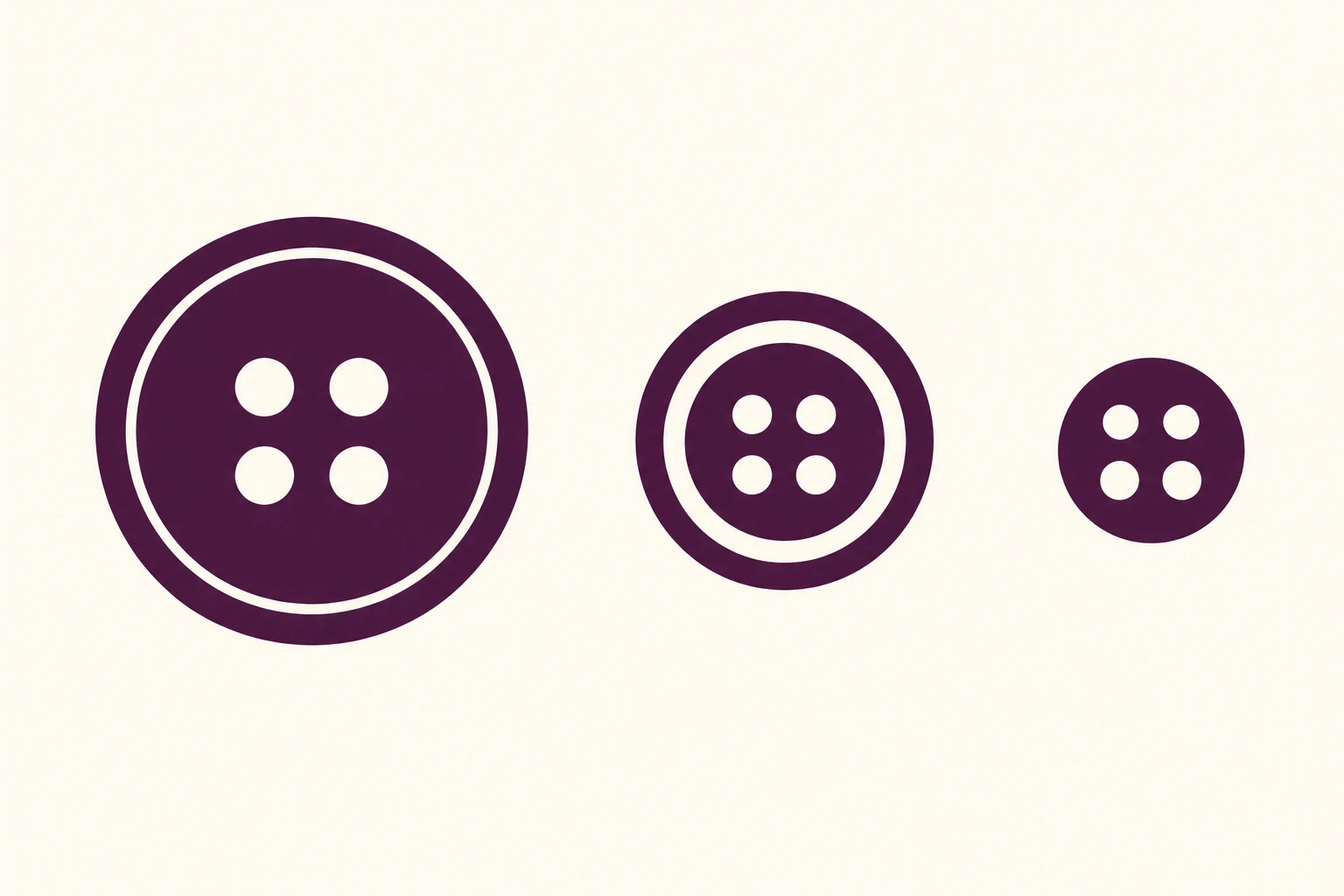
네 구멍 단추 로고를 세 크기로 보여 주며, 작은 크기에서 테두리 디테일을 덜어 정체성과 가독성을 유지한다.
동네 단추 가게 · 크기별 로고 단순화
- 형태·선
- 각 단추를 꽉 찬 원형 실루엣과 네 개의 둥근 구멍으로 만든다. 큰 버전에는 가장자리 안쪽에 가느다란 동심원 띠를 뚫고, 중간 버전에서는 그 띠를 더 넓게 만들며, 작은 버전에서는 없앤다. 작은 버전의 구멍은 비례상 더 크게 만들어 네 개가 각각 구분되게 한다.
- 색·명암
- 세 심벌 모두 같은 짙은 가지색으로 채우고, 모든 구멍과 테두리의 뚫린 띠에는 아이보리 배경이 보이게 한다. 명암 대비를 강하게 유지하고 조명 그라데이션이나 가장자리 음영 없이 색을 균일하게 만든다.
- 질감·재질
- 매끄러운 원형 가장자리와 잉크처럼 균일한 면을 가진 평면 벡터 그래픽으로 표현한다. 배경도 매끄럽게 유지해 표면 입자가 가장 작은 구멍을 가리거나 추가 로고 디테일처럼 보이지 않게 한다.
- 구도
- 이미지 왼쪽의 큰 버전, 중앙의 중간 버전, 오른쪽의 확실히 작은 버전 순으로 배치한다. 중심을 정렬하고 주변 간격을 넉넉히 확보한다. 확대 삽입 화면 없이 각각의 실제 표시 크기로 보여 주어 테두리 디테일의 축소를 직접 비교할 수 있게 한다.
우선순위
원형 실루엣과 네 구멍의 정체성을 유지하면서 가장 작은 마크도 또렷하게 읽히게 한다.
피할 표현과 결과 확인
디테일이 같은 그림을 그대로 줄여 테두리 띠와 구멍이 뭉개지게 하지 않는다.
세 마크가 같은 단추로 읽히며 가장 작은 마크에는 테두리 띠 없이 네 구멍이 각각 선명하게 남는지 확인한다.
이 예시의 실제 생성 프롬프트
SUBJECT
Create a visual identity reference for a fictional local button shop using three size variants of the same circular four-hole button symbol. Each variant retains four background-colored holes in a square arrangement; these are adaptations of one logo, not three different designs.

COMPOSITION
Use a straight-on, horizontal reference sheet on a warm ivory background. Place the large symbol at image-left, the medium symbol at image-center, and the small symbol at image-right, with all three centers on one horizontal axis. Leave generous clear space so the smallest symbol can be judged at its displayed size.

STYLE GUIDE
1. Shape & line
Build each button from a solid circular silhouette and four round cutout holes. In the large version, add a fine concentric cutout ring near the perimeter; make that ring broader in the medium version and remove it in the small version. Enlarge the small version's holes proportionally so all four remain visibly separate.

2. Color & light
Use the same deep aubergine fill for all three symbols and let the ivory background show through every hole and rim cutout. Keep the contrast strong and the color uniform, without lighting gradients or shaded edges.

3. Texture & material
Render the identity as clean, flat vector artwork with smooth circular edges and solid ink-like fills. Keep the background equally smooth so surface grain does not obscure the smallest holes or imitate extra logo detail.

4. Composition
Arrange the variants from large at image-left to medium at image-center to distinctly small at image-right. Keep their centers aligned and their surrounding gaps generous; show each at its actual presentation size without magnified insets, allowing the reduction of rim detail to be compared directly.

PRIORITY
Preserve the requested identity, count, action, composition and output settings. Apply the style rules within those constraints; a style reference must not replace the subject or layout. Within the style: Preserve the circular silhouette and four-hole identity while making the smallest mark clearly readable.

AVOID
Avoid merely shrinking an identical detailed drawing until its ring and holes merge.

OUTPUT
Produce one landscape image in a 3:2 aspect ratio. Include only the three logo variants, with no lettering, captions, measurements, watermarks, or mockup objects.

SELF-CHECK
Confirm that all three marks read as the same button and that the smallest retains four distinct holes without a rim ring.
모델명은 이미지 출처 정보 기준입니다. 같은 프롬프트를 사용해도 결과는 달라질 수 있습니다.