텍스트 → 이미지카페 · 브랜드스타일 가이드
동네 타일 공방 · 회전 모듈 심벌
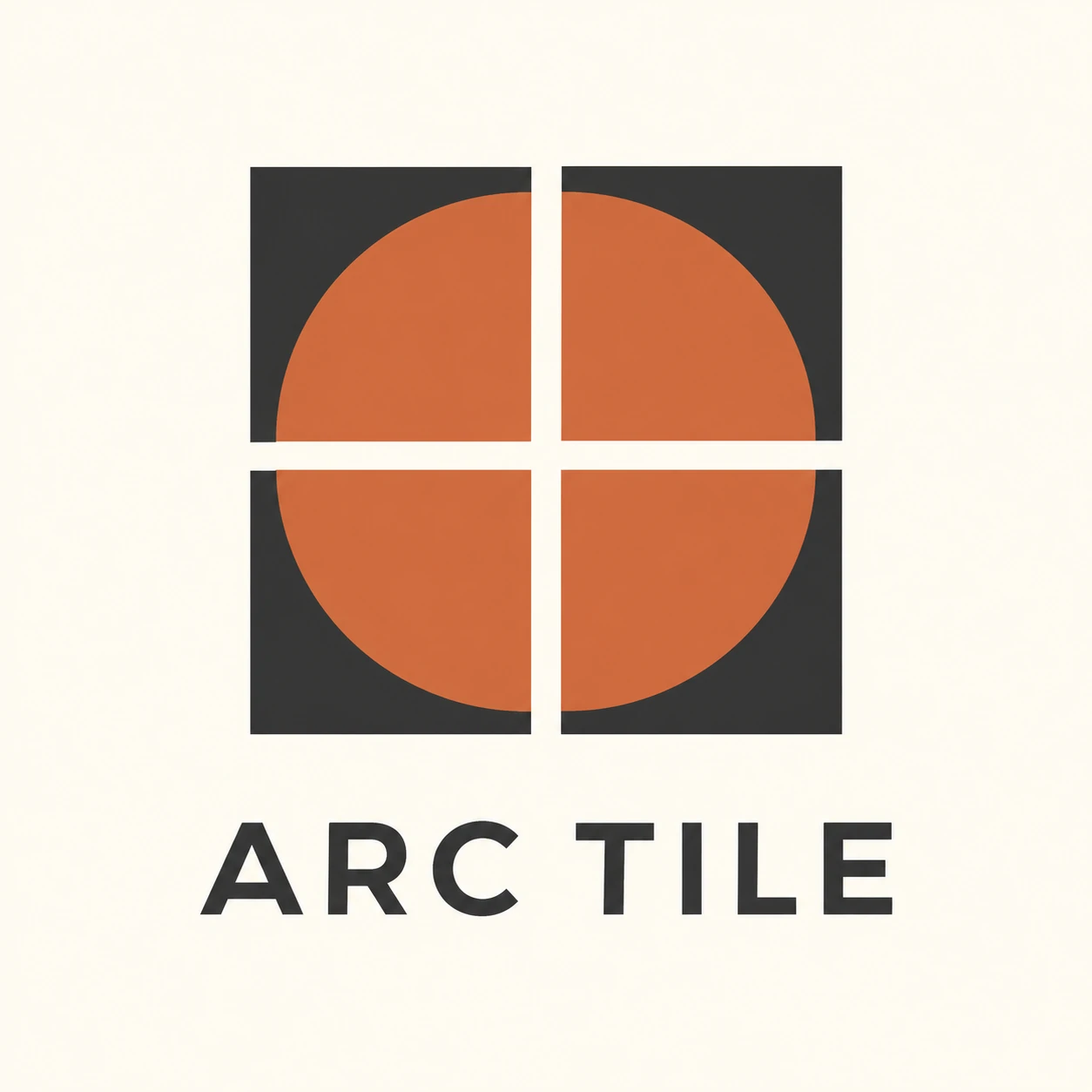
같은 사분원 타일을 회전해 네 조각이 하나의 원으로 읽히는 공방 브랜드 심벌을 만듭니다.
동네 타일 공방 · 회전 모듈 심벌
- 형태·선
- 각 모듈은 정사각형과 깔끔한 사분원 면으로 만들고, 사분원의 두 직선 반지름이 중앙을 향한 정사각형 모서리에서 만나게 하세요. 같은 도형을 90도씩 회전해 반복하며 바깥 사각형 변은 곧게, 곡선 경계는 매끄러운 원호로 유지하세요.
- 색·명암
- 네 사분원 면은 모두 평평한 테라코타색으로, 나머지 사각형 면과 글자는 짙은 차콜색으로, 배경과 분리 간격은 따뜻한 아이보리색으로 채우세요. 모든 모듈의 색을 동일하게 유지하고 명암 그라데이션 없이 회전으로 시각적 변화를 만드세요.
- 질감·재질
- 브랜드 그래픽은 가장자리가 깔끔하고 색이 균일하게 덮인 매끄러운 불투명 인쇄 면으로 표현하세요. 정사각형 모듈과 열린 줄눈으로 타일을 연상시키고, 표면은 무광으로 유지하며 돌출된 모서리나 도자기 반사광은 넣지 마세요.
- 구도
- 네 모듈을 균형 잡힌 2×2 블록으로 배치하고 가로와 세로의 아이보리 간격을 같게 두어 십자형 틈이 보이게 하세요. 아래에는 단순한 중간 굵기 산세리프로 ARC TILE을 중앙 정렬하고, 심벌과 글자가 구분되면서도 하나의 간결한 조합으로 보이도록 세로 여백을 두세요.
우선순위
동일한 모듈 도형과 회전으로 조립되는 원의 형태를 우선하세요.
피할 표현과 결과 확인
불규칙한 원호, 막힌 줄눈, 원근 왜곡, 장식적인 글자를 피하세요.
동일한 네 회전 모듈이 열린 아이보리 십자 틈을 사이에 두고 하나의 원으로 읽히는지 확인하세요.
이 예시의 실제 생성 프롬프트
SUBJECT
Create one original identity lockup for a fictional neighborhood tile studio named ARC TILE. Its symbol contains exactly four square tile modules in a two-by-two arrangement. Each square contains one terracotta quarter-disc on a charcoal field. Rotate the same module so every quarter-disc's right-angle corner faces the central junction; together the four discs suggest one circle interrupted by the grid gaps. Place the studio name below the symbol.

COMPOSITION
Use a straight-on, centered presentation on a warm ivory background. Show one large symbol above one line of readable uppercase lettering, with generous surrounding space. Keep the entire lockup visible and make the central circular assembly immediately legible.

STYLE GUIDE
1. Shape & line
Build each module from a square and a clean quarter-disc whose two straight radii meet at the square's inward-facing corner. Repeat that same geometry with quarter-turn rotations, keeping the outer square edges straight and the curved boundaries smoothly circular.

2. Color & light
Use flat terracotta for all four quarter-discs, deep charcoal for the remaining square fields and wordmark, and warm ivory for the background and separating gaps. Keep every module equally colored, without lighting gradients, so rotation carries the visual change.

3. Texture & material
Render the identity as smooth, opaque printed shapes with clean edges and solid coverage. Let the tile reference come from the square modules and open seams, while keeping the surface matte and free of raised bevels or simulated ceramic reflections.

4. Composition
Arrange the four modules as a balanced two-by-two block with equal horizontal and vertical ivory gaps forming a visible cross. Center ARC TILE beneath it in a simple medium-weight sans serif, leaving enough vertical space to separate the lettering from the symbol while keeping them one compact lockup.

PRIORITY
Preserve the requested identity, count, action, composition and output settings. Apply the style rules within those constraints; a style reference must not replace the subject or layout. Within the style: Prioritize the shared module geometry and the circle assembled through rotation.

AVOID
Avoid inconsistent arcs, closed seams, perspective distortion, and decorative lettering.

OUTPUT
One square 1:1 brand-reference image with crisp, flat graphic artwork. Include only the exact wordmark ARC TILE; no captions, measurements, construction guides, or additional text.

SELF-CHECK
Check that four matching rotated modules form one readable circle across an open ivory cross.
모델명은 이미지 출처 정보 기준입니다. 같은 프롬프트를 사용해도 결과는 달라질 수 있습니다.