텍스트 → 이미지제품 사진스타일 가이드
남색 벨벳 상자 · 결 방향에 따른 광택
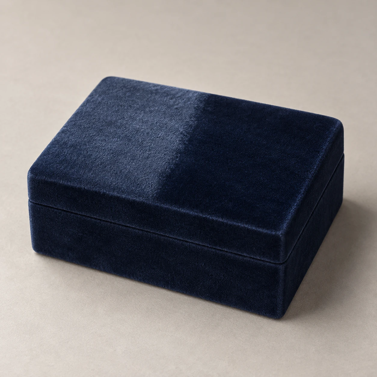
닫힌 벨벳 상자의 같은 윗면에서 결 방향만 달라져 밝기가 바뀌는 모습을 보여주는 제품 이미지.
남색 벨벳 상자 · 결 방향에 따른 광택
- 형태·선
- 모서리가 부드럽게 둥근 아담한 직사각형 상자를 만들고, 가느다란 뚜껑 이음선을 보이는 면 둘레로 이어라. 두 결 영역 사이에서도 뚜껑 면을 평평하게 유지하고 경계에 융기나 홈을 만들지 마라.
- 색·명암
- 화면 왼쪽 위에 넓고 부드러운 주광을 두어라. 뚜껑의 화면 왼쪽 결 영역에는 은은한 은청색 광택을, 인접한 화면 오른쪽 영역에는 짙은 남색을 나타내라. 두 영역에 공통된 조명 그라데이션을 유지하고 탁자 그림자는 화면 오른쪽으로 부드럽게 드리워라.
- 질감·재질
- 짧고 촘촘한 벨벳 결을 광택을 잘게 흩뜨리는 부드러운 표면 잔털로 표현하라. 반대 방향으로 쓸린 영역의 경계를 조금 흐트러뜨려 밝기 차이가 인쇄된 줄무늬가 아니라 결 방향으로 읽히게 하고, 표면이 번들거리거나 금속처럼 보이지 않도록 하이라이트를 부드럽게 하라.
- 구도
- 결 영역의 경계를 뚜껑 중앙 부근에서 뒤쪽 가장자리부터 앞쪽 가장자리까지 이어, 밝은 영역은 화면 왼쪽에, 어두운 영역은 화면 오른쪽에 두어라. 두 영역을 똑같이 선명하고 가림 없이 보여주고, 단순한 배경을 사용해 같은 면 안의 대비에 시선이 모이게 하라.
우선순위
연속된 하나의 뚜껑 면에서 드러나는 벨벳 결 방향의 광택 차이를 우선하라.
피할 표현과 결과 확인
인쇄된 색 블록, 솟은 구획 이음선, 단단한 플라스틱 같은 하이라이트를 피하라.
뚜껑의 두 영역이 반대 방향으로 쓸린 동일한 남색 벨벳으로 읽히는지 확인하라.
이 예시의 실제 생성 프롬프트
SUBJECT
One closed rectangular navy velvet jewelry box with a shallow fitted lid. Two broad adjacent areas on the lid have their pile brushed in opposite directions; both belong to the same continuous, flat velvet surface.

COMPOSITION
Use an elevated three-quarter view showing the lid, front face and image-right side. Center the box on a warm pale-gray tabletop with generous margins; make the lid large enough to read its contrasting pile areas.

STYLE GUIDE
1. Shape & line
Build a compact rectangular box with gently softened corners and a narrow lid seam that continues around the visible faces. Keep the lid plane continuous across the two brushed areas, with no ridge or groove at their boundary.

2. Color & light
Place a broad soft key light above image-left. Let the image-left brushed area of the lid show a muted silvery-blue sheen while the adjacent image-right area stays deep navy; preserve one shared lighting gradient and cast a soft tabletop shadow toward image-right.

3. Texture & material
Render short, dense velvet pile as soft surface fuzz that breaks up the sheen. Give the opposing brushed areas a slightly feathered transition, so their brightness difference reads as nap direction rather than a printed stripe; soften highlights without making the surface glossy or metallic.

4. Composition
Run the brushed-area boundary from the rear edge to the front edge near the lid's center, placing the brighter region on image-left and the darker region on image-right. Keep both regions equally sharp and unobstructed, and use a plain backdrop so their same-plane contrast remains the focal point.

PRIORITY
Preserve the requested identity, count, action, composition and output settings. Apply the style rules within those constraints; a style reference must not replace the subject or layout. Within the style: Prioritize directional velvet sheen across one continuous lid surface.

AVOID
Avoid printed color blocks, raised dividing seams and hard plastic highlights.

OUTPUT
Create one realistic studio product photograph in a square 1:1 aspect ratio, with no text, logos or annotations.

SELF-CHECK
Check that the two lid regions read as the same navy velvet brushed in opposite directions.
모델명은 이미지 출처 정보 기준입니다. 같은 프롬프트를 사용해도 결과는 달라질 수 있습니다.