텍스트 → 이미지제품 사진스타일 가이드
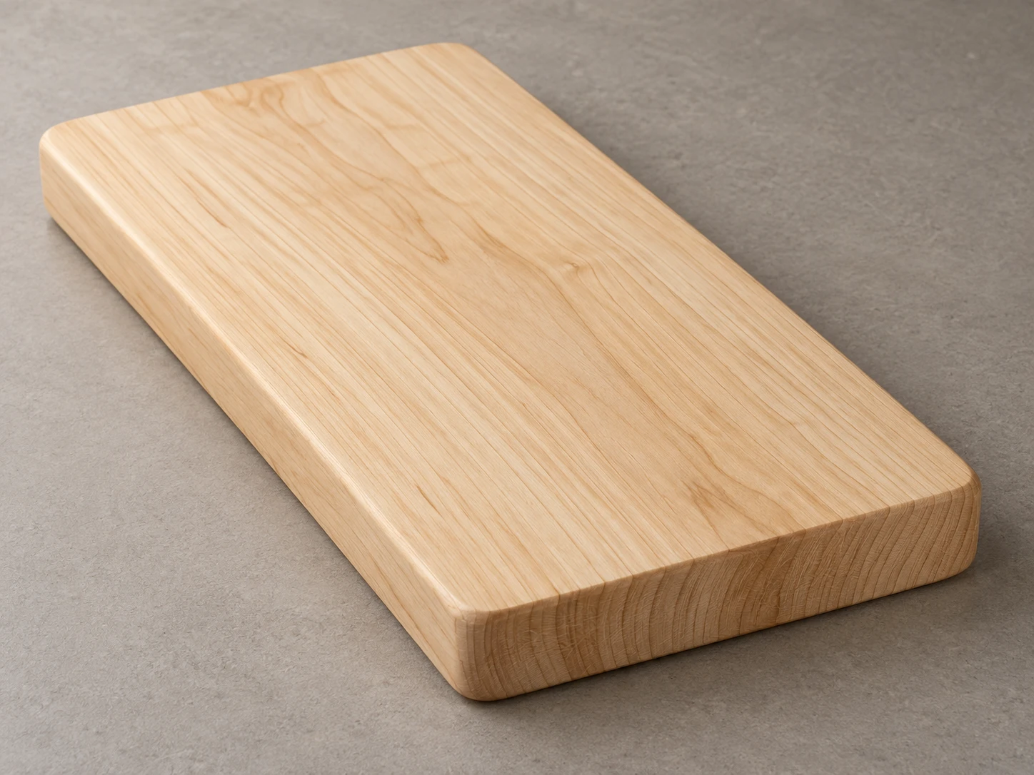
단풍나무 도마 · 면과 마구리의 나뭇결 대비
도마 윗면의 긴 나뭇결과 짧은 마구리 면의 끊긴 결을 대비해 목재의 방향과 두께를 보여준다.
단풍나무 도마 · 면과 마구리의 나뭇결 대비
- 형태·선
- 모서리가 완만하게 둥글고 가장자리가 살짝 부드러운 두꺼운 직사각형 판을 만든다. 윗면과 보이는 옆면을 일관된 원근으로 연결하고, 화면 오른쪽 아래의 짧은 마구리 면을 별도의 절단면으로 읽힐 만큼 충분히 드러낸다.
- 색·명암
- 연한 꿀빛 단풍나무에 절제된 황갈색 나뭇결을 넣는다. 화면 왼쪽 위의 큰 부드러운 광원으로 윗면을 밝게 하고 가까운 마구리 면을 조금 어둡게 하며, 도마 아래의 부드러운 접촉 그림자가 화면 오른쪽 아래로 이어지게 한다.
- 질감·재질
- 윗면에는 화면 왼쪽 위에서 오른쪽 아래로 이어지는 길고 완만하게 굽은 나뭇결을 그린다. 가까운 짧은 마구리 면에서는 긴 결 대신 짧고 불규칙한 흔적과 은은한 곡선형 나이테 일부를 넣고, 전체 분포가 가장자리에 도달하는 윗면의 결과 대응하게 한다. 목재는 매끄러운 무광으로 표현해 절단 방향의 대비가 잘 보이게 한다.
- 구도
- 두 가지 나뭇결 표현을 한 이미지에서 읽을 수 있을 만큼 도마를 크게 배치한다. 가까운 짧은 마구리 면을 가리지 않고 차분한 이음매 없는 탁자 배경을 사용하며, 도마 전체를 선명하게 유지해 윗면과 마구리 면을 직접 비교할 수 있게 한다.
우선순위
길게 이어지는 윗면의 결과 끊겨 보이는 마구리 결의 변화를 우선한다.
피할 표현과 결과 확인
같은 긴 나뭇결 줄무늬를 짧은 마구리 면까지 둘러 잇거나 결을 가리는 유광 반사를 넣지 않는다.
가까운 짧은 마구리 면이 목재의 절단면으로 읽히고 두 나뭇결 방향이 분명하게 보이는지 확인한다.
이 예시의 실제 생성 프롬프트
SUBJECT
One plain solid-maple cutting board with a rectangular body, softly rounded corners, and visible thickness. Its broad top shows longitudinal face grain; the short end facing the viewer shows the cut ends of that grain.

COMPOSITION
Use an elevated three-quarter product view on a warm gray tabletop. Place the board diagonally from image upper left to lower right, with its near short end at image lower right. Show the entire outline, broad top, near short end, and a narrow long side with generous surrounding space.

STYLE GUIDE
1. Shape & line
Construct a thick rectangular slab with gently rounded corners and a small softened edge. Keep the top and visible side planes joined in consistent perspective, making the short end at image lower right broad enough to read as a separate cut surface.

2. Color & light
Use pale honey-colored maple with restrained tan grain. Light from image upper left with a large soft source, keeping the top bright and the near end slightly darker; let a soft contact shadow sit beneath the board and extend toward image lower right.

3. Texture & material
Draw long, gently wavering grain streaks along the top from image upper left toward lower right. On the near short end, replace those streaks with short irregular marks and subtle curved growth-ring segments, aligning their general distribution with the grain arriving at the edge. Keep the wood smooth and matte so the cut-direction contrast remains visible.

4. Composition
Frame the board large enough that both grain treatments remain readable in the same image. Keep the near short end unobstructed, use a quiet seamless tabletop background, and hold the entire board in clear focus so the viewer can compare the top and end directly.

PRIORITY
Preserve the requested identity, count, action, composition and output settings. Apply the style rules within those constraints; a style reference must not replace the subject or layout. Within the style: Prioritize the visible change from longitudinal face grain to interrupted end grain.

AVOID
Avoid wrapping the same long grain stripes across the short end or adding glossy reflections that hide the grain.

OUTPUT
One photorealistic product-reference image in a 4:3 landscape aspect ratio, without text, logos, labels, or watermarks.

SELF-CHECK
Check that the near short end reads as cut wood and that both grain directions are clearly visible.
모델명은 이미지 출처 정보 기준입니다. 같은 프롬프트를 사용해도 결과는 달라질 수 있습니다.