텍스트 → 이미지제품 사진스타일 가이드
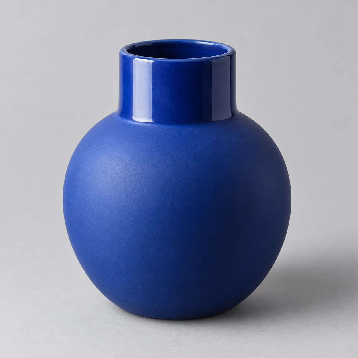
청색 도자기 꽃병 · 무광과 유광의 대비
같은 청색의 무광 몸체와 유광 목에 서로 다른 반사 형태를 적용해 표면 마감의 차이를 보여주는 제품 이미지.
청색 도자기 꽃병 · 무광과 유광의 대비
- 형태·선
- 넓고 둥근 몸체 위에 짧고 곧은 원통형 목을 만들고, 입구는 도자기 테두리가 보이는 얕은 타원으로 표현한다. 어깨의 외곽선을 매끄럽게 이어 주고, 마감 경계는 돌출된 이음매나 선 대신 반사의 차이로 드러낸다.
- 색·명암
- 화면 왼쪽의 세로로 긴 직사각형 소프트박스로 꽃병을 비춘다. 유광 목의 화면 왼쪽 부분에는 원통을 따라 완만하게 휘는 밝고 긴 반사를 넣고, 무광 몸체에는 넓고 부드러운 청색 명암을 만든다. 두 부분 모두 기본 색상을 유지하며 화면 오른쪽으로 어두워지게 한다.
- 질감·재질
- 몸체에는 소프트박스의 직사각형 형태를 남기지 않고 빛을 퍼뜨리는 곱고 균일한 무광 도자기 표면을 적용한다. 목은 매끄러운 유약 표면으로 표현해 알아볼 수 있는 소프트박스 반사와 절제된 밝은 테두리 강조를 넣는다. 마감 전환은 얼룩이나 장식 무늬 없이 깔끔한 원형 경계로 만든다.
- 구도
- 유광 목과 무광 어깨를 한눈에 비교할 수 있을 만큼 꽃병을 크게 배치하되, 입구 위와 바닥 주변에는 여백을 남긴다. 차분한 연회색 배경과 화면 오른쪽으로 뻗는 부드러운 바닥 그림자를 사용해 두 표면 마감에 시선이 모이게 한다.
우선순위
하나의 청색을 공유하는 두 마감의 서로 다른 반사 형태를 우선한다.
피할 표현과 결과 확인
무광 몸체를 번들거리게 만들거나 서로 다른 도색으로 마감을 구분하지 않는다.
소프트박스 형태가 유광 목에는 보이고 무광 몸체에서는 넓은 명암으로 퍼지는지 확인한다.
이 예시의 실제 생성 프롬프트
SUBJECT
One empty cobalt-blue ceramic vase with a rounded matte body and a short glossy cylindrical neck. Both sections share the same underlying blue color; their finish boundary follows the circular shoulder where the neck meets the body.

COMPOSITION
Show the entire vase centered in a slightly elevated three-quarter view, with its opening and shoulder visible. Place it on a pale gray seamless surface with generous surrounding space. A tall rectangular softbox stands off-frame on image-left, producing an observable reflection on the left-facing side of the glossy neck.

STYLE GUIDE
1. Shape & line
Build a broad rounded body beneath a short straight-sided neck, and show the opening as a shallow ellipse with a visible ceramic rim. Keep the silhouette continuous at the shoulder; indicate the finish boundary through reflection behavior rather than a raised seam or drawn outline.

2. Color & light
Light the vase from image-left with a tall rectangular softbox. Put a bright elongated reflection on the image-left portion of the glossy neck, bending it gently around the cylinder, while the matte body receives a broad soft blue gradient. Let both sections darken toward image-right without changing their underlying hue.

3. Texture & material
Give the body a fine, even matte ceramic surface that spreads the light without preserving the softbox's rectangular shape. Keep the neck smooth and glazed, with a recognizable softbox reflection and a restrained bright rim accent. Make the finish transition clean and circular, without adding speckles or decorative patterns.

4. Composition
Frame the vase large enough to compare the glossy neck and matte shoulder at a glance, while leaving clear space above the opening and around the base. Use a quiet pale gray background and a soft grounding shadow extending toward image-right so the two surface finishes remain the visual focus.

PRIORITY
Preserve the requested identity, count, action, composition and output settings. Apply the style rules within those constraints; a style reference must not replace the subject or layout. Within the style: Prioritize the distinct reflection shapes of two finishes sharing one blue color.

AVOID
Avoid making the matte body shiny or separating the finishes with different paint colors.

OUTPUT
One square 1:1 studio product photograph, with no lettering, logos, captions, or watermark.

SELF-CHECK
Confirm that the softbox shape appears on the glossy neck and dissolves into a broad gradient on the matte body.
모델명은 이미지 출처 정보 기준입니다. 같은 프롬프트를 사용해도 결과는 달라질 수 있습니다.