텍스트 → 이미지카페 · 브랜드스타일 가이드
동네 양말 수선소 · 배경 경계에서 색 반전
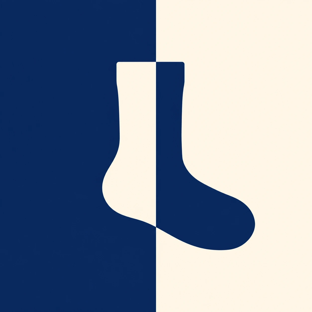
두 색의 배경 경계를 가로지르는 양말 심벌의 색을 반전해, 하나의 실루엣을 선명하게 유지하는 브랜드 그래픽.
동네 양말 수선소 · 배경 경계에서 색 반전
- 형태·선
- 양말을 평평한 입구, 부드럽게 둥근 뒤꿈치, 화면 오른쪽을 향한 넓고 둥근 발끝을 가진 하나의 연속된 실루엣으로 만든다. 색이 바뀌는 곳에서도 외곽선을 그대로 이어가고, 테두리선이나 내부 봉제선은 넣지 않는다.
- 색·명암
- 화면 왼쪽 배경은 짙은 남색, 오른쪽 배경은 따뜻한 크림색으로 채운다. 남색 배경 위의 양말 부분은 크림색으로, 크림색 배경 위의 부분은 남색으로 만들고, 동일한 수직 경계에서 틈이나 겹침, 그라데이션, 그림자 없이 색을 바꾼다.
- 질감·재질
- 두 색 모두 매끈한 종이 위에 불투명한 무광 잉크를 고르게 찍은 모습으로 표현한다. 색면은 균일하게, 가장자리는 선명하게 유지해 천의 디테일이나 표면 입자보다 색 반전이 정체성을 전달하게 한다.
- 구도
- 수직 경계가 양말의 다리와 발 내부를 지나도록 배치하고, 양쪽에 충분한 양말 면적이 보이게 한다. 심벌 높이는 화면 높이의 약 절반으로 잡고 입구 위와 밑창 아래에 뚜렷한 여백을 두어, 두 색의 부분이 하나의 양말로 읽히게 한다.
우선순위
끊김 없는 양말 실루엣과 정확히 맞물린 전경·배경의 색 반전을 우선한다.
피할 표현과 결과 확인
양말을 두 개의 물체로 분리하거나 색 경계에 구분선을 추가하지 않는다.
하나의 양말이 알아보기 쉽게 유지되며 배경이 바뀌는 곳에서 양말 색도 정확히 반전되는지 확인한다.
이 예시의 실제 생성 프롬프트
SUBJECT
Create a brand symbol for a small neighborhood sock-mending service: exactly one upright sock silhouette with its toe pointing toward image-right. The sock crosses a vertical two-color background boundary, and its fill reverses against each background half.

COMPOSITION
Use a square, straight-on graphic framing. Divide the image vertically at the center and position the sock across that division, with its leg straddling the boundary and its foot extending toward image-right. Leave generous open space around the complete symbol.

STYLE GUIDE
1. Shape & line
Build the sock as one continuous solid silhouette with a straight cuff, gently rounded heel, and broad rounded toe pointing image-right. Keep the outer contour identical through the color change; use no outline or internal seam marks.

2. Color & light
Fill the image-left background with deep navy and the image-right background with warm cream. Make every part of the sock on the navy field cream and every part on the cream field navy, switching exactly at the same visible vertical boundary without a gap, overlap, gradient, or shadow.

3. Texture & material
Give both colors an even, opaque matte-ink appearance on smooth paper. Keep the fields visually uniform and the edges crisp so the color reversal, rather than fabric detail or surface grain, carries the identity.

4. Composition
Place the vertical boundary through the interior of the sock’s leg and foot, leaving substantial visible sock area on both sides. Let the symbol occupy roughly half the image height, with clear margins above the cuff and below the sole, so the two colored portions read together as one sock.

PRIORITY
Preserve the requested identity, count, action, composition and output settings. Apply the style rules within those constraints; a style reference must not replace the subject or layout. Within the style: Prioritize an uninterrupted sock silhouette and a clearly aligned foreground–background color reversal.

AVOID
Avoid separating the sock into two objects or adding a divider line along the color boundary.

OUTPUT
Produce one 1:1 image as a clean, flat brand-reference graphic, with no lettering, numbers, captions, or watermark.

SELF-CHECK
Check that one sock remains recognizable and its fill reverses precisely where the background changes.
모델명은 이미지 출처 정보 기준입니다. 같은 프롬프트를 사용해도 결과는 달라질 수 있습니다.