텍스트 → 이미지화풍스타일 가이드
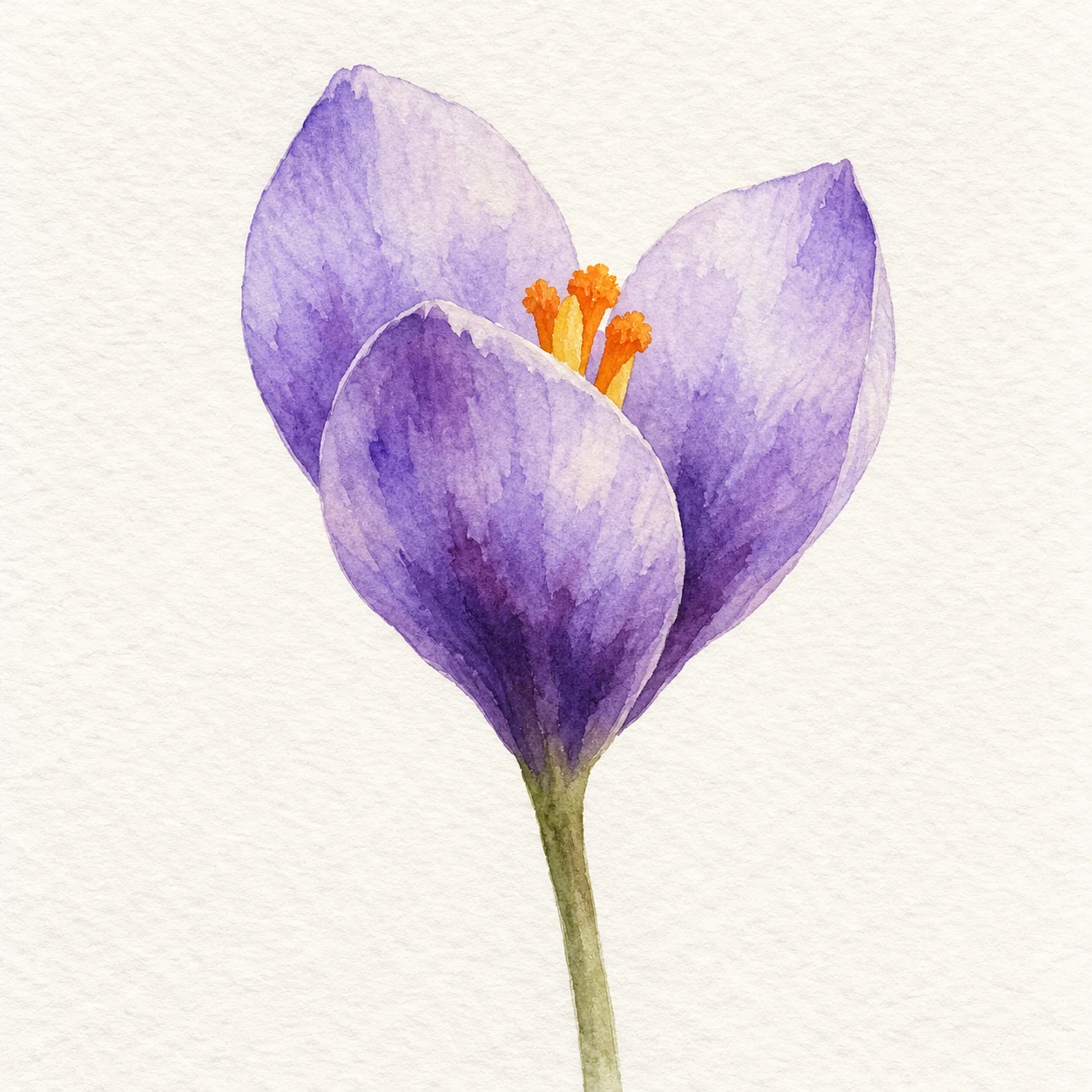
보라색 크로커스 한 송이 · 웨트 온 웨트 수채 번짐
젖은 꽃잎 안에서 보라색 안료가 부드럽게 퍼지는 수채화로, 선명한 외곽과 흐린 내부 색 경계를 대비합니다.
보라색 크로커스 한 송이 · 웨트 온 웨트 수채 번짐
- 형태·선
- 각 꽃잎을 밑부분으로 좁아지는 넓고 둥근 워시 형태로 만들고, 앞 꽃잎이 뒤쪽 두 꽃잎의 아랫부분을 가리게 하세요. 잉크로 외곽선을 두르지 말고 드러난 끝부분과 겹침 경계가 읽히도록 유지하세요.
- 색·명암
- 젖은 꽃잎 형태 안에 옅은 라벤더색을 깔고, 워시가 젖어 있을 때 밑부분에 짙은 보라색을 넣으세요. 보라색이 라벤더색으로 불규칙하고 부드럽게 위로 번지게 하되 끝부분에는 종이빛이 비치는 밝은 영역을 남기고, 주변 워시가 마른 뒤 주황색 수술을 더하세요.
- 질감·재질
- 투명한 안료가 결이 은은한 수채화 종이에 고르지 않게 스며든 모습을 표현하세요. 꽃잎 내부의 번짐은 부드럽게 갈라지는 가장자리와 밑부분에 모인 색으로 나타내고, 옅은 워시 사이로 종이 결이 보이게 하세요. 이 흔적은 꽃 안에 두고 배경 전체에 균일한 질감을 퍼뜨리지 마세요.
- 구도
- 꽃잎 내부의 워시 변화가 보일 만큼 꽃을 크게 배치하고, 밝은 뒤쪽 꽃잎들이 앞 꽃잎의 짙은 밑부분을 둘러싸게 하세요. 그 사이의 열린 공간에 작은 주황색 수술 무리를 놓고, 가는 줄기와 채색하지 않은 주변 종이로 번지는 보라색에 시선이 모이게 하세요.
우선순위
명확하게 읽히는 꽃잎 형태 안의 부드러운 안료 번짐을 우선하세요.
피할 표현과 결과 확인
에어브러시 같은 그라데이션, 불투명한 물감 쌓임, 딱딱한 내부 색 띠를 피하세요.
보라색이 라벤더색으로 부드럽게 번지면서도 꽃잎 끝과 겹침이 구분되는지 확인하세요.
이 예시의 실제 생성 프롬프트
SUBJECT
Show one violet crocus flower with three overlapping cup-shaped petals, a small cluster of orange stamens inside the cup, and one slender green stem connecting directly to the flower base.

COMPOSITION
Use a close, front three-quarter view with the flower cup above the center and the stem descending toward the lower edge. Separate the three petal tips clearly against bare paper, and leave generous space around the blossom.

STYLE GUIDE
1. Shape & line
Build each petal from a broad curved wash silhouette that narrows into its base; let the front petal overlap the lower portions of the two rear petals. Keep the exposed tips and overlap boundaries readable without outlining the flower in ink.

2. Color & light
Lay pale lavender into damp petal shapes, then introduce deeper violet at their bases while the washes remain wet. Let violet feather upward into lavender in irregular soft transitions, preserving pale paper-lit areas near the tips; add the orange stamens after the surrounding wash has dried.

3. Texture & material
Show transparent pigment settling unevenly into lightly textured watercolor paper. Make the interior diffusion appear as soft branching fringes and pooled color near petal bases, with paper grain visible through lighter washes; keep these marks inside the flower rather than spreading a uniform texture across the background.

4. Composition
Keep the blossom large enough for its internal wash transitions to be visible, with the pale rear petals framing the darker front petal base. Place the small orange stamen cluster in the opening between them, and use the thin stem and untouched surrounding paper to keep attention on the diffused violet.

PRIORITY
Preserve the requested identity, count, action, composition and output settings. Apply the style rules within those constraints; a style reference must not replace the subject or layout. Within the style: Prioritize soft pigment diffusion inside clearly readable petal shapes.

AVOID
Avoid airbrushed gradients, opaque paint buildup, and hard interior color stripes.

OUTPUT
Create one square image of a watercolor painting on off-white paper, with no lettering, labels, signature, or watermark.

SELF-CHECK
Check that violet visibly feathers into lavender while the petal tips and overlaps remain distinct.
모델명은 이미지 출처 정보 기준입니다. 같은 프롬프트를 사용해도 결과는 달라질 수 있습니다.