텍스트 → 이미지공간 · 건축스타일 가이드
작은 복도 · 멀어지는 문틀의 반복
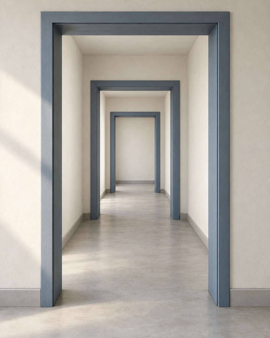
세 개의 열린 문틀이 멀어질수록 작아지고 간격이 압축되는 모습으로 짧은 복도의 깊이를 표현한다.
작은 복도 · 멀어지는 문틀의 반복
- 형태·선
- 세 문틀의 기둥은 곧은 수직선으로, 상인방은 수평선으로 만들고, 문틀 두께를 드러내는 깊이 방향 모서리와 복도의 바닥·천장 모서리를 화면 중앙 부근의 공통 소실점으로 향하게 한다. 멀리 있는 개구부일수록 같은 직사각형 비례를 유지하며 눈에 띄게 작아지게 한다.
- 색·명암
- 벽은 따뜻한 미색, 바닥은 옅은 회색, 문틀은 차분한 청회색으로 표현한다. 가장 가까운 개구부의 화면 왼쪽에서 넓고 부드러운 빛이 들어와 화면 왼쪽 문틀 면이 오른쪽 문틀 면보다 밝아지게 하고, 뒤쪽 벽에도 은은한 빛을 남겨 겹쳐 보이는 개구부를 모두 구분할 수 있게 한다.
- 질감·재질
- 벽은 넓고 희미한 표면 변화가 있는 무광 회벽으로, 문틀은 매끈하게 도장한 목재로 표현한다. 문틀 기둥과 바닥이 만나는 곳, 문틀 안쪽 면과 벽이 만나는 곳에 절제된 접촉 음영을 넣고, 뒤로 갈수록 보이는 질감을 줄여 표면 묘사가 깊이의 반복을 뒷받침하게 한다.
- 구도
- 가장 가까운 문틀의 바닥 접점을 화면 아래쪽에 두고, 뒤쪽 문틀의 접점은 차례로 중앙 소실점에 가까워지게 한다. 문틀 사이에 보이는 바닥 간격을 멀어질수록 압축하고, 세 개구부를 모두 통과하는 바닥 띠가 이어지게 하여 겹친 직사각형이 하나로 연결된 복도로 읽히게 한다.
우선순위
작아지는 개구부와 압축되는 바닥 간격으로 복도의 깊이가 즉시 읽히도록 한다.
피할 표현과 결과 확인
크기가 같은 겹친 문틀, 서로 어긋나는 소실점, 개구부를 흐리는 과도한 질감을 피한다.
온전한 열린 문틀 세 개가 하나의 원근 체계를 따르며 뒤쪽 벽을 향해 작아지고 서로 가까워지는지 확인한다.
이 예시의 실제 생성 프롬프트
SUBJECT
One short, empty interior corridor containing exactly three rectangular open doorframes arranged successively along its length, ending at a plain back wall. Each opening reveals the next; the frames have visible thickness and no door leaves.

COMPOSITION
Use an eye-level view centered on the corridor axis in one-point perspective. The nearest frame fills much of the foreground, the middle frame sits inside its opening, and the smallest frame surrounds the distant back wall. Keep all three lintels and both jambs of each frame readable.

STYLE GUIDE
1. Shape & line
Build the three doorframes with straight vertical jambs and horizontal lintels; aim their visible depth edges and the corridor's floor and ceiling edges toward one shared vanishing point near the image center. Make each farther opening visibly smaller while preserving the same rectangular proportions.

2. Color & light
Use warm off-white walls, pale gray flooring, and muted blue-gray frames. Let broad soft light enter from the image-left side of the nearest opening, making the image-left jamb faces lighter than the image-right jamb faces; keep the back wall softly lit so every nested opening remains distinct.

3. Texture & material
Render the walls as matte plaster with faint broad surface variation and the frames as smooth painted wood. Add restrained contact shading where jambs meet the floor and where frame returns meet the walls; reduce visible texture toward the back so surface detail supports the depth rhythm.

4. Composition
Place the nearest frame's floor contacts low in the image and the farther contacts progressively closer to the central vanishing point. Compress the visible floor intervals between successive frames with distance, keeping a continuous strip of floor through all three openings so the nested rectangles read as one connected corridor.

PRIORITY
Preserve the requested identity, count, action, composition and output settings. Apply the style rules within those constraints; a style reference must not replace the subject or layout. Within the style: Prioritize the shrinking openings and compressed floor intervals that make the corridor's depth immediately readable.

AVOID
Avoid equal-sized nested frames, conflicting vanishing points, and heavy texture that obscures the openings.

OUTPUT
Create one architectural visualization in a 4:5 portrait aspect ratio, with no text, labels, dimensions, logos, or watermark.

SELF-CHECK
Check that three complete open frames share one perspective system and become smaller and closer together toward the back wall.
모델명은 이미지 출처 정보 기준입니다. 같은 프롬프트를 사용해도 결과는 달라질 수 있습니다.