텍스트 → 이미지제품 사진스타일 가이드
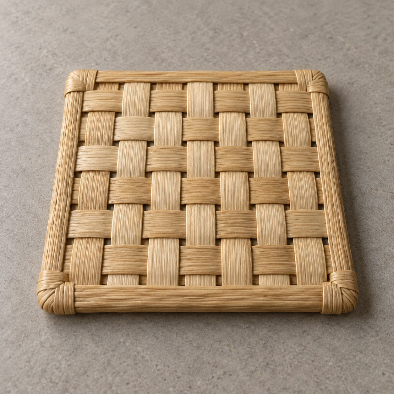
갈대 코스터 · 교차 짜임
납작한 갈대 띠가 번갈아 위아래로 교차하는 모습을 겹침과 짧은 그림자로 표현한 제품 이미지.
갈대 코스터 · 교차 짜임
- 형태·선
- 두 방향의 납작한 띠를 직각으로 교차시켜 정사각형을 만든다. 각 교차점에서 위쪽 띠의 양쪽 가장자리는 이어 그리고 아래쪽 띠의 가장자리는 가려진 구간에서 끊는다. 어느 방향으로든 다음 교차점에서는 위아래 관계를 뒤집어 일관된 바둑판식 짜임을 만든다.
- 색·명암
- 이미지 왼쪽 위의 넓은 광원 아래에서 옅은 볏짚색과 꿀색을 사용한다. 각 솟은 교차점 바로 오른쪽 아래의 드러난 아래쪽 띠에 짧고 부드러운 그림자를 놓고, 위쪽 띠 밑에는 더 어두운 접촉선을 넣는다. 빛을 받는 갈대 표면은 은은하게 밝힌다.
- 질감·재질
- 각 갈대 띠에 길이 방향의 은근한 섬유 결과 광택이 적은 건조한 표면을 표현한다. 띠가 교차점 위에서 완만하게 솟고 그 사이에서 내려앉게 하여, 섬유 결이 각 띠의 방향을 따르고 유연한 재료의 얕은 입체감이 읽히도록 한다.
- 구도
- 묶인 테두리 전체를 보이게 하고 위에서 비스듬히 내려다보는 시점으로 중앙의 이웃한 교차점 여러 개를 드러낸다. 원근에 따라 이미지 위쪽으로 갈수록 짜임 간격을 점차 좁히되, 아래쪽 교차점은 번갈아 겹치는 구조를 살펴볼 수 있을 만큼 크게 유지한다.
우선순위
일관되게 번갈아 겹치는 패턴과 교차점의 얕은 입체감을 우선한다.
피할 표현과 결과 확인
인쇄된 바둑판 무늬, 서로 붙어버린 교차점, 바구니처럼 깊게 부푼 형태를 피한다.
각 띠가 연속된 교차점에서 위쪽과 아래쪽으로 번갈아 지나가는지 확인한다.
이 예시의 실제 생성 프롬프트
SUBJECT
One square coaster woven from broad, flat natural reed strips in two perpendicular sets, with a narrow bound border holding the weave together. At successive crossings, each strip alternates between passing above and beneath the other set.

COMPOSITION
Show the entire coaster centered on a warm gray tabletop, viewed obliquely from above. Its front edge sits toward image-bottom and its rear edge toward image-top; keep the square outline and individual crossings clearly readable with generous surrounding space.

STYLE GUIDE
1. Shape & line
Build the square from two perpendicular families of flat strips. At each crossing, keep the upper strip's two edges continuous and interrupt the lower strip's edges beneath it; reverse this relationship at the next crossing along either direction to establish a consistent checkerboard weave.

2. Color & light
Use pale straw and honey tones under a broad light from image-upper-left. Place a short, soft shadow on the exposed lower strip immediately toward image-lower-right of each raised crossing, with a darker contact line tucked beneath the upper strip; keep the lit reed surfaces softly luminous.

3. Texture & material
Give each reed strip subtle lengthwise fibers and a dry, low-sheen surface. Let the strips rise gently over crossings and settle into the gaps between them, so fibers follow each strip's own direction and the weave reads as flexible material with shallow physical depth.

4. Composition
Keep the full bound border visible and use the overhead oblique view to expose several adjacent crossings near the center. Compress the weave spacing gradually toward image-top with perspective, while leaving the image-bottom crossings large enough to inspect the alternating overlaps.

PRIORITY
Preserve the requested identity, count, action, composition and output settings. Apply the style rules within those constraints; a style reference must not replace the subject or layout. Within the style: Prioritize a consistent alternating overlap pattern and visible shallow depth at the crossings.

AVOID
Avoid printed checkerboard markings, fused intersections, and deep basket-like bulges.

OUTPUT
One realistic studio product image in a 1:1 aspect ratio, without text, logos, labels, or a watermark.

SELF-CHECK
Check that each strip visibly switches from above to beneath at consecutive crossings.
모델명은 이미지 출처 정보 기준입니다. 같은 프롬프트를 사용해도 결과는 달라질 수 있습니다.