텍스트 → 이미지화풍스타일 가이드
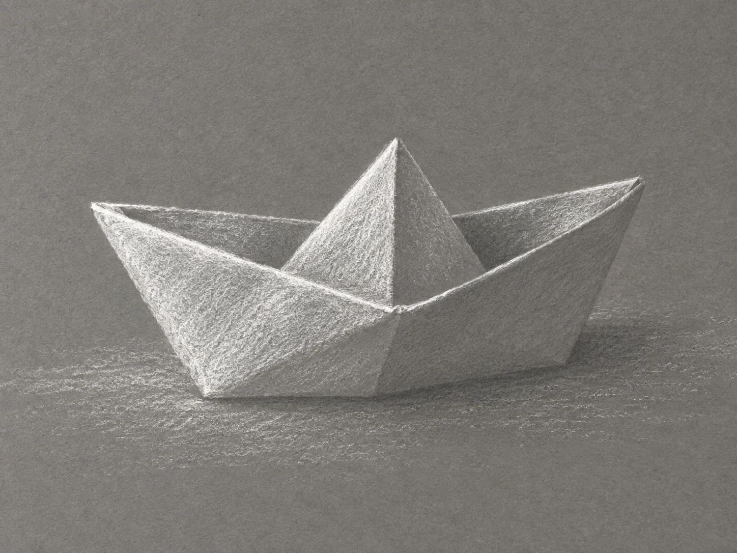
종이배 한 척 · 중간톤 위의 흰 분필
회색 종이를 중간톤으로 남기고 흰 분필을 더해 접힌 종이배의 밝은 면과 날카로운 능선을 드러내는 드로잉.
종이배 한 척 · 중간톤 위의 흰 분필
- 형태·선
- 곧은 접힘선과 넓고 각진 면으로 종이배를 구성한다. 빛을 받는 위쪽 테두리와 중앙 능선은 가늘고 또렷한 흰 분필 선으로 그리고, 아래쪽 선체 윤곽은 모든 면을 선으로 두르지 말고 회색 바탕에 부드럽게 스며들게 한다.
- 색·명암
- 회색 종이를 중간 명도로 사용하고 흰 분필만 색으로 더한다. 빛은 화면 왼쪽 위에서 오게 하여 그쪽을 향한 접힌 면에 가장 밝은 분필을 쌓고, 오른쪽을 향한 선체는 대부분 회색으로 남기며, 배 안쪽의 넓은 어두운 영역은 칠하지 않은 회색으로 유지한다.
- 질감·재질
- 분필 옆면으로 넓은 면을 칠해 종이 결 사이로 흰색이 끊기며 입자가 보이게 한다. 일부 밝은 면의 안쪽만 가볍게 문지르고 가장자리에는 가루 같은 빈틈을 남긴다. 선택한 접힘 능선에만 분필을 진하게 쌓아 거친 종이 위의 마른 분필 질감을 유지한다.
- 구도
- 종이배를 중앙보다 조금 아래에 놓고 손대지 않은 회색 종이 위에서 실루엣이 명확하게 보이게 한다. 배 옆에 성긴 수평 분필 자국을 넣어 받침면을 암시하되 선체 바로 아래에는 가느다란 회색 접촉 띠를 남긴다. 배경 자국은 밝은 중앙 봉우리보다 약하게 표현한다.
우선순위
회색 바탕이 보이는 상태에서 흰색을 더해 접힌 면을 명확하게 드러내는 것을 우선한다.
피할 표현과 결과 확인
검은 외곽선, 유색 강조, 분필 입자를 가리는 매끈한 디지털 그라데이션을 피한다.
종이배 한 척이 명확하게 읽히고 칠하지 않은 회색 종이가 그림자 면을 이루는지 확인한다.
이 예시의 실제 생성 프롬프트
SUBJECT
One small boat folded from plain white paper, with a central triangular peak rising between two folded hull sides, resting on a flat surface.

COMPOSITION
Show the entire boat in a slightly elevated three-quarter view, with its bow pointing toward image-left and its long hull extending toward image-right. Keep the opening and central peak readable, with generous gray-paper space around the subject.

STYLE GUIDE
1. Shape & line
Construct the boat from straight fold edges and broad angular planes. Draw the illuminated upper rim and central ridge with firm, narrow white-chalk strokes, then let the lower hull contour soften into the gray ground instead of enclosing every plane with an outline.

2. Color & light
Use the gray sheet as the middle value and white chalk as the only added color. Light from image-upper-left: build the brightest chalk on the upper-left-facing folds, leave the right-facing hull mostly bare gray, and reserve the unmarked gray inside the opening as the darkest large area.

3. Texture & material
Lay broad planes with the side of the chalk so the paper tooth breaks the white into a visible grain. Blend lightly within a few bright planes, but retain powdery gaps near their edges; use denser chalk only along selected fold crests so the material still reads as dry chalk on textured paper.

4. Composition
Place the boat slightly below center and keep its silhouette clear against untouched gray paper. Suggest the supporting surface with a sparse horizontal chalk scuff beside the boat, while leaving a narrow gray contact strip directly beneath the hull; keep background marks quieter than the bright central peak.

PRIORITY
Preserve the requested identity, count, action, composition and output settings. Apply the style rules within those constraints; a style reference must not replace the subject or layout. Within the style: Prioritize readable folded planes built by adding white to a visible gray ground.

AVOID
Avoid black outlines, colored accents, and smooth digital gradients that conceal the chalk grain.

OUTPUT
One image in a 4:3 landscape aspect ratio, presented as a finished chalk drawing on gray paper, without text, labels, signatures, or borders.

SELF-CHECK
Check that one boat reads clearly and that bare gray paper supplies its shadow planes.
모델명은 이미지 출처 정보 기준입니다. 같은 프롬프트를 사용해도 결과는 달라질 수 있습니다.