텍스트 → 이미지카페 · 브랜드스타일 가이드
동네 배 과수원 · 명암 반전 심벌
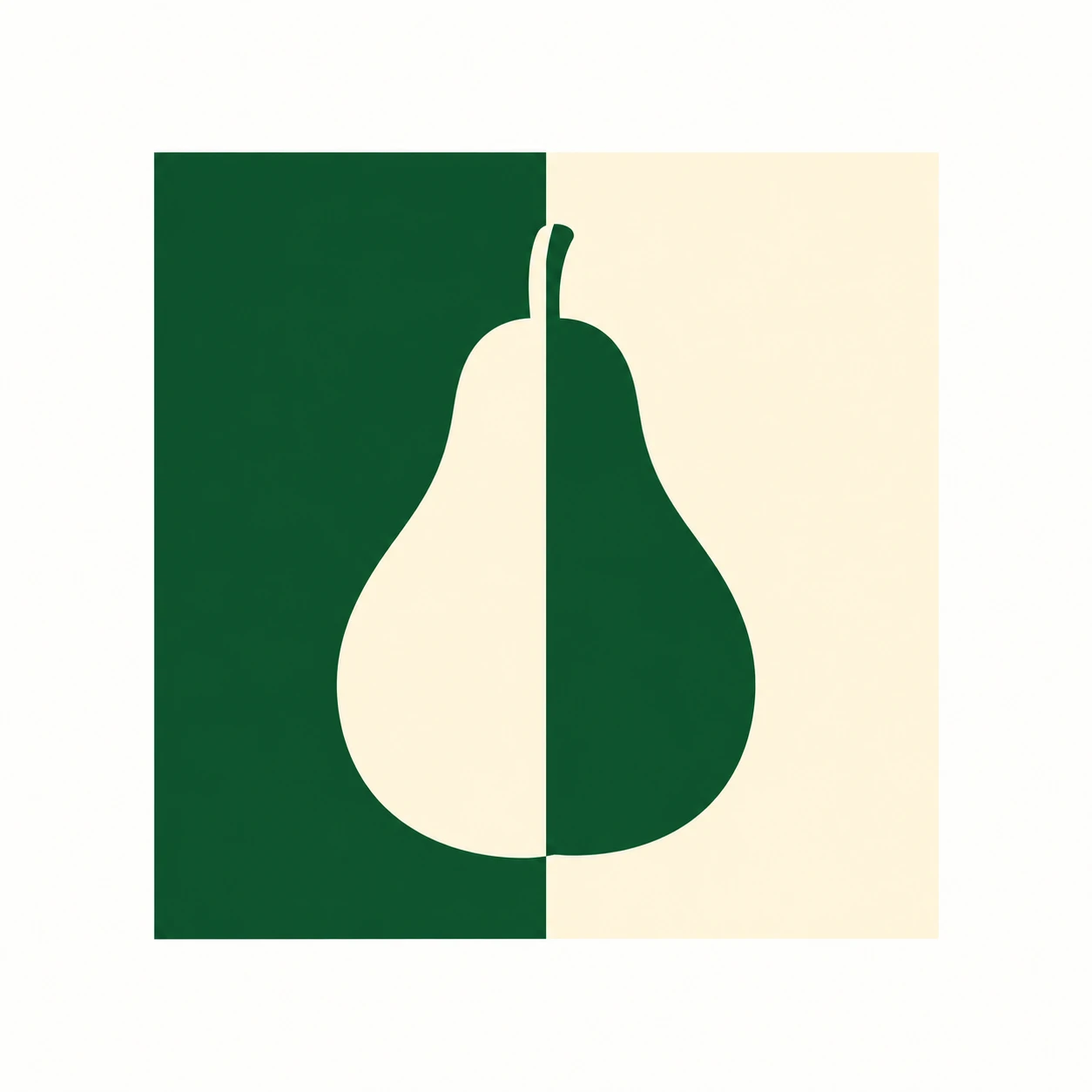
배 실루엣과 배경의 밝고 어두운 면을 중앙에서 맞바꾸어, 두 색만으로 선명한 과수원 심벌을 만듭니다.
동네 배 과수원 · 명암 반전 심벌
- 형태·선
- 목은 좁고 둥글게, 아랫부분은 넓게, 꼭지는 짧고 곧게 세워 하나로 이어진 배 실루엣을 만드세요. 외곽 곡선은 매끄럽고 알아보기 쉽게 유지하고, 중앙의 색 전환은 배에 틈을 내지 않고 채움색만 나누세요.
- 색·명암
- 정사각형의 화면 왼쪽 절반은 짙은 초록색, 오른쪽 절반은 따뜻한 아이보리색으로 채우세요. 초록색 면 위의 배는 아이보리색으로, 아이보리색 면 위의 배는 초록색으로 만들고, 두 반전이 같은 수직 경계에서 만나게 하세요. 양쪽에서 배가 또렷하게 보이도록 단색으로 채우세요.
- 질감·재질
- 불투명하고 균일한 채움과 또렷한 가장자리로 벡터처럼 깔끔한 그래픽을 표현하세요. 표면은 평평하고 질감 없이 유지하여, 음영이나 추가 외곽선 없이 공유 경계와 반전된 색이 디자인을 드러내게 하세요.
- 구도
- 배의 꼭지와 몸통 중심축을 정사각형의 중앙 분할선에 놓고, 실루엣 전체 둘레에 배경 여백을 남기세요. 넓은 배 밑부분 아래에도 충분한 공간을 두어 균형을 잡고, 주변 캔버스는 단순하게 유지하여 색 반전이 한눈에 읽히게 하세요.
우선순위
알아보기 쉬운 배 형태와 하나로 정렬된 명암 반전 경계를 우선하세요.
피할 표현과 결과 확인
색 반전을 흐리는 중앙 틈, 추가 외곽선, 그라데이션을 피하세요.
배가 하나의 온전한 형태로 읽히고 배경이 바뀌는 지점에서 함께 색이 반전되는지 확인하세요.
이 예시의 실제 생성 프롬프트
SUBJECT
Create one original brand emblem for a small pear orchard: one upright pear silhouette with a short stem, centered inside one square field. The pear crosses the field's vertical midpoint, where its fill reverses against the two background halves.

COMPOSITION
Show the complete emblem straight on, centered on a plain warm-white canvas. Keep the square field large enough to read the pear immediately, with generous clear margins on all four sides.

STYLE GUIDE
1. Shape & line
Build the pear as one continuous silhouette with a narrow rounded neck, a broad lower body and a short upright stem. Keep its outer curves smooth and recognizable; let the central color change divide the fill without cutting a gap through the pear.

2. Color & light
Fill the square's image-left half with deep green and its image-right half with warm ivory. Make the pear ivory over the green half and green over the ivory half, with both reversals meeting at the same straight vertical boundary. Use solid colors so the pear remains visible on both sides.

3. Texture & material
Render the emblem as clean vector-like artwork with opaque, even fills and crisp edges. Keep the surface visually flat and untextured, allowing the shared boundary and reversed colors to carry the design without shading or an added outline.

4. Composition
Place the pear's stem and body axis on the square's central dividing line, leaving open background around the entire silhouette. Balance the pear's broad base with clear space beneath it, and keep the surrounding canvas quiet so the color reversal reads at a glance.

PRIORITY
Preserve the requested identity, count, action, composition and output settings. Apply the style rules within those constraints; a style reference must not replace the subject or layout. Within the style: Prioritize a recognizable pear and a single aligned counterchange boundary.

AVOID
Avoid a central gap, extra outlines or gradients that weaken the color reversal.

OUTPUT
Deliver one square 1:1 image of the finished flat graphic emblem, with no lettering, captions, watermarks or mockup setting.

SELF-CHECK
Check that the pear reads as one whole shape and reverses color exactly where the background changes.
모델명은 이미지 출처 정보 기준입니다. 같은 프롬프트를 사용해도 결과는 달라질 수 있습니다.