텍스트 → 이미지제품 사진스타일 가이드
반투명 아크릴 북엔드 · 투과상 확산
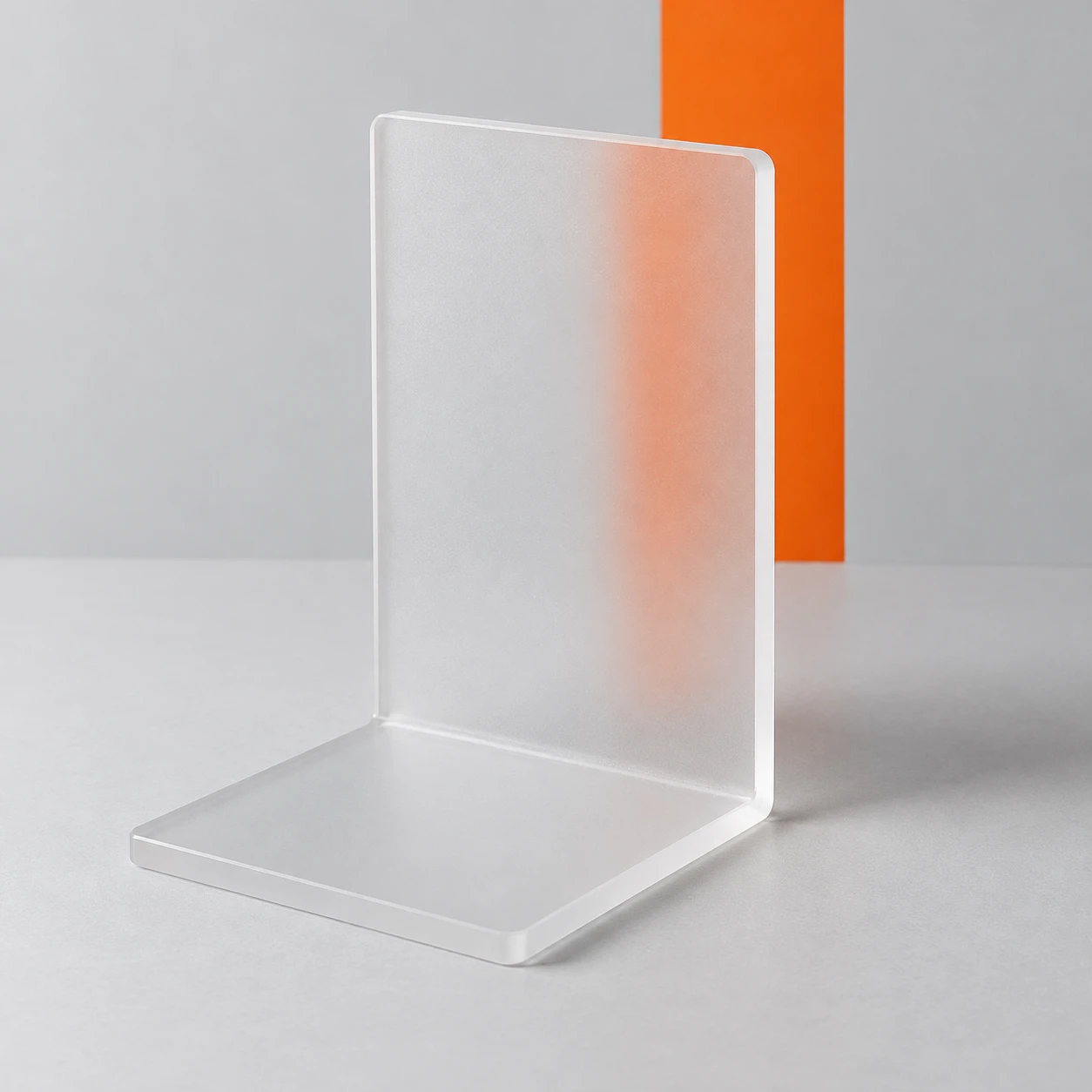
북엔드 뒤의 주황색 띠가 반투명 면을 통과하며 흐려지는 모습으로 무광 아크릴의 재질을 보여준다.
반투명 아크릴 북엔드 · 투과상 확산
- 형태·선
- 넓은 직사각형 면 두 개를 분명한 직각으로 연결하고 모서리는 부드럽게 다듬는다. 세로판의 화면 오른쪽 두께 면과 받침의 앞쪽 가장자리를 보여 북엔드가 입체적인 L자 형태로 읽히게 한다.
- 색·명암
- 화면 왼쪽의 넓고 부드러운 광원으로 왼쪽을 향한 가장자리에 옅은 하이라이트를 만들고 탁자 위 그림자는 화면 오른쪽으로 부드럽게 드리운다. 판 바깥의 주황색 띠는 선명하고 진하게 유지하되, 판을 통해 보이는 부분은 색을 옅게 하고 경계를 흐린다.
- 질감·재질
- 아크릴 표면은 고르게 서리 낀 듯한 미세한 무광 질감과 넓고 절제된 하이라이트로 표현한다. 투과된 띠는 수직 방향을 유지한 채 부드러운 주황색 영역으로 퍼지게 하고, 판이 불투명하거나 우윳빛 흰색이 되지 않도록 주황색 중심을 알아볼 수 있게 남긴다.
- 구도
- 띠의 화면 왼쪽 경계는 세로판을 통해 보이고 화면 오른쪽 경계는 판 옆으로 드러나게 배치한다. 두 경계를 같은 초점 범위에 두어 표면에 의한 확산과 카메라 흐림의 차이를 바로 확인할 수 있게 한다.
우선순위
선명한 주황색 띠가 부드러운 투과상으로 바뀌는 모습을 가장 중요하게 표현한다.
피할 표현과 결과 확인
이미지 전체를 흐리게 하거나 아크릴을 완전히 불투명하게 만들지 않는다.
직접 보이는 띠는 선명하고 투과된 경계는 눈에 띄게 부드러운지 확인한다.
이 예시의 실제 생성 프롬프트
SUBJECT
One unmarked L-shaped frosted acrylic bookend, with an upright rectangular panel joined to a flat foot extending toward the viewer. A single vertical orange stripe on the backdrop sits behind the upright panel; part of the stripe remains visible beyond the panel’s image-right edge.

COMPOSITION
Use a slightly elevated three-quarter product view that reveals the upright panel, its thickness, and the forward-projecting foot. Center the bookend with generous margins on a pale gray tabletop against a matching backdrop. Keep the orange stripe visible both through the panel and directly beside its image-right edge.

STYLE GUIDE
1. Shape & line
Construct the bookend from two broad rectangular planes joined at a clear right angle, with gently softened corners. Show the upright panel’s narrow image-right thickness edge and the foot’s front edge so the object reads as a solid L-shaped piece.

2. Color & light
Light the object with a broad soft source from image-left, creating a pale highlight on the left-facing edges and a soft tabletop shadow toward image-right. Keep the orange stripe crisp and saturated outside the panel, but paler with softened boundaries where seen through it.

3. Texture & material
Render the acrylic as evenly frosted, with a fine matte surface and broad restrained highlights. Let the transmitted stripe spread into a soft orange band while preserving its vertical direction; retain a recognizable orange center rather than turning the panel opaque or milky white.

4. Composition
Place the stripe so its image-left boundary is seen through the upright panel and its image-right boundary is exposed beside the panel. Keep both boundaries in the same focal range, making the difference between surface diffusion and camera blur immediately visible.

PRIORITY
Preserve the requested identity, count, action, composition and output settings. Apply the style rules within those constraints; a style reference must not replace the subject or layout. Within the style: Prioritize the visible transition from a crisp orange stripe to its softened transmitted image.

AVOID
Avoid blurring the entire image or making the acrylic fully opaque.

OUTPUT
Produce one square product-reference image with no lettering, logos, captions, or watermark.

SELF-CHECK
Check that the exposed stripe is sharp while its transmitted boundary is visibly softened.
모델명은 이미지 출처 정보 기준입니다. 같은 프롬프트를 사용해도 결과는 달라질 수 있습니다.