텍스트 → 이미지카페 · 브랜드스타일 가이드
동네 서점 · 끊긴 윤곽의 시각적 완성
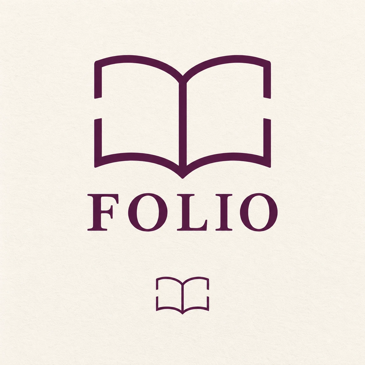
열린 책의 윤곽 일부를 생략해도 형태가 이어져 보이는 시각적 완성을 활용한 서점 로고 레퍼런스.
동네 서점 · 끊긴 윤곽의 시각적 완성
- 형태·선
- 열린 책을 매끄럽고 일정한 굵기의 선으로 그리고, 두 페이지의 위쪽을 완만하게 휘게 하며 중앙 접힘선은 이어 둔다. 양쪽 바깥 윤곽의 중간에 넓은 틈을 만들되 선 끝이 같은 가상 곡선을 따르게 하여 빠진 가장자리가 자연스럽게 이어져 보이게 한다.
- 색·명암
- 모든 심벌 선과 워드마크에 짙은 가지색을 사용하고 배경은 따뜻한 아이보리로 채운다. 잉크색은 단색으로 유지하고 배경 밝기를 균일하게 하여 아이보리 틈이 그려진 윤곽만큼 또렷하게 보이게 한다.
- 질감·재질
- 아이덴티티를 무광 비코팅 종이 위의 평면 벡터 그래픽으로 표현하고 종이결은 약하고 균일하게 넣는다. 선 가장자리와 틈의 경계를 선명하게 유지하여 표면 질감이 생략된 책 윤곽을 대신 채우지 않게 한다.
- 구도
- 주 심벌을 절제된 대문자 세리프 FOLIO 워드마크 위에 중앙 정렬하고 둘 사이에 분명한 간격을 둔다. 아래에는 같은 끊긴 윤곽 심벌을 훨씬 작게 반복하되 틈과 두 페이지의 실루엣을 유지하여 두 크기에서 모두 시각적 완성이 드러나게 한다.
우선순위
바깥 가장자리 일부가 없어도 시각적 완성으로 즉시 알아볼 수 있는 열린 책을 우선한다.
피할 표현과 결과 확인
흩어진 장식용 짧은 선, 막힌 틈, 페이지 음영, 목업 원근을 피한다.
두 심벌 모두 열린 책으로 읽히고 바깥 윤곽의 틈이 보이는지 확인한다.
이 예시의 실제 생성 프롬프트
SUBJECT
Create a brand reference for a fictional neighborhood bookshop named FOLIO: one open-book symbol above one FOLIO wordmark. The book has two facing pages joined at a central gutter; deliberate gaps interrupt the outer page contours while the remaining segments imply one complete book.

COMPOSITION
Use a square, front-facing identity sheet with a large primary logo centered in the upper two-thirds and one smaller repetition of the book symbol centered below. Give both generous surrounding space and keep the smaller symbol clearly subordinate.

STYLE GUIDE
1. Shape & line
Draw the open book with smooth, uniform-weight strokes, two gently bowed page tops, and a continuous central gutter. Leave a broad gap midway along each outer side contour, keeping the stroke ends aligned with the same implied curve so the eye completes the missing edges.

2. Color & light
Use deep aubergine for every symbol stroke and the wordmark on a warm ivory background. Keep the ink color solid and the background evenly lit, allowing the ivory gaps to remain as clear as the drawn contours.

3. Texture & material
Render the identity as flat vector artwork on matte, uncoated paper with a faint, even paper grain. Preserve crisp stroke edges and clean gap boundaries so surface texture never supplies the missing book contours.

4. Composition
Center the main book symbol above a restrained uppercase serif FOLIO wordmark, leaving a clear interval between them. Repeat the same broken-contour symbol at a substantially smaller size below, preserving visible gaps and the two-page silhouette to demonstrate closure at both scales.

PRIORITY
Preserve the requested identity, count, action, composition and output settings. Apply the style rules within those constraints; a style reference must not replace the subject or layout. Within the style: Prioritize an immediately recognizable open book whose missing outer edges are completed by visual closure.

AVOID
Avoid scattered decorative dashes, closed gaps, page shading, and mockup perspective.

OUTPUT
Produce one image in a 1:1 aspect ratio. Include only the word FOLIO beneath the primary symbol; add no captions, explanatory labels, guides, or other text.

SELF-CHECK
Check that both symbols read as open books and that their outer contour gaps remain visible.
모델명은 이미지 출처 정보 기준입니다. 같은 프롬프트를 사용해도 결과는 달라질 수 있습니다.