텍스트 → 이미지카페 · 브랜드스타일 가이드
동네 빵 협동조합 · 칼집 패턴 체계
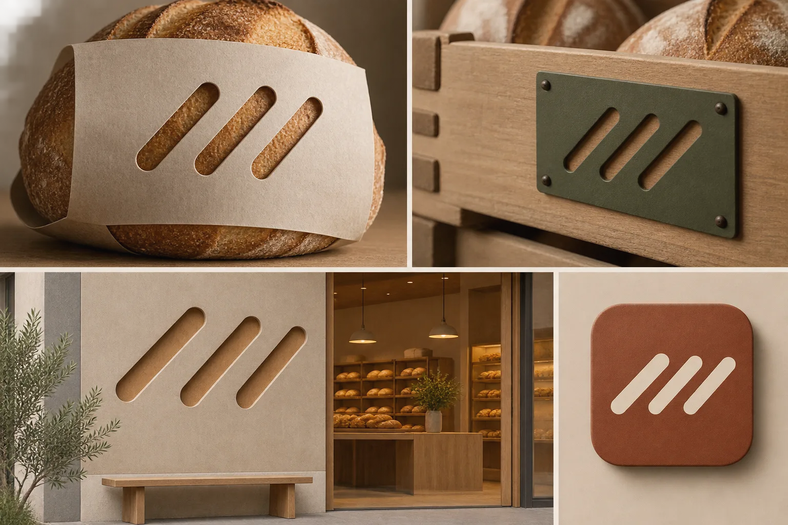
빵의 칼집에서 가져온 짧은 절개를 반복 가능한 브랜드 형태와 제작 방식으로 확장한다.
동네 빵 협동조합 · 칼집 패턴 체계
- 1
- Keep a consistent three-cut motif, angle, and rounded-end shape.
- 2
- Adapt motif scale and spacing to each application's size.
- 3
- Translate the same form credibly across die-cut paper, recessed surfaces, and flat digital graphics.
- 4
- Show a coherent family of applications without relying on text or color alone.
우선순위
소재를 바꿔도 네 가지 표현 규칙을 유지합니다.
피할 표현과 결과 확인
불필요한 글자·로고·워터마크를 제외합니다.
축소해도 형태와 구도가 명확한지 확인합니다.
이 화풍으로 에셋 만들기
공통 화풍 고정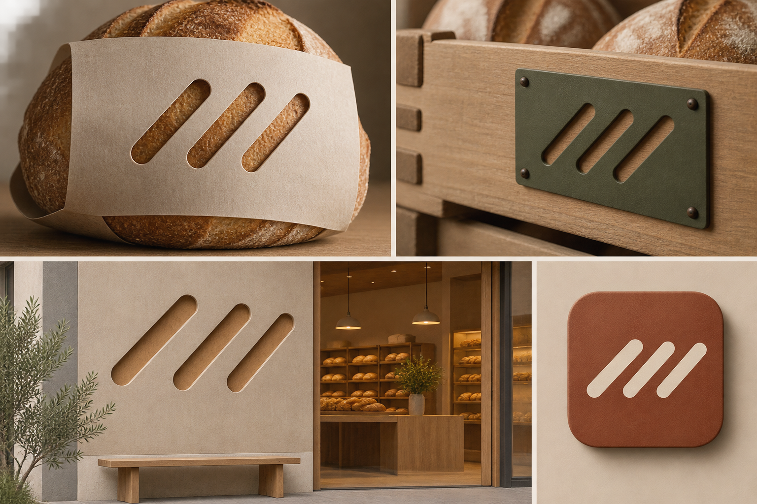
이 예시의 실제 생성 프롬프트
실제 사용한 프롬프트 · 원문
Design a cohesive visual identity presentation for an original neighborhood bread cooperative. Derive its signature motif from three short diagonal scoring cuts on a loaf: maintain the same cut angle and rounded ends as the motif appears on a bread sleeve, a reusable crate tag, a storefront panel, and a small digital tile. Vary spacing and scale to suit each surface while keeping the three-cut rhythm recognizable. On paper, use real die-cut slits that reveal the warm substrate beneath; on the crate tag and storefront, translate the same shape into shallow physical recesses; on the digital tile, use a flat graphic equivalent. Arrange the applications together as a clear brand system with restrained materials and no decorative wheat clichés. The three-cut motif is the intended identity mark. No wordmarks, letters, numbers, unrelated logos, or watermarks.
모델명은 이미지 출처 정보 기준입니다. 같은 프롬프트를 사용해도 결과는 달라질 수 있습니다.