텍스트 → 이미지공간 · 건축스타일 가이드
작은 복도 · 반복 프레임의 크기 감소
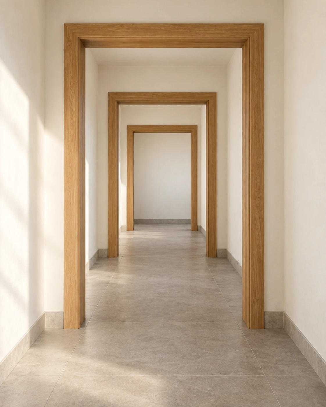
복도 안쪽으로 갈수록 작아지는 세 개의 문틀로 공간의 깊이를 보여주는 실내 이미지.
작은 복도 · 반복 프레임의 크기 감소
- 형태·선
- 수직 기둥과 수평 상인방으로 세 개의 겹쳐 보이는 직사각형 개구부를 만든다. 안쪽 문틀일수록 눈에 띄게 작게 보이게 하고, 바닥과 벽의 경계선을 가장 먼 개구부 안의 공통 소실점으로 향하게 하여 같은 크기의 구조물이 서로 다른 깊이에 놓인 것으로 읽히게 한다.
- 색·명암
- 옅은 크림색 벽, 차분한 꿀색 목재, 따뜻한 회색 바닥을 사용한다. 화면 왼쪽 바깥에서 넓은 자연광이 들어와 화면 왼쪽 벽을 밝히고 문틀의 화면 오른쪽 안쪽 면은 부드러운 그늘로 남기되, 모든 개구부가 구분되게 한다.
- 질감·재질
- 목재에는 각 부재의 길이 방향을 따르는 절제된 나뭇결을, 회벽에는 부드러운 무광 표면을, 바닥에는 매끈한 석재 질감을 표현한다. 먼 문틀에서는 나뭇결의 세부를 줄이되 단단한 윤곽과 읽을 수 있는 두께는 유지한다.
- 구도
- 가장 가까운 개구부가 가장 크고 가장 먼 개구부가 가장 작도록 문틀을 명확한 앞뒤 순서로 배치한다. 뒤쪽으로 갈수록 보이는 바닥 간격을 좁히고, 연속된 문틀 사이에 벽과 바닥의 띠가 또렷하게 남도록 하여 깊이 단계를 쉽게 셀 수 있게 한다.
우선순위
먼 벽을 향해 문틀 크기와 바닥 간격이 줄어드는 관계를 명확하게 보여준다.
피할 표현과 결과 확인
평면 장식처럼 보이는 동일한 크기의 중첩 문틀은 피한다.
세 개의 구분되는 문틀이 하나의 복도를 따라 멀어지는 같은 구조물로 읽히는지 확인한다.
이 예시의 실제 생성 프롬프트
SUBJECT
A short, empty corridor containing exactly three rectangular timber doorway frames at successive depths, with a plain pale wall closing the far end. Each frame spans the same corridor width and height; their apparent size decreases with distance.

COMPOSITION
Use a centered, eye-level view looking straight down the corridor. Show the nearest frame fully inside the image, with enough foreground floor to establish its position. Keep all three openings readable and the far wall visible through them.

STYLE GUIDE
1. Shape & line
Build three nested rectangular openings with upright jambs and level lintels. Make each successive frame visibly smaller, and direct the floor–wall junctions toward one shared vanishing point inside the far opening so the frames read as equal structures at different depths.

2. Color & light
Use pale cream walls, muted honey-colored timber, and a warm gray floor. Let broad daylight enter from outside the image on the left, brightening the image-left wall and leaving the image-right inner faces of the frames gently shaded; keep every opening distinguishable.

3. Texture & material
Render the timber with restrained grain running along each member, the plaster with a soft matte finish, and the floor as smooth stone. Reduce visible grain detail on the farther frames while preserving their solid edges and readable thickness.

4. Composition
Arrange the frames in a clear near-to-far sequence, with the nearest opening largest and the farthest smallest. Compress the visible floor intervals toward the back, and leave clear strips of wall and floor between successive frames so the depth steps remain easy to count.

PRIORITY
Preserve the requested identity, count, action, composition and output settings. Apply the style rules within those constraints; a style reference must not replace the subject or layout. Within the style: Prioritize the readable decrease in frame size and floor spacing toward the far wall.

AVOID
Avoid equally sized nested frames that resemble a flat decorative pattern.

OUTPUT
Create one architectural interior image in a 4:5 portrait aspect ratio, with no text, labels, logos, or watermark.

SELF-CHECK
Check that three distinct frames read as matching structures receding along one corridor.
모델명은 이미지 출처 정보 기준입니다. 같은 프롬프트를 사용해도 결과는 달라질 수 있습니다.