텍스트 → 이미지일러스트스타일 가이드
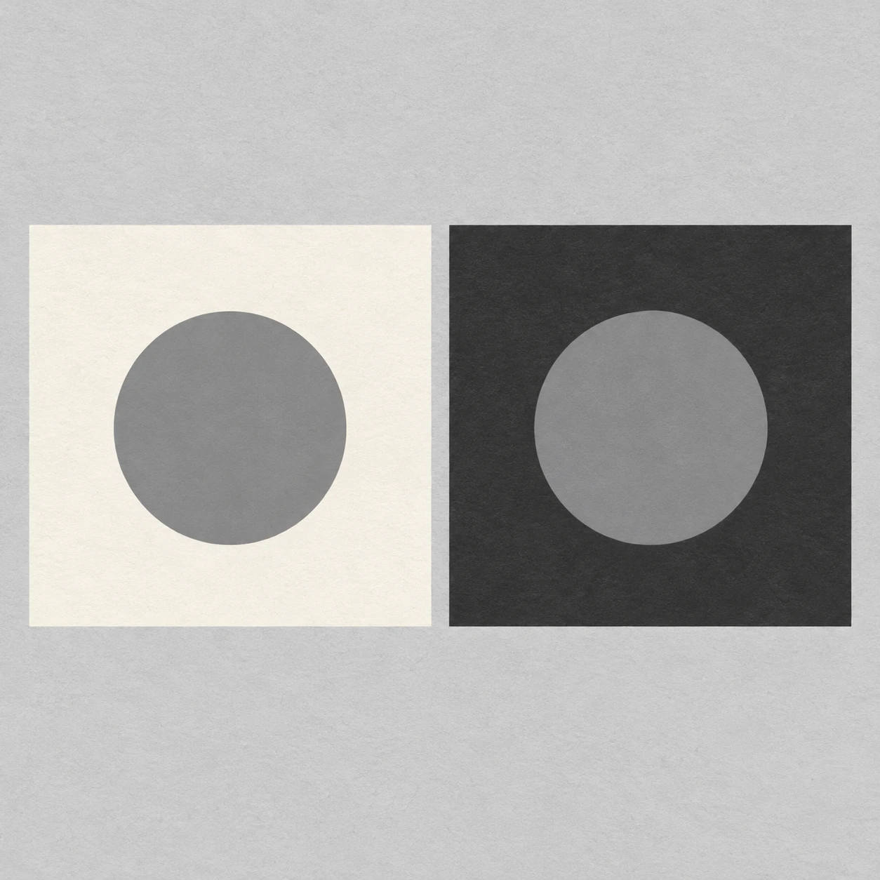
두 회색 종이 원 · 명도 동시 대비
같은 회색 종이 원을 밝고 어두운 바탕에 놓아 주변 명도가 지각되는 밝기를 바꾸는 효과를 보여준다.
두 회색 종이 원 · 명도 동시 대비
- 형태·선
- 두 원은 같은 크기의 깔끔한 원으로, 두 바탕은 곧은 변을 가진 같은 크기의 정사각형으로 그린다. 외곽선, 모서리 음영, 원근 왜곡 없이 또렷한 종이 오림 실루엣을 사용하여 형태 차이가 대비의 원인이 되지 않게 한다.
- 색·명암
- 두 원을 정확히 같은 균일한 중간 회색으로 채운다. 화면 왼쪽 원은 밝은 아이보리로, 오른쪽 원은 짙은 차콜로 둘러싸서 주변 명도만으로 왼쪽 원은 더 어둡고 오른쪽 원은 더 밝게 보이게 한다. 조명은 고르게 유지하고 그라데이션과 투영 그림자는 생략한다.
- 질감·재질
- 정사각형 바탕과 중립 배경에 희미하고 고른 섬유 질감을 넣어 무광 종이를 표현한다. 원은 광택이나 반투명 가장자리 없이 매끈하고 불투명하게 유지하여 동일한 회색 면을 명확히 비교할 수 있게 한다.
- 구도
- 각 원을 정사각형 중앙에 놓고 원의 지름을 바탕 너비의 약 절반으로 잡아 사방에 넓고 끊김 없는 주변 면을 남긴다. 두 정사각형에 같은 화면 면적을 배정하고 중립색 간격을 좁게 유지하여 나란히 놓인 밝기 차이를 즉시 비교할 수 있게 한다.
우선순위
원 자체의 명도는 동일하게 유지하고 주변 바탕 때문에 지각되는 밝기가 뚜렷하게 달라지도록 한다.
피할 표현과 결과 확인
효과를 만들기 위해 오른쪽 원을 밝게 하거나 왼쪽 원을 어둡게 하지 않는다.
두 원이 같은 회색으로 채워졌으면서 차콜 위의 원이 아이보리 위의 원보다 밝게 보이는지 확인한다.
이 예시의 실제 생성 프롬프트
SUBJECT
Exactly two identical medium-gray circular paper disks, each centered on its own square paper ground. The image-left ground is pale ivory; the image-right ground is deep charcoal. Both disks use the same gray fill.

COMPOSITION
A straight overhead view of two equally sized square grounds arranged side by side on a neutral light-gray background. Align their upper and lower edges and place the disks at the same height, with generous margins and a narrow neutral gap between the grounds.

STYLE GUIDE
1. Shape & line
Draw both disks as matching clean circles and both grounds as matching squares with straight edges. Use crisp cut-paper silhouettes without outlines, bevels, or perspective distortion so shape differences cannot explain the contrast.

2. Color & light
Fill both disks with exactly the same flat medium gray. Surround the image-left disk with pale ivory and the image-right disk with deep charcoal; the left disk should appear darker and the right disk lighter through their immediate surroundings alone. Keep illumination even and omit gradients and cast shadows.

3. Texture & material
Suggest matte paper with a faint, even fiber texture on the square grounds and neutral background. Keep the circular disks smooth and opaque, with no gloss or translucent edges, preserving an unambiguous comparison of their identical gray fills.

4. Composition
Center each disk within its square and make each disk roughly half the square's width, leaving a broad uninterrupted surround on every side. Give the two squares equal visual space and keep the neutral gap narrow enough for an immediate side-by-side brightness comparison.

PRIORITY
Preserve the requested identity, count, action, composition and output settings. Apply the style rules within those constraints; a style reference must not replace the subject or layout. Within the style: Prioritize identical disk values and a clearly different perceived brightness caused by the surrounding grounds.

AVOID
Avoid lightening the right disk or darkening the left disk to manufacture the effect.

OUTPUT
One square 1:1 illustration, with no text, labels, numbers, or watermark.

SELF-CHECK
Check that both disks share one gray fill while the disk on charcoal appears lighter than the disk on ivory.
모델명은 이미지 출처 정보 기준입니다. 같은 프롬프트를 사용해도 결과는 달라질 수 있습니다.