텍스트 → 이미지화풍스타일 가이드
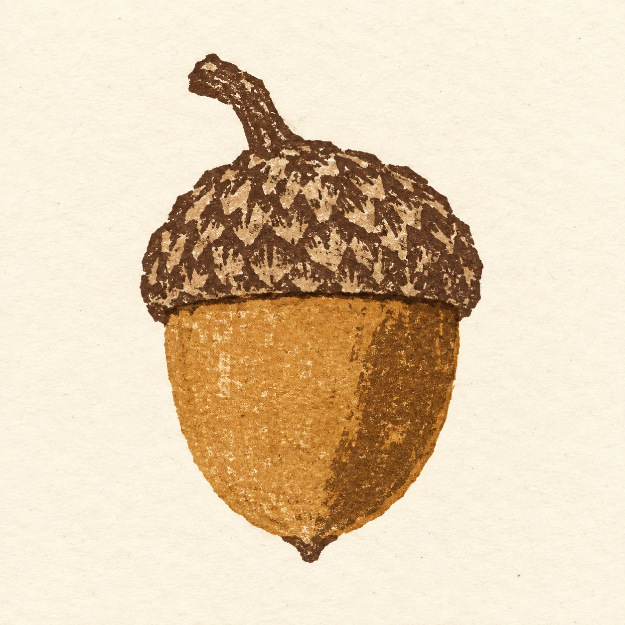
도토리 한 알 · 판지 콜라그래프
판지의 잘린 윤곽과 불균일한 잉크 전사로 도토리의 매끈한 몸통과 거친 깍정이를 구분하는 판화 스타일.
도토리 한 알 · 판지 콜라그래프
- 형태·선
- 몸통, 깍정이, 꼭지를 약간 각진 판지 절단 가장자리가 드러나는 몇 개의 넓은 형태로 구성한다. 깍정이의 아래 가장자리가 몸통 윗부분을 눈에 보이게 덮도록 하고 그 경계에 좁고 짙은 이음선을 찍으며, 몸통의 뾰족한 아래 끝과 짧은 꼭지를 명확히 살린다.
- 색·명암
- 인쇄하지 않은 아이보리 종이를 바탕으로 몸통에는 따뜻한 황토색, 깍정이와 꼭지에는 짙은 암갈색 잉크를 사용한다. 몸통의 화면 오른쪽에 넓고 더 짙은 황토색 면 하나를 두어 부피를 암시하고, 매끄러운 그라데이션으로 섞지 말고 불규칙한 인쇄 경계를 남긴다.
- 질감·재질
- 끊긴 잉크 피복, 희미한 판지 섬유 자국, 절단 가장자리에 간간이 고인 짙은 잉크로 판지 콜라그래프의 전사 흔적을 드러낸다. 깍정이에는 짧은 인쇄 면이 겹치는 거친 무늬를 넣고 몸통의 잉크 면은 비교적 연속적으로 유지하며, 모든 질감이 평평한 종이에 옮겨진 잉크로 보이게 한다.
- 구도
- 깍정이의 질감과 겹침 경계가 읽히도록 도토리를 정사각 화면 중앙의 대략 절반을 차지하는 크기로 배치한다. 전체 실루엣 둘레에 깨끗한 아이보리 여백을 확보하고 배경은 인쇄하지 않아 두 잉크 표면의 대비가 구도를 이끌게 한다.
우선순위
알아보기 쉬운 도토리 형태와 거친 깍정이 전사면, 더 매끈한 몸통 인쇄면의 대비를 우선한다.
피할 표현과 결과 확인
입체 판지 콜라주처럼 보이는 표현, 광택 렌더링, 균일한 디지털 낡음 효과를 피한다.
깍정이가 몸통을 명확하게 덮고 모든 거친 자국이 종이 위의 인쇄 흔적으로 읽히는지 확인한다.
이 예시의 실제 생성 프롬프트
SUBJECT
One acorn with a rounded, tapering nut seated inside a shallow textured cup; one short stem extends from the cup.

COMPOSITION
Show the entire acorn upright in a simple frontal view, with the cup above the exposed nut and the stem leaning toward image-left. Center it with generous paper margins.

STYLE GUIDE
1. Shape & line
Build the nut, cup, and stem from a few broad shapes with slightly angular cut-cardboard edges. Let the cup’s lower edge visibly overlap the upper nut, and print a narrow dark seam there; keep the nut’s pointed bottom and the short stem clearly readable.

2. Color & light
Use warm ochre ink for the nut and deep umber for the cup and stem against unprinted ivory paper. Suggest volume with one broad, darker ochre patch on the image-right side of the nut, allowing its irregular printed boundary to remain visible instead of blending it into a smooth gradient.

3. Texture & material
Make the cardboard collagraph process visible through broken ink coverage, faint board fibers, and occasional darker ink catches along cut edges. Give the cup a coarse pattern of short, overlapping printed patches while keeping the nut’s ink field comparatively continuous; all texture must read as ink transferred onto flat paper.

4. Composition
Keep the acorn large enough for the cup texture and overlap seam to be legible, occupying roughly the middle half of the square. Surround its entire silhouette with clear ivory space, and leave the background unprinted so the contrast between the two ink surfaces carries the composition.

PRIORITY
Preserve the requested identity, count, action, composition and output settings. Apply the style rules within those constraints; a style reference must not replace the subject or layout. Within the style: Prioritize recognizable acorn shapes and the contrast between coarse cup impressions and the smoother printed nut.

AVOID
Avoid a raised cardboard collage appearance, glossy rendering, and uniform digital distress.

OUTPUT
Create one square image of a finished cardboard collagraph print on warm ivory paper, with no lettering, captions, borders, or watermark.

SELF-CHECK
Check that the cup overlaps the nut clearly and that every rough mark reads as a printed impression on paper.
모델명은 이미지 출처 정보 기준입니다. 같은 프롬프트를 사용해도 결과는 달라질 수 있습니다.