텍스트 → 이미지카페 · 브랜드스타일 가이드
씨앗 나눔소 · 두 색 중첩 인쇄
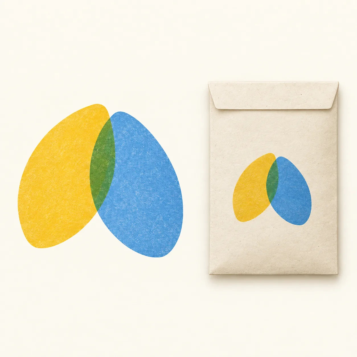
두 씨앗 형태의 겹침에서 생기는 세 번째 색을 작은 봉투까지 이어 쓰는 씨앗 나눔소 브랜드 레퍼런스.
씨앗 나눔소 · 두 색 중첩 인쇄
- 형태·선
- 내부 선 없이 매끈한 윤곽과 완만하게 좁아지는 끝을 가진 두 개의 꽉 찬 타원형 씨앗을 그린다. 화면 왼쪽 씨앗은 오른쪽 위로, 오른쪽 씨앗은 왼쪽 위로 기울이고, 안쪽 가장자리를 겹쳐 넓은 렌즈 모양의 중심을 만들되 바깥쪽 두 끝은 구별되게 남긴다.
- 색·명암
- 화면 왼쪽 씨앗은 반투명한 황금빛 노랑으로, 오른쪽 씨앗은 반투명한 파랑으로 인쇄한다. 겹친 영역은 중첩 인쇄로 뚜렷한 초록이 되게 하고 바깥에서는 원래 두 색을 선명하게 유지한다. 봉투에는 부드럽고 고른 빛을 적용해 조명이 세 번째 잉크색처럼 보이지 않게 한다.
- 질감·재질
- 봉투는 무광의 비코팅 아이보리 종이로 표현하고 인쇄된 형태에는 옅고 불규칙한 잉크 입자를 더한다. 입자가 꽉 찬 실루엣보다 두드러지지 않게 하고, 큰 심벌과 봉투 심벌 모두에서 잉크 아래 종이가 은은하게 비치는 표현을 유지한다.
- 구도
- 큰 심벌과 봉투의 중심을 같은 수평선에 맞춘다. 작은 심벌은 봉투 앞면 중앙에 배치하고 씨앗의 각도와 겹침 비율을 큰 버전과 일치시킨다. 넓은 아이보리 여백을 남겨 두 색의 구성이 시각적 중심이 되게 한다.
우선순위
초록색 겹침과 두 크기에서 일관된 심벌이 즉시 읽히게 한다.
피할 표현과 결과 확인
불투명한 형태의 겹침, 그라데이션 음영, 장식 글자를 피한다.
두 심벌 모두 두 씨앗 실루엣과 하나의 초록색 겹침 영역을 보여주는지 확인한다.
이 예시의 실제 생성 프롬프트
SUBJECT
Create an original identity reference for a community seed exchange: one emblem made from exactly two overlapping seed silhouettes, and one plain paper seed packet carrying the same emblem. The overlap represents seeds shared between neighbors.

COMPOSITION
Use a square, front-facing presentation on warm ivory. Place the large emblem in the image-left half and the smaller upright packet in the image-right half, with generous space between them. Show the packet face clearly so the repeated emblem is easy to compare.

STYLE GUIDE
1. Shape & line
Draw two solid, gently tapered oval seeds with smooth outlines and no internal lines. Tilt the image-left seed toward the upper right and the image-right seed toward the upper left, overlapping their inner edges to form one broad lens-shaped center while preserving two distinct outer tips.

2. Color & light
Print the image-left seed in translucent golden yellow and the image-right seed in translucent blue. Let their shared area become visibly green through overprinting, with both original colors remaining clear outside the overlap; use soft, even light on the packet so lighting does not imitate the third ink color.

3. Texture & material
Give the packet matte, uncoated ivory paper and the printed shapes a faint, irregular ink grain. Keep the grain subordinate to the solid silhouettes, and preserve the same paper-through-ink appearance in the large emblem and the packet emblem.

4. Composition
Align the large emblem and the packet around a shared horizontal center. Center the smaller emblem on the packet face, keep its seed angles and overlap proportion consistent with the large version, and leave broad ivory margins so the two-color construction remains the visual focus.

PRIORITY
Preserve the requested identity, count, action, composition and output settings. Apply the style rules within those constraints; a style reference must not replace the subject or layout. Within the style: Make the green overlap and the consistent emblem across both scales immediately readable.

AVOID
Avoid opaque layered shapes, gradient shading and decorative lettering.

OUTPUT
One square image, 1:1 aspect ratio, presented as a finished brand reference. Include no lettering, numbers, captions, watermarks or placeholder text.

SELF-CHECK
Confirm that both emblems show two seed silhouettes and one green shared area.
모델명은 이미지 출처 정보 기준입니다. 같은 프롬프트를 사용해도 결과는 달라질 수 있습니다.