텍스트 → 이미지카페 · 브랜드스타일 가이드
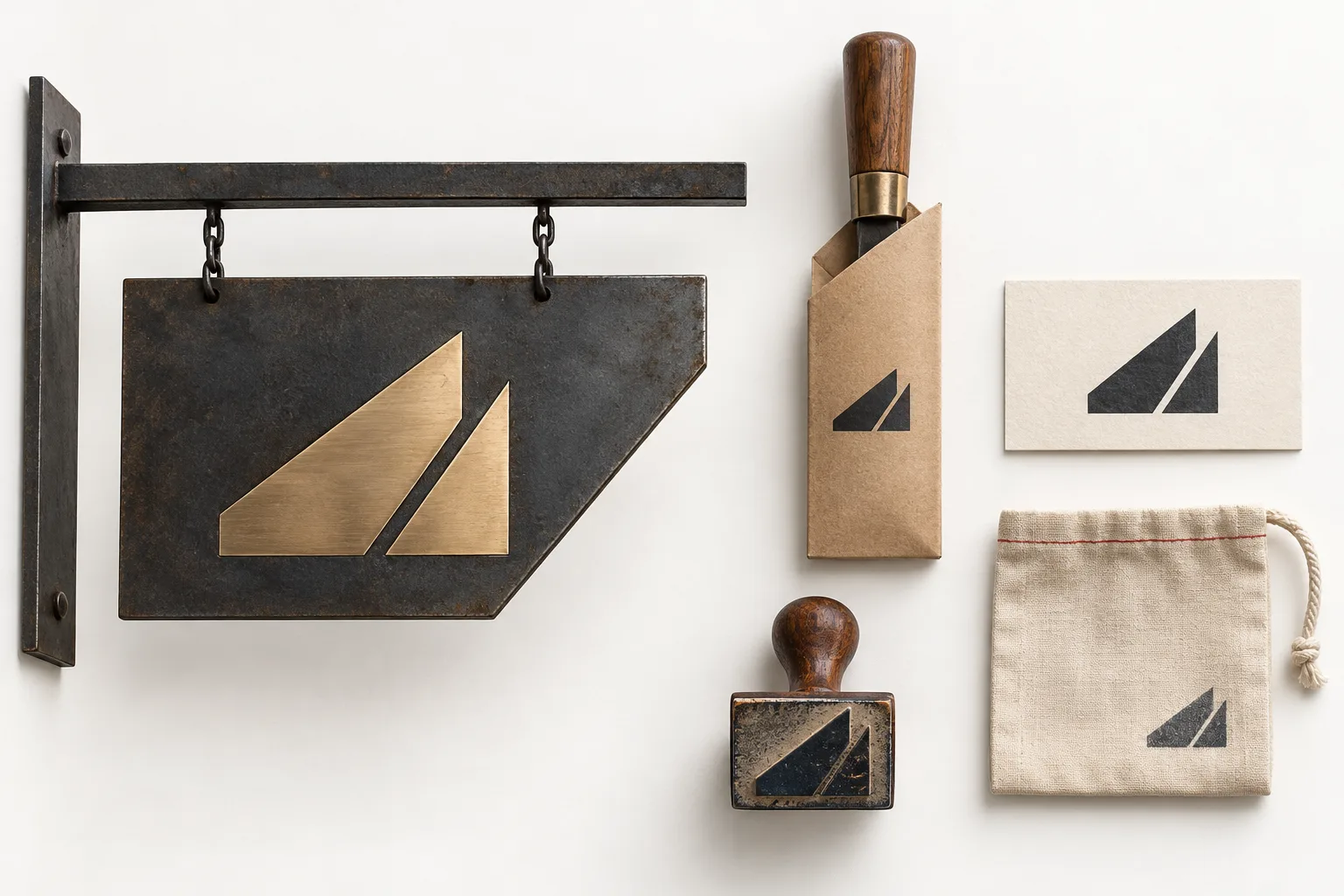
동네 도구 연마소 · 날각 형태 시스템
연마된 날의 사선 각도를 표식과 응용물 전반에 반복하는 시각 체계를 만든다.
동네 도구 연마소 · 날각 형태 시스템
- 1
- Construct the core symbol from two solid forms meeting at one fixed bevel angle.
- 2
- Preserve a narrow unprinted seam wherever the symbol appears.
- 3
- Repeat the bevel angle in the crop or edge of each application.
- 4
- Keep the icon recognizable across stamp, sleeve, card, and sign scales.
우선순위
소재를 바꿔도 네 가지 표현 규칙을 유지합니다.
피할 표현과 결과 확인
불필요한 글자·로고·워터마크를 제외합니다.
축소해도 형태와 구도가 명확한지 확인합니다.
스타일 가이드 프롬프트
SUBJECT AND SCENE
Design an original visual identity presentation for a neighborhood tool sharpening service. Derive a simple abstract symbol from two solid shapes meeting at one consistent acute bevel angle, with a narrow unprinted seam that suggests a sharpened edge. Apply that same angle to a storefront blade sign, a tool sleeve, a service card, and a small stamp on a return pouch. Vary scale and placement while keeping the angle and seam construction consistent; use sturdy paper, stamped ink, and a restrained metal finish to suit a practical local workshop. Arrange the applications as a coherent flat-lay with one larger sign mockup, leaving generous whitespace. Use an icon-only identity with no legible lettering, unrelated logos, or watermarks.


STYLE GUIDE
1. 1
Construct the core symbol from two solid forms meeting at one fixed bevel angle.

2. 2
Preserve a narrow unprinted seam wherever the symbol appears.

3. 3
Repeat the bevel angle in the crop or edge of each application.

4. 4
Keep the icon recognizable across stamp, sleeve, card, and sign scales.

REFERENCE ROLES
When combining references, assign each supplied image a role: identity, style, composition or palette. Transfer only the assigned traits. A style-only reference must not contribute its subject, props or layout. Use the written instructions when no reference image is attached.

PRIORITY
Preserve the subject identity, count, action and explicit camera, palette, lighting and output requirements in SUBJECT AND SCENE, COMPOSITION, STYLE SETTINGS and OUTPUT. Apply the STYLE GUIDE within those constraints. Preserve the four style rules when changing subject or composition.

AVOID
Avoid unwanted lettering, logos and watermarks.


SELF-CHECK
Check silhouette and composition at thumbnail size.
실제 사용한 프롬프트 · 원문
Design an original visual identity presentation for a neighborhood tool sharpening service. Derive a simple abstract symbol from two solid shapes meeting at one consistent acute bevel angle, with a narrow unprinted seam that suggests a sharpened edge. Apply that same angle to a storefront blade sign, a tool sleeve, a service card, and a small stamp on a return pouch. Vary scale and placement while keeping the angle and seam construction consistent; use sturdy paper, stamped ink, and a restrained metal finish to suit a practical local workshop. Arrange the applications as a coherent flat-lay with one larger sign mockup, leaving generous whitespace. Use an icon-only identity with no legible lettering, unrelated logos, or watermarks.
모델명은 이미지 출처 정보 기준입니다. 같은 프롬프트를 사용해도 결과는 달라질 수 있습니다.