텍스트 → 이미지공간 · 건축스타일 가이드
작은 방 모서리 · 두 소실점 원근법
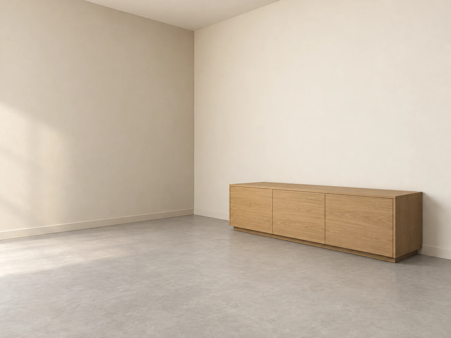
서로 다른 방향으로 수렴하는 두 벽과 낮은 수납장으로 방 모서리의 깊이를 표현합니다.
작은 방 모서리 · 두 소실점 원근법
- 형태·선
- 방 모서리와 수납장의 세로 모서리는 수직으로 유지합니다. 화면 왼쪽 벽에 속한 수평 모서리는 화면 오른쪽 밖의 점으로, 오른쪽 벽에 속한 수평 모서리는 화면 왼쪽 밖의 점으로 수렴시킵니다. 두 점은 같은 눈높이 수평선에 두고 수납장도 해당 벽의 방향에 맞춥니다.
- 색·명암
- 따뜻한 아이보리 벽, 연회색 바닥, 차분한 꿀빛 목재를 사용합니다. 화면 왼쪽에서 부드러운 빛이 들어와 오른쪽 벽이 왼쪽 벽보다 밝게 보이도록 하고, 수납장의 화면 오른쪽 끝면과 바로 아래의 부드러운 접지 그림자를 어둡게 표현합니다.
- 질감·재질
- 회벽과 바닥은 입자가 은은한 넓은 무광 면으로 표현합니다. 수납장의 긴 면에는 원근 방향을 따르는 차분한 나뭇결 선을 소량 넣어 재질이 직육면체 형태를 뒷받침하게 합니다.
- 구도
- 수납장 위로 두 벽이 만나는 모서리를 온전히 드러내고 앞쪽 바닥을 끊김 없이 확보합니다. 얇고 절제된 모서리 선과 넓은 명암 면을 사용해 보조선 없이도 두 수렴 방향이 읽히게 합니다.
우선순위
방과 수납장의 일관된 원근 수렴을 우선합니다.
피할 표현과 결과 확인
기울어진 수직선과 서로 충돌하는 소실 방향을 피합니다.
두 모서리 계열이 같은 눈높이 수평선 위로 수렴하는지 확인합니다.
이 예시의 실제 생성 프롬프트
SUBJECT
One small rectangular room viewed toward an interior corner, with one low rectangular wooden cabinet resting on the floor against the image-right wall. Show both adjoining walls, their shared vertical corner, and the continuous floor.

COMPOSITION
Use a landscape interior view at standing eye level. Place the back corner slightly left of center and the cabinet in the lower-right half. Let both walls extend beyond the side edges, with enough open foreground floor to reveal their different depth directions.

STYLE GUIDE
1. Shape & line
Keep the room corner and cabinet uprights vertical. Make horizontal edges belonging to the image-left wall converge toward a point beyond the image-right edge, and those belonging to the image-right wall converge toward a point beyond the image-left edge; place both points on the same eye-level horizon and align the cabinet with its wall.

2. Color & light
Use warm ivory walls, a pale gray floor, and muted honey-colored wood. Let soft light enter from image-left, making the image-right wall lighter than the image-left wall; shade the cabinet's image-right end and place a soft grounding shadow beneath it.

3. Texture & material
Render plaster and flooring as broad matte surfaces with restrained grain. Add a few subdued wood-grain strokes along the cabinet's long faces, following their perspective direction so the material reinforces the box form.

4. Composition
Keep the shared wall corner fully visible above the cabinet and preserve an uninterrupted stretch of foreground floor. Use thin, quiet construction edges and broad tonal planes so the two convergence directions remain readable without drawn guides.

PRIORITY
Preserve the requested identity, count, action, composition and output settings. Apply the style rules within those constraints; a style reference must not replace the subject or layout. Within the style: Prioritize consistent convergence between the room and cabinet.

AVOID
Avoid tilted verticals and conflicting vanishing directions.

OUTPUT
Create one architectural illustration in a 4:3 aspect ratio, without text, labels, dimension marks, or a watermark.

SELF-CHECK
Check that both edge families converge on one shared eye-level horizon.
모델명은 이미지 출처 정보 기준입니다. 같은 프롬프트를 사용해도 결과는 달라질 수 있습니다.