텍스트 → 이미지화풍스타일 가이드
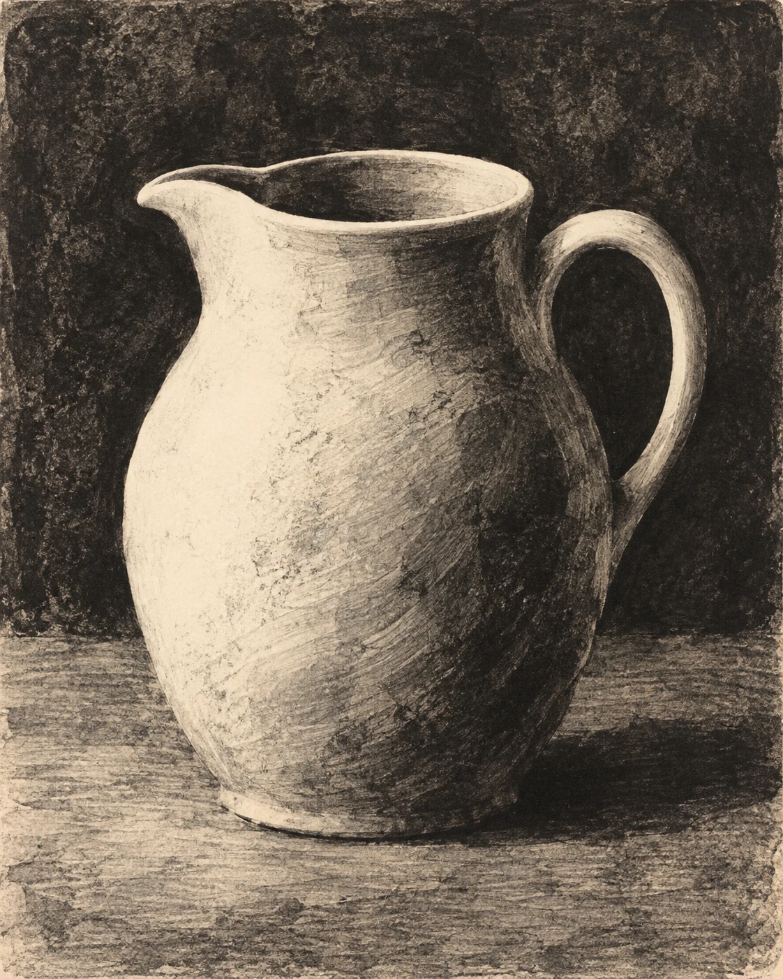
흰 물주전자 하나 · 닦아낸 모노타이프
검은 잉크막을 넓게 닦아 밝은 형태를 드러내고, 부드러운 닦임 자국으로 흰 물주전자의 볼륨을 표현한다.
흰 물주전자 하나 · 닦아낸 모노타이프
- 형태·선
- 어두운 잉크면을 넓게 닦아 주전자의 형태를 만든다. 둥근 몸체는 이어지는 밝은 실루엣으로 드러내고, 입구 안에는 어두운 초승달 형태를 남기며, 손잡이 주변을 닦되 구멍은 어둡게 유지한다. 그린 윤곽선 대신 잉크면의 경계로 형태를 구분한다.
- 색·명암
- 검은 잉크와 드러난 종이의 따뜻한 상아색을 사용한다. 화면 왼쪽 위에서 빛이 오는 모습이 되도록 왼쪽 어깨와 배를 거의 깨끗하게 닦고, 중앙에는 회색 잉크막을, 오른쪽 옆면에는 짙은 잉크를 남긴다. 바닥에서 화면 오른쪽으로 낮고 어두운 그림자를 이어 놓는다.
- 질감·재질
- 표면이 한 번 전사한 잉크처럼 보이게 한다. 몸체의 회색 부분에는 넓고 휘어진 천 자국을, 잉크를 일부 걷어낸 경계에는 부드럽게 풀리는 전이를 남기고, 드문 끊긴 잉크 자국 사이로 종이 결을 드러낸다. 가장 밝게 닦은 부분은 차분하게 유지해 도자기의 매끈함을 살린다.
- 구도
- 주전자가 화면 높이의 가운데 약 3분의 2를 차지하게 한다. 아래에는 차분한 수평 탁자면을 닦아 만들고, 주변 배경은 몸체보다 어둡게 유지한다. 주둥이 주변과 손잡이 안에는 분명한 어두운 틈을 남겨 밝은 형태가 잘 읽히게 한다.
우선순위
넓게 닦아낸 밝은 면과 남은 잉크 농담으로 주전자의 볼륨을 만드는 데 집중한다.
피할 표현과 결과 확인
에칭식 교차 해칭, 매끈한 디지털 그라데이션, 두꺼운 물감 요철은 피한다.
왼쪽의 밝은 몸체, 오른쪽의 어두운 옆면, 열린 손잡이가 닦아낸 잉크만으로 분명하게 읽히는지 확인한다.
이 예시의 실제 생성 프롬프트
SUBJECT
One plain white ceramic water pitcher with a rounded body, a short pouring lip pointing toward image-left, and one loop handle on image-right; the background remains visible through the handle opening.

COMPOSITION
Show the entire pitcher in a slightly elevated three-quarter view, centered on a simple tabletop with generous surrounding space. Keep the pouring lip, open mouth, and handle opening clearly readable.

STYLE GUIDE
1. Shape & line
Build the pitcher from broad areas wiped out of a dark ink field. Let the rounded body emerge through a continuous pale silhouette, retain a dark crescent inside the mouth, and wipe around the handle while leaving its opening dark; use ink boundaries instead of drawn outlines.

2. Color & light
Use black ink and the warm ivory of the exposed paper. Establish light from image-upper-left by wiping the image-left shoulder and belly almost clean, leaving a gray veil across the middle and dense ink on the image-right flank; extend a low dark cast shadow toward image-right from the base.

3. Texture & material
Make the surface read as a single ink transfer: leave broad curved cloth streaks in the gray body tones, soft feathered transitions where ink was partially removed, and occasional broken ink deposits revealing paper grain. Keep the brightest wiped areas quiet so the ceramic still feels smooth.

4. Composition
Let the pitcher occupy roughly the middle two-thirds of the image height. Wipe a subdued horizontal tabletop area beneath it, keep the surrounding background darker than the body, and preserve clear dark gaps around the pouring lip and inside the handle so the pale form remains readable.

PRIORITY
Preserve the requested identity, count, action, composition and output settings. Apply the style rules within those constraints; a style reference must not replace the subject or layout. Within the style: Prioritize broad wiped highlights and residual ink tones that visibly build the pitcher’s volume.

AVOID
Avoid etched crosshatching, glossy digital gradients, and thick painted relief.

OUTPUT
One image in a 4:5 portrait aspect ratio, presented as a finished monotype print on warm ivory paper, with no text, signature, labels, or border.

SELF-CHECK
Check that the bright image-left body, dark image-right flank, and open handle read clearly through wiped ink alone.
모델명은 이미지 출처 정보 기준입니다. 같은 프롬프트를 사용해도 결과는 달라질 수 있습니다.