텍스트 → 이미지화풍스타일 가이드
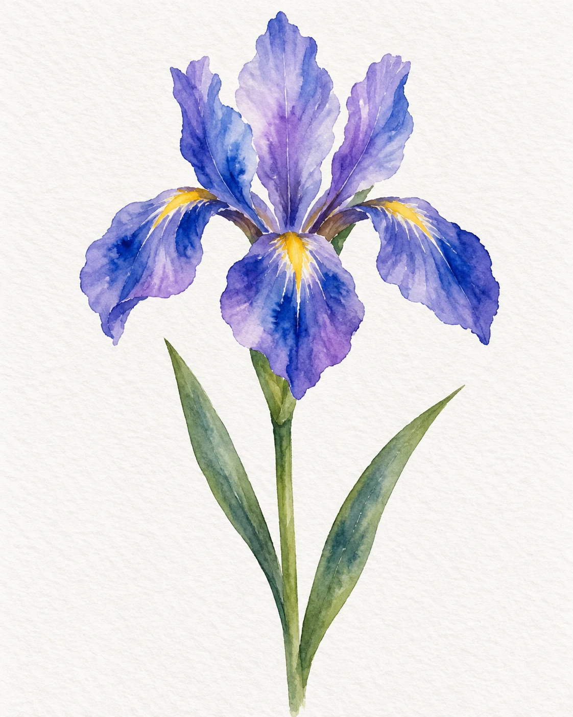
붓꽃 한 송이 · 수채화 웨트온웨트 번짐
젖은 종이 위에서 보라색과 파란색이 부드럽게 번지며, 붓꽃의 꽃잎 안쪽과 마른 가장자리의 차이를 보여주는 수채화 습작.
붓꽃 한 송이 · 수채화 웨트온웨트 번짐
- 형태·선
- 꽃잎을 잉크 윤곽선으로 둘러싸지 말고 넓고 불규칙한 채색 면으로 만든다. 화면 오른쪽으로 처진 꽃잎의 바깥 가장자리는 물감이 마른 종이와 만나는 선명한 경계로 남기고, 일부 내부 경계는 보라색과 파란색이 서로 부드럽게 번지도록 풀어준다.
- 색·명암
- 촉촉한 꽃잎 안쪽에 연보라색을 깔고, 아직 젖어 있을 때 아래쪽 접힘에 짙은 파란색을 찍어 넣는다. 파란색이 부드럽게 가지 치듯 퍼지게 하고, 위쪽 접힘에는 종이의 흰색이 가늘게 남도록 하며 노란색 포인트는 작고 또렷하게 유지한다.
- 질감·재질
- 투명한 안료 사이로 은은한 수채화 종이 결이 보이게 한다. 젖은 부분에는 퍼지는 안료와 불균일한 색 농도, 꽃잎 안쪽에 부드럽게 고인 자국을 조금 남긴다. 주변 종이는 깨끗하게 두어 채색과 종이 표면에서 질감이 드러나게 한다.
- 구도
- 가장 풍부한 젖은 색 혼합은 화면 위쪽 중앙의 꽃에 집중하고, 줄기와 잎은 단순하고 차분한 채색으로 처리한다. 처진 꽃잎 사이에는 좁은 흰 여백을 남기고 아래쪽은 넉넉하게 비워, 부드럽게 번진 꽃이 분명한 중심이 되게 한다.
우선순위
붓꽃의 형태가 명확히 읽히면서 내부의 젖은 안료 번짐이 잘 드러나도록 한다.
피할 표현과 결과 확인
모든 윤곽이 흐려지는 처리, 불투명한 물감 덩어리, 디지털 그라데이션처럼 매끈한 혼합을 피한다.
파란색이 보라색으로 번지는 모습과 선명한 꽃잎 바깥 경계가 부드러운 내부 채색과 대비되는지 확인한다.
이 예시의 실제 생성 프롬프트
SUBJECT
Paint one open blue-violet iris flower on a single green stem, with two slender leaves attached below the bloom. Show three upright petals and three drooping petals, with a small yellow accent at each drooping petal's base.

COMPOSITION
Use a portrait framing with the entire flower, stem, and both leaves visible. Place the bloom above the center, let one drooping petal extend toward image-left and another toward image-right, and leave generous unpainted paper around the silhouette.

STYLE GUIDE
1. Shape & line
Build the petals from broad, irregular wash shapes without enclosing ink outlines. Keep the outer edge of the image-right drooping petal crisp where paint meets dry paper, while softening selected interior boundaries so adjoining violet and blue washes feather into each other.

2. Color & light
Lay pale violet washes into damp petal interiors, then touch deeper blue into their lower folds while those washes remain wet. Let blue spread outward with soft, branching margins; preserve paper-white slivers along upper folds and keep the yellow accents small and distinct.

3. Texture & material
Show lightly textured watercolor paper through transparent pigment. Make wet passages visibly diffuse, with uneven pigment concentrations and a few soft pooling marks inside the petals; keep the surrounding paper clean so the texture comes from the painted washes and paper surface.

4. Composition
Concentrate the richest wet blending within the upper-central bloom and use simpler, quieter washes for the stem and leaves. Separate the drooping petals with narrow white gaps, and leave the lower half spacious so the feathered flower remains the clear focal point.

PRIORITY
Preserve the requested identity, count, action, composition and output settings. Apply the style rules within those constraints; a style reference must not replace the subject or layout. Within the style: Prioritize visible wet pigment feathering inside a clearly readable iris silhouette.

AVOID
Avoid uniformly blurred contours, opaque paint buildup, and digital gradient smoothing.

OUTPUT
Create one image in a 4:5 portrait aspect ratio, without lettering, captions, signatures, or watermarks.

SELF-CHECK
Check that the blue visibly feathers into violet and that a crisp outer petal edge contrasts with the soft interior washes.
모델명은 이미지 출처 정보 기준입니다. 같은 프롬프트를 사용해도 결과는 달라질 수 있습니다.