텍스트 → 이미지화풍스타일 가이드
오렌지 한 개 · 종이 모자이크
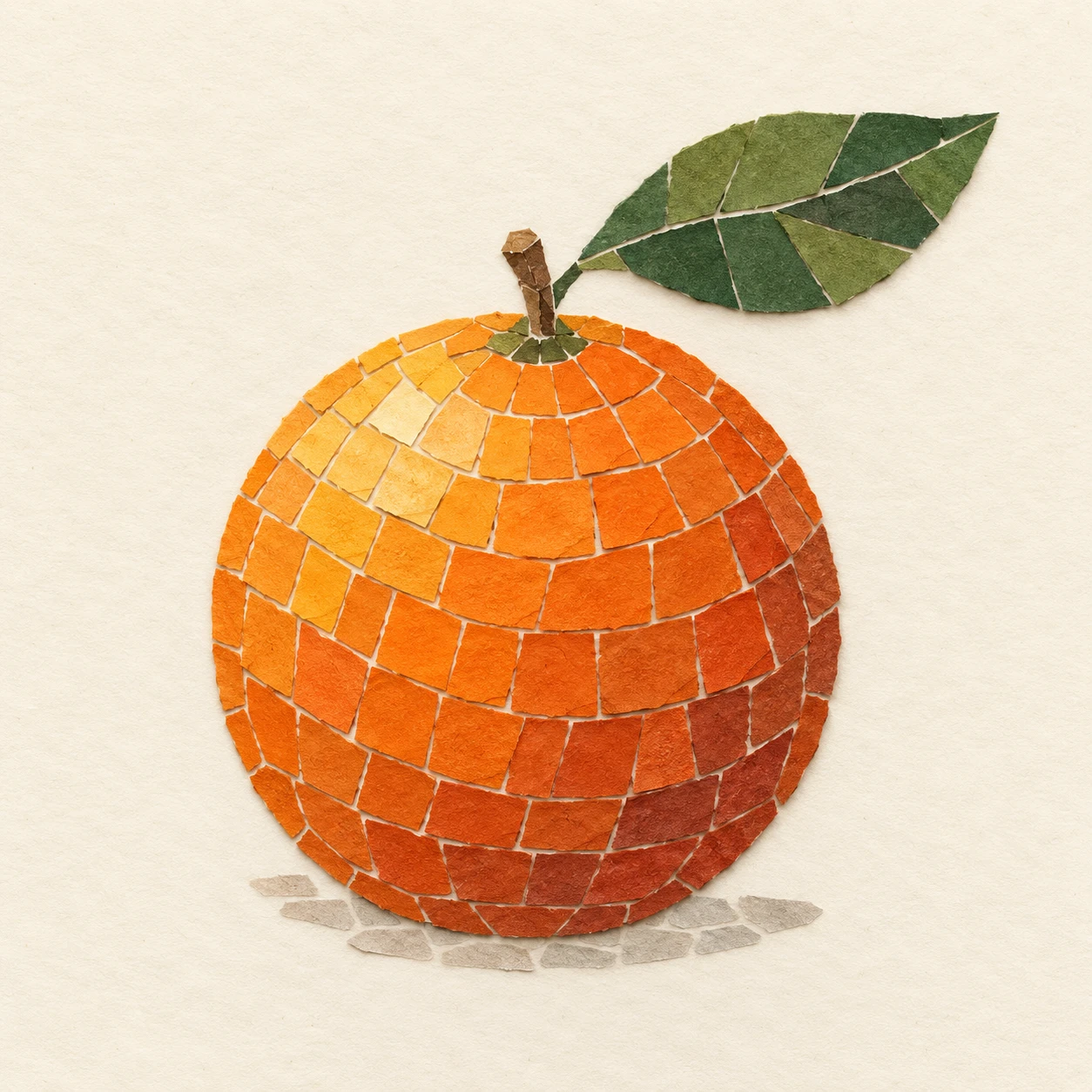
불투명한 색종이 조각의 방향과 색 변화로 오렌지의 둥근 부피를 표현하는 모자이크 스터디.
오렌지 한 개 · 종이 모자이크
- 형태·선
- 작고 불규칙한 사각형 색종이 조각을 완만하게 휘는 줄로 배열해 오렌지의 둥근 윤곽을 감싸게 한다. 가장자리에는 더 좁은 조각을, 잎의 중심선을 따라서는 길쭉한 조각을 사용하고 인접한 조각 사이에 가느다란 크림색 틈을 남긴다.
- 색·명암
- 열매의 화면 왼쪽 위에는 연한 황주황색 조각을, 중앙에는 선명한 주황색 조각을, 오른쪽 아래에는 차분한 적갈색 조각을 배치해 화면 왼쪽 위에서 오는 빛을 암시한다. 분리된 색 단계로 부피를 만들고 잎에는 올리브색과 짙은 녹색 조각을 사용한다.
- 질감·재질
- 모든 조각에 은은한 섬유 결과 손으로 자른 가장자리가 보이는 무광의 불투명한 종이 표면을 부여한다. 일부 살짝 들린 모서리는 바로 옆 크림색 바탕에 짧은 그림자를 드리우게 하되, 모자이크 전체는 평평하게 유지하고 종이 색을 서로 번지게 하지 않는다.
- 구도
- 크림색 배경을 이어진 한 장의 종이로 유지해 오렌지의 조각 배열에 시선이 모이게 한다. 잎 끝과 화면 오른쪽 위 가장자리 사이에 분명한 여백을 두고, 열매 바로 아래에는 차분한 회베이지색 조각을 성긴 호 형태로 놓아 바닥에 놓인 그림자를 암시한다.
우선순위
분리된 종이 조각과 눈에 보이는 틈으로 읽히는 둥근 부피를 우선한다.
피할 표현과 결과 확인
물감으로 그린 그라데이션, 반투명한 겹침, 광택 있는 도자기 타일 표면을 피한다.
오렌지 한 개가 명확하게 읽히고 휘어진 조각 줄, 단계적인 색 변화, 종이 가장자리가 보이는지 확인한다.
이 예시의 실제 생성 프롬프트
SUBJECT
Show exactly one whole orange with one short stem and one green leaf attached to it. The leaf extends toward the upper-right of the image. Construct the fruit, stem, and leaf from opaque cut-paper pieces mounted on a single cream paper ground.

COMPOSITION
Use a straight-on view with the entire orange and attached leaf visible. Place the fruit slightly below center, occupying roughly half the image width, with generous cream margins. Keep the silhouette simple and immediately recognizable.

STYLE GUIDE
1. Shape & line
Build the orange from small irregular quadrilateral paper pieces arranged in gently curving rows that wrap around its round silhouette. Use narrower pieces along the perimeter and elongated pieces along the leaf’s centerline, leaving thin cream seams between neighboring pieces.

2. Color & light
Suggest illumination from the image’s upper-left by placing pale yellow-orange pieces on the fruit’s upper-left area, saturated orange pieces across its middle, and muted rust pieces on its lower-right. Make these discrete color steps establish volume; use olive and deep green pieces for the leaf.

3. Texture & material
Give every piece a matte, opaque paper surface with subtle fiber grain and visibly hand-cut edges. Let occasional slightly lifted corners cast short shadows onto the cream ground immediately beside them, while keeping the overall mosaic flat and the paper colors unblended.

4. Composition
Keep the cream background as one uninterrupted sheet so the orange’s tile pattern remains the focal point. Preserve a clear gap between the leaf tip and the upper-right frame edge, and use a sparse arc of muted gray-beige paper pieces directly beneath the fruit to suggest a resting shadow.

PRIORITY
Preserve the requested identity, count, action, composition and output settings. Apply the style rules within those constraints; a style reference must not replace the subject or layout. Within the style: Prioritize recognizable round volume built from distinct paper pieces and visible seams.

AVOID
Avoid painted gradients, translucent overlaps, and glossy ceramic tile surfaces.

OUTPUT
Create one square image showing a finished handmade paper mosaic, with no text, lettering, border, or watermark.

SELF-CHECK
Check that one orange reads clearly and that the curving rows, stepped colors, and paper edges remain visible.
모델명은 이미지 출처 정보 기준입니다. 같은 프롬프트를 사용해도 결과는 달라질 수 있습니다.