텍스트 → 이미지화풍스타일 가이드
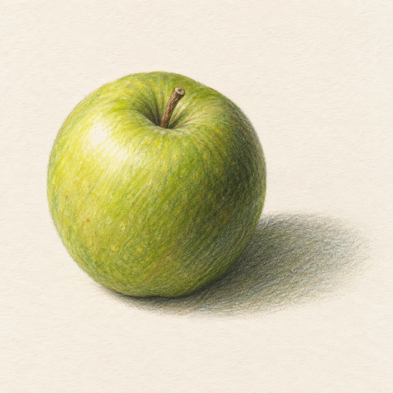
초록 사과 한 개 · 색연필 버니싱
색연필의 성긴 밑칠을 눌러 겹쳐 매끈하게 만드는 버니싱으로 사과의 둥근 양감과 종이 결의 차이를 보여준다.
초록 사과 한 개 · 색연필 버니싱
- 형태·선
- 살짝 불규칙한 둥근 실루엣과 얕게 들어간 윗부분으로 사과를 구성한다. 짧은 색연필 획을 양감에 따라 휘게 긋고, 굵은 외곽선 대신 윤곽을 인접한 색면에 자연스럽게 합친다.
- 색·명암
- 광원을 화면 왼쪽 위에 둔다. 왼쪽 위의 볼록한 면에는 황록색을 겹치고 오른쪽 아래 곡면에는 올리브색을 깊게 쌓으며 작은 밝은 하이라이트를 남긴다. 부드러운 회녹색 접촉 그림자는 사과 바로 아래에서 시작해 화면 오른쪽으로 퍼지게 한다.
- 질감·재질
- 가볍고 종이 결이 드러나는 색연필 밑칠로 시작한 뒤, 밝은 면과 중간 명도 면에 연한 황록색 연필을 눌러 겹쳐 종이 결을 메우고 획을 매끈한 왁스성 표면으로 합친다. 가장 어두운 곡면과 느슨한 그림자에는 성긴 결을 일부 남겨 버니싱한 표면과 차이가 보이게 한다.
- 구도
- 성긴 획에서 매끈한 색면으로 바뀌는 차이가 읽히도록 사과를 충분히 크게 배치한다. 조금 높은 시점에서 꼭지의 움푹한 자리를 보여주고, 오른쪽으로 뻗는 그림자를 화면 안에 담으며 주변 아이보리 종이는 대부분 칠하지 않은 채 남긴다.
우선순위
버니싱한 색면과 드러난 색연필 결의 대비를 가장 뚜렷한 스타일 특징으로 만든다.
피할 표현과 결과 확인
색연필 작업의 흔적을 가리는 균일한 디지털 그라데이션이나 광택성 사진 반사를 피한다.
사과 한 개가 명확히 읽히고, 눌러 겹친 매끈한 색면이 성긴 색연필 획으로 눈에 보이게 이어지는지 확인한다.
이 예시의 실제 생성 프롬프트
SUBJECT
One green apple with a short brown stem seated in its top indentation, resting on ivory paper; its cast shadow extends toward image-right.

COMPOSITION
A square still life viewed slightly from above, with the entire apple and its short cast shadow visible. Place the apple just left of center and leave generous ivory margins.

STYLE GUIDE
1. Shape & line
Build the apple from a slightly uneven rounded silhouette with a shallow top dip; curve short pencil strokes around its volume, and merge the contour into the adjacent color instead of drawing a heavy enclosing outline.

2. Color & light
Place the light at image-upper-left: layer yellow-green on the upper-left bulge, deepen the lower-right curve with olive green, and preserve a small pale highlight. Let the soft gray-green contact shadow begin beneath the apple and spread toward image-right.

3. Texture & material
Start with light, grainy colored-pencil layers, then press a pale yellow-green pencil over the bright and middle-value areas to fill the paper tooth and fuse the strokes into a smooth waxy finish. Keep some broken grain in the darkest curve and loose shadow so the burnished surface has a visible comparison.

4. Composition
Keep the apple large enough for the transition from grainy marks to polished color to read clearly. Show the stem indentation from the slightly elevated viewpoint, contain the rightward shadow within the frame, and leave the surrounding ivory paper mostly untouched.

PRIORITY
Preserve the requested identity, count, action, composition and output settings. Apply the style rules within those constraints; a style reference must not replace the subject or layout. Within the style: Make the contrast between burnished color and visible pencil grain the clearest stylistic feature.

AVOID
Avoid uniformly smooth digital gradients or glossy photographic reflections that conceal the pencil process.

OUTPUT
One image, 1:1 aspect ratio, with no lettering, labels, signature, or watermark.

SELF-CHECK
Check that one apple reads clearly and that smooth compressed color visibly transitions into grainy pencil marks.
모델명은 이미지 출처 정보 기준입니다. 같은 프롬프트를 사용해도 결과는 달라질 수 있습니다.