텍스트 → 이미지카페 · 브랜드스타일 가이드
동네 무화과 가게 · 가장자리에서 이어지는 패턴
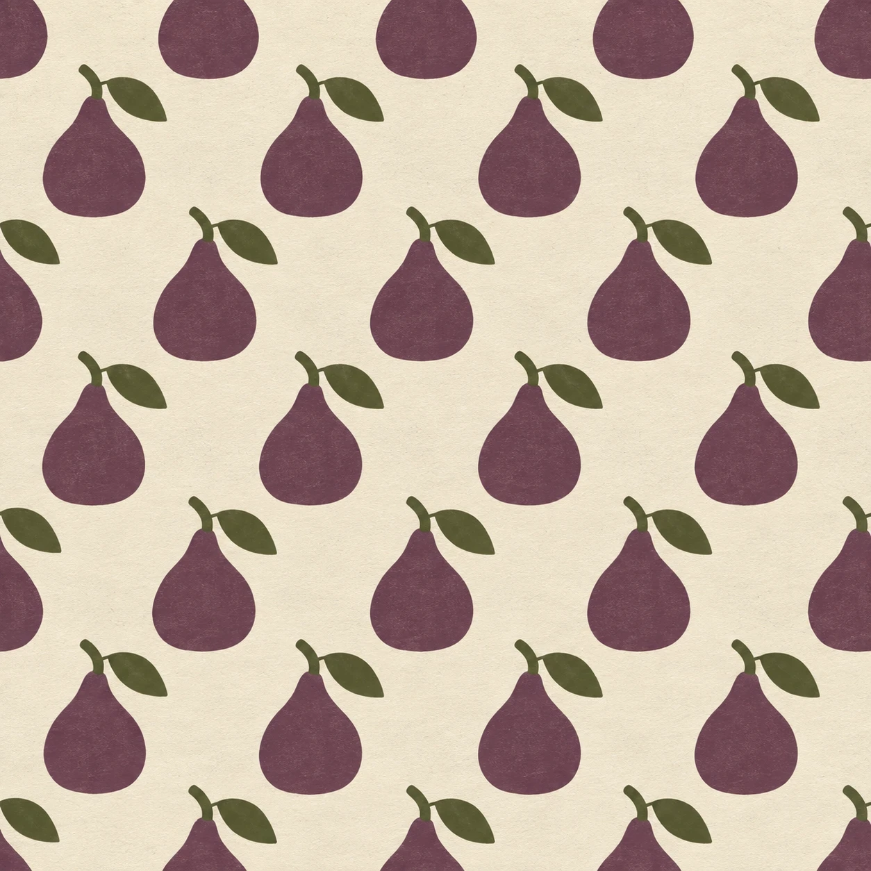
무화과 심벌을 엇갈려 반복하고 화면 가장자리에서 잘라, 포장지 밖으로도 이어지는 브랜드 패턴을 만든다.
동네 무화과 가게 · 가장자리에서 이어지는 패턴
- 형태·선
- 모든 무화과 심벌을 동일한 넓은 배 모양 실루엣, 살짝 좁아진 목, 짧게 휘어진 꼭지, 꼭지 옆에 붙은 아몬드 모양 잎 하나로 만든다. 매끄러운 면 윤곽을 사용하고 잎과 열매 사이의 틈을 열어 두어 작은 심벌도 읽히게 한다.
- 색·명암
- 따뜻한 크림색 바탕에 열매는 차분한 자두색, 꼭지와 잎은 짙은 올리브색으로 인쇄한다. 반복 전체에서 각 색을 평평하고 일정하게 유지하고, 크림색 간격이 이웃 심벌을 명확하게 구분하도록 대비를 준다.
- 질감·재질
- 비코팅 포장지에 잉크를 인쇄한 듯한 무광 표면을 만든다. 넓은 인쇄 면에는 희미한 종이 결이 비치게 하되 심벌 가장자리는 선명하게 유지한다. 표면을 고르게 밝혀 질감은 은은하고 반복 무늬는 두드러지게 한다.
- 구도
- 교대하는 줄을 반복 간격의 대략 절반만큼 옆으로 이동하고 심벌 사이의 크림색 간격을 일정하게 유지한다. 같은 배열을 화면 밖까지 이어서 화면 왼쪽과 오른쪽 가장자리는 열매 몸통을 자르고, 위와 아래 가장자리는 이웃한 줄의 서로 다른 부분을 자르게 한다. 내부 심벌은 온전하게 두고 가장자리 심벌을 맞추려고 줄이거나 옮기지 않는다.
우선순위
잘린 가장자리 심벌이 내부 패턴을 눈에 보이게 이어 가는 일관된 반복을 우선한다.
피할 표현과 결과 확인
둘레 테두리, 불규칙한 심벌 크기, 광택 음영, 장식 문구를 피한다.
네 가장자리 모두 동일한 반복을 잘라 보여 주며 내부의 온전한 무화과가 쉽게 알아보이는지 확인한다.
이 예시의 실제 생성 프롬프트
SUBJECT
Create one wrapping-paper pattern design for an original neighborhood fig stand. Repeat the same simple upright fig emblem across the sheet; each emblem consists of one plump fig body with a short bent stem and one small attached leaf.

COMPOSITION
Show the design straight overhead as a flat square swatch filling the entire image. Arrange the fig emblems in evenly spaced staggered rows, with several complete emblems in the interior and partial emblems visibly cut by all four image edges.

STYLE GUIDE
1. Shape & line
Build every fig emblem from the same broad pear-shaped silhouette, a slightly pinched neck, a short curved stem, and one almond-shaped leaf attached beside the stem. Use smooth solid contours and keep the leaf gap open so the small marks remain readable.

2. Color & light
Print the fig bodies in muted plum and their stems and leaves in dark olive on a warm cream ground. Keep each color flat and consistent across the repeat, with enough contrast for the cream gaps to clearly separate neighboring emblems.

3. Texture & material
Give the swatch the matte appearance of ink on uncoated wrapping paper. Show a faint paper grain through the broad printed areas while preserving crisp emblem edges; illuminate the surface evenly so texture stays subtle and the repeat remains dominant.

4. Composition
Offset alternate rows by roughly half the repeat spacing and maintain a steady cream gap between marks. Extend the same arrangement beyond the frame: the image-left and image-right edges cut through fig bodies, while the top and bottom edges cut through different parts of neighboring rows. Keep interior emblems whole and do not shrink or reposition edge marks to make them fit.

PRIORITY
Preserve the requested identity, count, action, composition and output settings. Apply the style rules within those constraints; a style reference must not replace the subject or layout. Within the style: Prioritize a consistent repeat whose cropped edge marks visibly continue the interior pattern.

AVOID
Avoid a surrounding border, irregular emblem sizes, glossy shading, and decorative text.

OUTPUT
Produce one square 1:1 brand reference image with no lettering, numerals, captions, watermark, or additional panels.

SELF-CHECK
Check that all four edges crop the unchanged repeat and that complete interior figs remain easy to recognize.
모델명은 이미지 출처 정보 기준입니다. 같은 프롬프트를 사용해도 결과는 달라질 수 있습니다.