텍스트 → 이미지화풍스타일 가이드
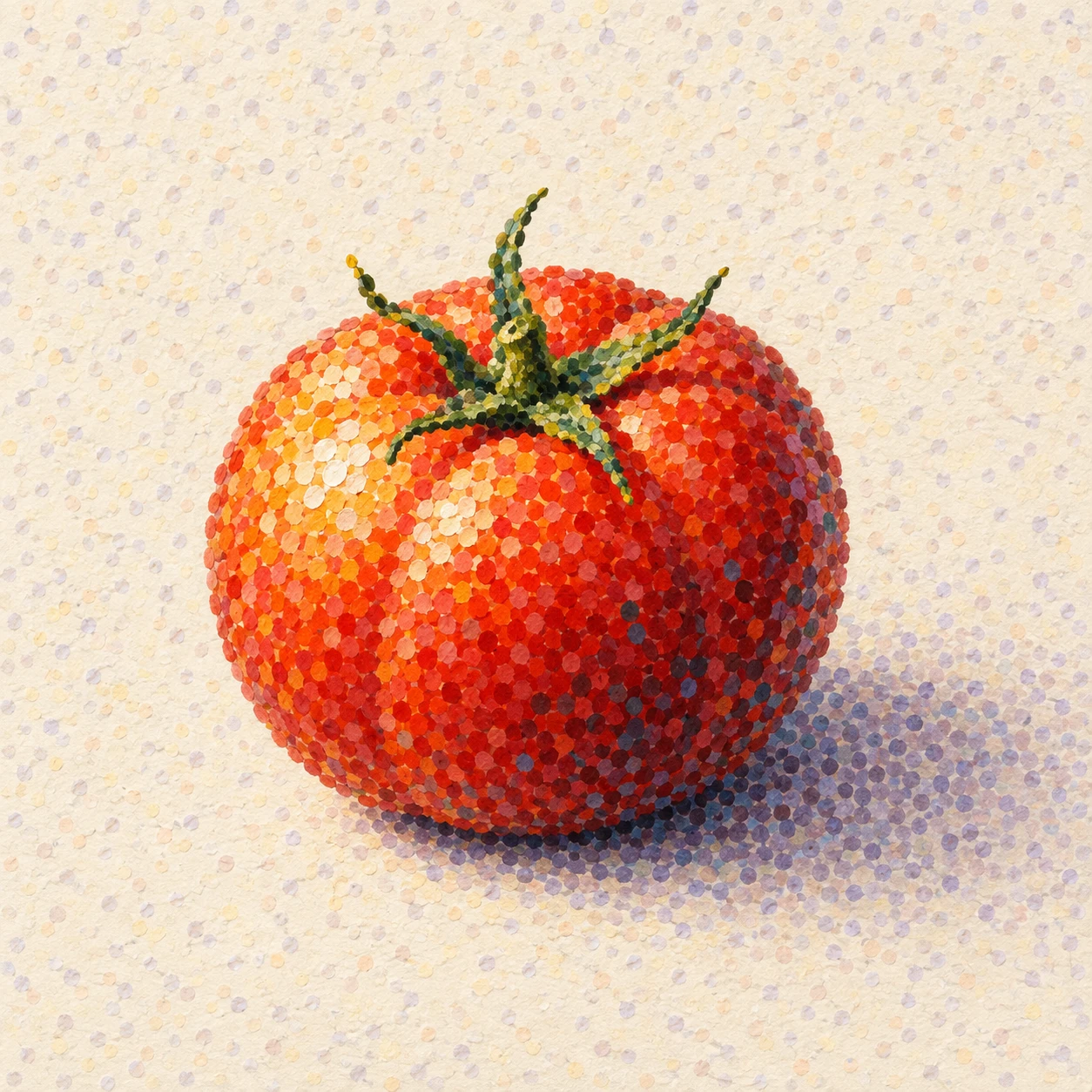
토마토 한 개 · 점묘의 광학적 색 혼합
서로 분리된 색점을 촘촘히 배치해 붉은 토마토의 둥근 형태와 빛을 만드는 점묘화 스타일.
토마토 한 개 · 점묘의 광학적 색 혼합
- 형태·선
- 연속된 외곽선 대신 작은 물감 점의 무리로 토마토의 둥근 실루엣을 만든다. 점의 배열로 얕은 굴곡을 드러내고, 꽃받침은 한눈에 읽히는 몇 개의 가늘어지는 초록색 끝으로 구성한다.
- 색·명암
- 광원을 화면 왼쪽 위에 두고 왼쪽 위 표면에는 연노랑과 주황 점, 중앙에는 빨강과 주홍 점, 오른쪽 아래 표면에는 버건디와 드문 청록 점을 모은다. 이웃한 색점이 눈에 분리되어 보이도록 유지해 멀리서 광학적으로 섞이게 하고, 접촉점에서 화면 오른쪽으로 차분한 보라색 점 그림자를 이어간다.
- 질감·재질
- 무광 종이 위에 조금씩 불규칙한 불투명 물감 점을 따로 찍고 점 사이에 작은 종이 여백을 남긴다. 어두운 부분에서는 점을 촘촘히, 밝은 부분에서는 성기게 배치하되 매끈한 그라데이션으로 문지르지 않고 개별 자국을 보이게 한다.
- 구도
- 토마토 주변에 가장 강한 점 대비와 또렷한 실루엣을 두고, 주변 바탕에는 차분한 크림색과 연보라색 점을 사용한다. 아래쪽 가장자리 바로 밑에 가장 어두운 그림자 점을 밀집시켜 접촉을 드러내고, 그림자가 화면 오른쪽으로 뻗을수록 점을 더 성기게 펼친다.
우선순위
멀리서 볼 때 둥근 토마토로 합쳐지는 분리된 색점을 우선한다.
피할 표현과 결과 확인
문질러 섞은 그라데이션, 검은 외곽선, 균일한 디지털 점 격자를 피한다.
개별 색점이 보이며 왼쪽에서 빛을 받은 토마토가 오른쪽으로 뻗는 그림자 위에 자연스럽게 놓였는지 확인한다.
이 예시의 실제 생성 프롬프트
SUBJECT
Show exactly one ripe red tomato with a small attached green calyx, resting on a pale cream tabletop. Keep its gently lobed body recognizable and its calyx connected to the top.

COMPOSITION
Use a square, slightly elevated three-quarter view. Place the whole tomato just below center, occupying roughly half the image width, with open background around it and enough tabletop to show its cast shadow extending toward image-right.

STYLE GUIDE
1. Shape & line
Build the tomato’s rounded silhouette from clusters of small painted dots rather than a continuous outline. Let the dots describe its shallow lobes, and shape the calyx into a few tapered green points that remain readable at a glance.

2. Color & light
Place the light at upper image-left: cluster pale yellow and orange dots on the upper-left surface, red and vermilion dots across the middle, and burgundy with sparse blue-green dots on the lower-right surface. Keep neighboring colors visibly separate so they blend optically from a distance; carry a muted violet dotted shadow from the contact point toward image-right.

3. Texture & material
Use discrete, slightly irregular opaque paint dabs on matte paper, leaving small paper gaps between them. Make the dots denser in the darker passages and more open in the light, while keeping individual marks visible instead of smearing them into smooth gradients.

4. Composition
Keep the strongest dot contrast and clearest silhouette around the tomato, then use quieter cream and pale lavender dots across the surrounding field. Compress the darkest shadow dots directly beneath the lower edge to establish contact, and spread them more loosely as the shadow extends to image-right.

PRIORITY
Preserve the requested identity, count, action, composition and output settings. Apply the style rules within those constraints; a style reference must not replace the subject or layout. Within the style: Prioritize separate colored dots that merge into a rounded tomato when viewed from a distance.

AVOID
Avoid blended gradients, black contour lines, and a uniform digital dot grid.

OUTPUT
Create one square image of a pointillist painting on matte paper, with no text, lettering, signature, border, or watermark.

SELF-CHECK
Check that individual color dots remain visible and the left-lit tomato rests convincingly on its rightward shadow.
모델명은 이미지 출처 정보 기준입니다. 같은 프롬프트를 사용해도 결과는 달라질 수 있습니다.