텍스트 → 이미지화풍스타일 가이드
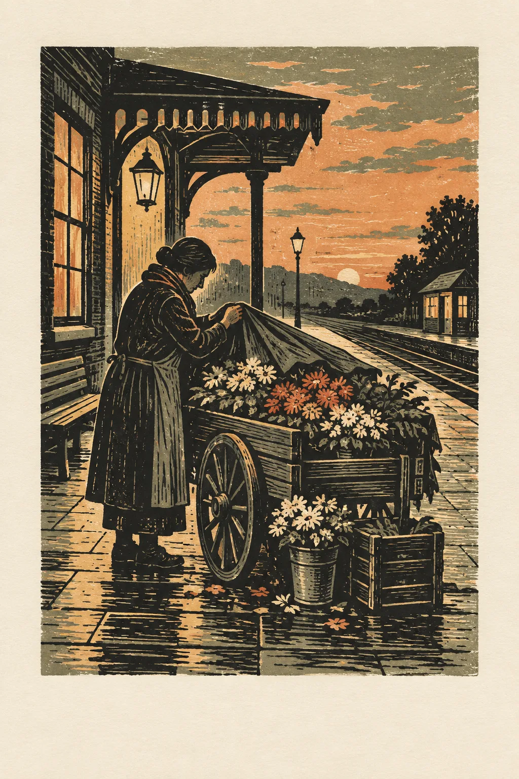
역 앞 꽃수레 · 감산 목판화
한 판을 단계적으로 깎아 인쇄한 듯한 색층과 칼자국으로 장면을 구성한다.
역 앞 꽃수레 · 감산 목판화
- 1
- Limit the image to three successive printed value layers plus exposed paper.
- 2
- Use carved mark density to distinguish flowers, wood, stone, and cloth.
- 3
- Preserve strong large shapes beneath the fine gouge texture.
- 4
- Show believable ink pressure and registration from a hand-printed reduction block.
우선순위
소재를 바꿔도 네 가지 표현 규칙을 유지합니다.
피할 표현과 결과 확인
불필요한 글자·로고·워터마크를 제외합니다.
축소해도 형태와 구도가 명확한지 확인합니다.
이 화풍으로 에셋 만들기
공통 화풍 고정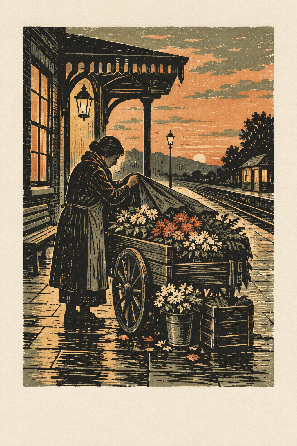
이 예시의 실제 생성 프롬프트
실제 사용한 프롬프트 · 원문
Create an original reduction linocut print of a flower seller closing a cart outside a small railway station at dusk. Build the image as if one block were carved and printed in successive stages: a broad pale base, a middle layer defining cart and flower masses, and a dark final layer for structural shadows and outlines. Let carved gouges describe petals, wooden slats, paving, and the seller's coat with different mark densities. Keep the large shapes locked together so the image remains readable before the fine cuts are noticed. Show natural ink pressure variation and occasional exposed paper, but maintain sound registration between layers. Use a portrait print format with a generous unprinted margin. No station name, lettering, logos, or watermarks.
모델명은 이미지 출처 정보 기준입니다. 같은 프롬프트를 사용해도 결과는 달라질 수 있습니다.