텍스트 → 이미지카페 · 브랜드스타일 가이드
동네 책 교환소 · 접힌 모서리 아이덴티티
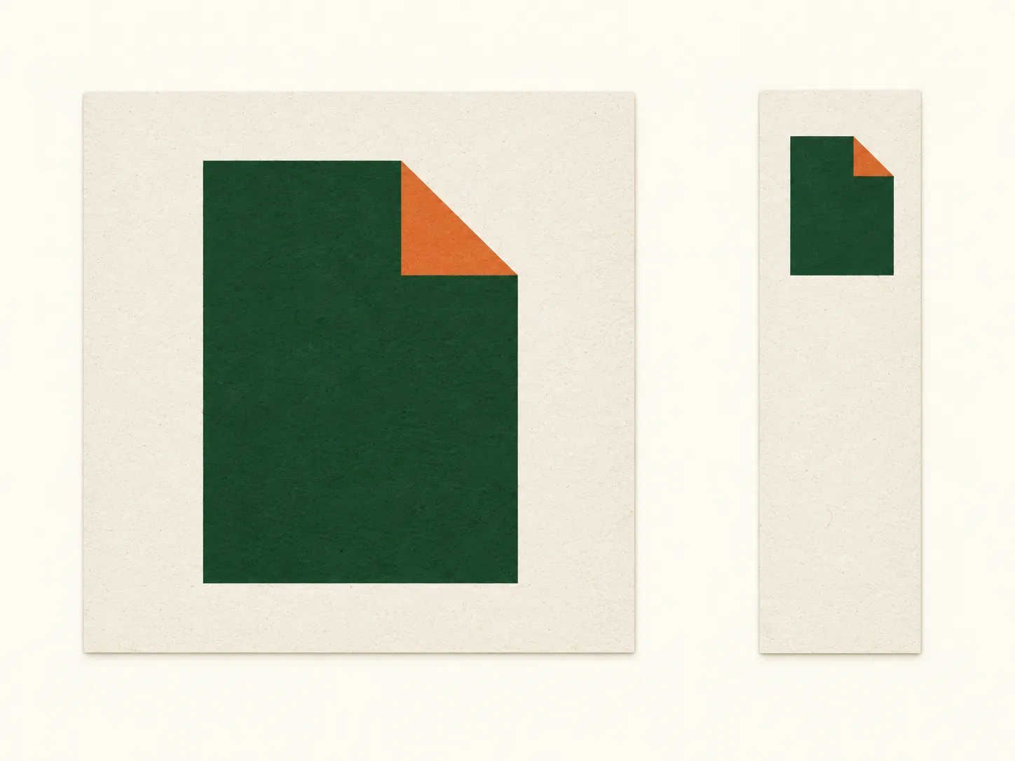
페이지의 접힌 모서리를 하나의 표식으로 삼아 안내판과 책갈피를 연결하는 글자 없는 브랜드 디자인.
동네 책 교환소 · 접힌 모서리 아이덴티티
- 형태·선
- 각 페이지 표식은 오른쪽 위 모서리를 대각선으로 잘라낸 세로 직사각형 면으로 만든다. 잘린 선의 바로 아래와 왼쪽에 삼각형 접힘을 놓고 대각선 변을 공유하게 하여, 떨어진 화살표가 아니라 안으로 접힌 페이지로 읽히게 한다.
- 색·명암
- 페이지 몸체에는 짙은 숲 초록, 삼각형 접힘에는 차분한 주황, 주변 바탕에는 따뜻한 아이보리를 사용한다. 모든 색은 평평하고 불투명하게 유지하며, 그라데이션이나 가상 조명 없이 색 대비로 접힘을 구분한다.
- 질감·재질
- 안내판과 책갈피 표면 안에 옅고 고르게 분포한 결을 넣어 비코팅 종이를 표현한다. 표식의 가장자리는 선명하고 잉크 면은 단단하게 유지하여 종이 질감보다 기하학적인 접힘이 먼저 보이게 한다.
- 구도
- 왼쪽 안내판에는 큰 표식을 중앙에 배치하고, 오른쪽 책갈피에는 작은 표식을 위쪽에 배치하여 아래에 여백을 남긴다. 두 크기에서 모서리 방향과 접힘의 시각적 존재감을 비슷하게 유지하고, 넉넉한 가장자리 여백으로 두 응용물을 연결한다.
우선순위
명확하게 읽히는 접힌 모서리와 두 응용물의 일관된 아이덴티티를 우선한다.
피할 표현과 결과 확인
분리된 삼각형, 장식적인 책 그림, 접힘을 가리는 원근 표현을 피한다.
두 표식 모두 오른쪽 위가 안으로 접혀 있으며 각 표시 크기에서 알아볼 수 있는지 확인한다.
이 예시의 실제 생성 프롬프트
SUBJECT
Create a wordless identity for a neighborhood book swap, shown on exactly one square sign and one tall rectangular bookmark. Both carry the same upright page symbol with its upper-right corner folded inward. The sign presents the symbol prominently; the bookmark repeats it at a smaller size.

COMPOSITION
Show both applications straight-on against a warm ivory background, with the square sign on image-left and the bookmark on image-right. Align their bottom edges and leave a generous visible gap. Keep every edge inside the frame so the shared corner treatment and differences in scale are easy to compare.

STYLE GUIDE
1. Shape & line
Build each page symbol as a solid upright rectangle with a diagonal cut across its upper-right corner. Place a triangular fold immediately below and left of that cut, sharing its diagonal edge, so the corner reads as a page turned inward rather than a detached arrow.

2. Color & light
Use deep forest green for the page body, muted orange for the triangular fold and warm ivory for the surrounding field. Keep all colors flat and opaque; separate the fold through color contrast without gradients or simulated lighting.

3. Texture & material
Suggest uncoated paper with a faint, evenly distributed grain inside the sign and bookmark surfaces. Keep symbol edges crisp and the ink coverage visually solid, allowing the paper texture to remain secondary to the geometric fold.

4. Composition
Center the large symbol on the left sign and place the smaller symbol near the top of the right bookmark, leaving open space below it. Preserve the same corner direction and a similarly prominent fold at both sizes, using generous margins to make the two applications feel related.

PRIORITY
Preserve the requested identity, count, action, composition and output settings. Apply the style rules within those constraints; a style reference must not replace the subject or layout. Within the style: Prioritize a clearly readable folded corner and a consistent identity across both applications.

AVOID
Avoid detached triangles, decorative book illustrations and perspective that obscures the fold.

OUTPUT
Produce one 4:3 image as a flat graphic identity presentation, with no lettering, numerals, captions or watermark.

SELF-CHECK
Check that both symbols show the same upper-right inward fold and remain recognizable at their displayed sizes.
모델명은 이미지 출처 정보 기준입니다. 같은 프롬프트를 사용해도 결과는 달라질 수 있습니다.