텍스트 → 이미지인물스타일 가이드
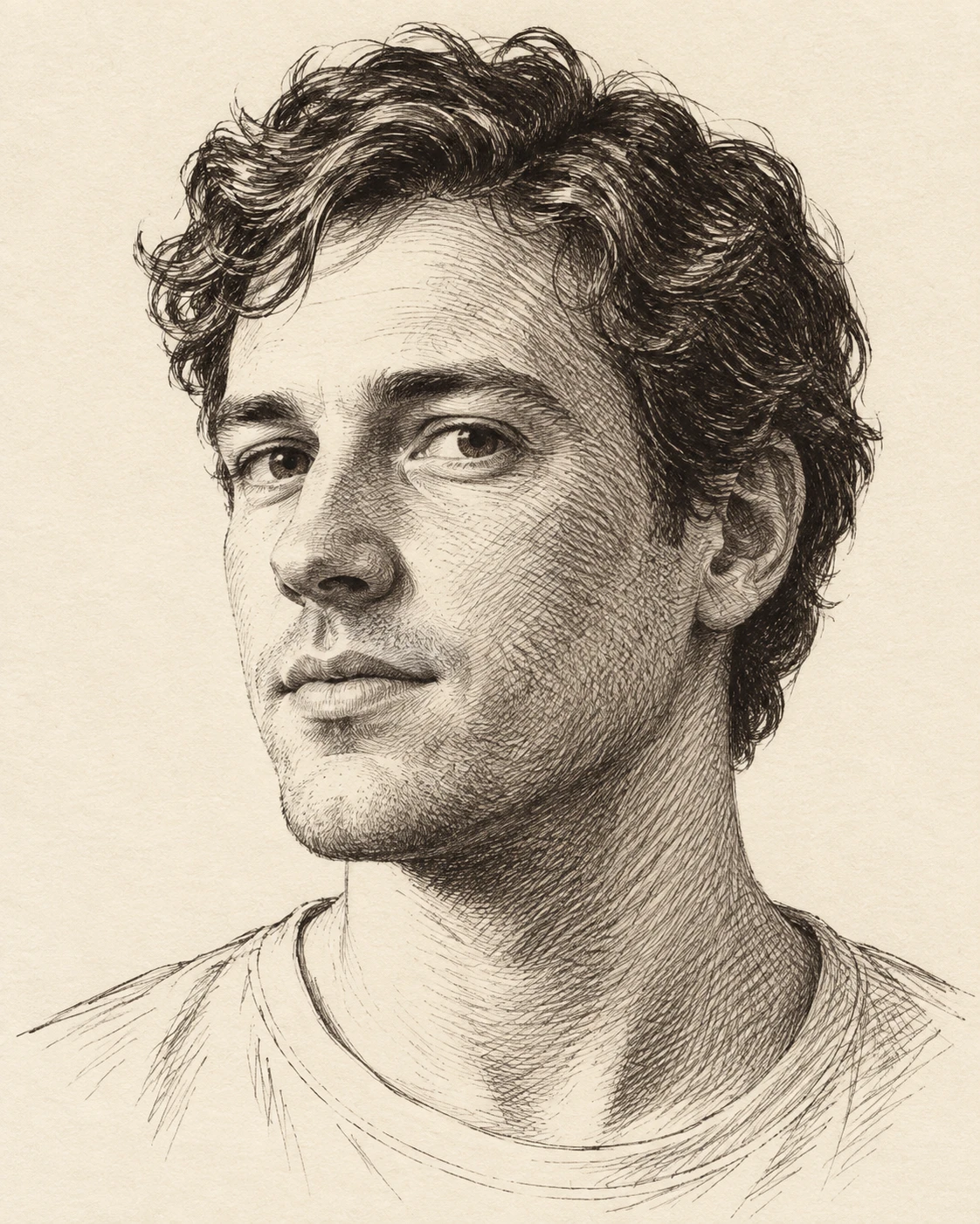
물결 머리 성인 · 얼굴을 감싸는 잉크 해칭
얼굴 면을 따라 휘어지는 펜 선과 선 사이의 간격으로 볼, 코, 턱의 입체감을 만드는 인물화.
물결 머리 성인 · 얼굴을 감싸는 잉크 해칭
- 형태·선
- 절제된 끊어진 윤곽선으로 얼굴을 잡고, 각 형태를 감싸도록 해칭 선을 휘게 그린다. 볼에서는 둥글게 활처럼 휘고, 코에서는 표면을 따라 감싸며, 턱 아래에서는 방향을 꺾는다. 얼굴 전체에 같은 사선을 깔지 말고 면이 바뀌는 곳에서 선의 방향을 바꾼다.
- 색·명암
- 따뜻한 상아색 종이에 검은 잉크를 사용하고, 화면 왼쪽에서 넓은 빛이 들어오게 한다. 화면 왼쪽 이마와 볼 윗부분은 종이 여백을 주로 남기고, 화면 오른쪽 볼과 턱 아래에서는 해칭 간격을 좁힌다. 가장 깊은 그림자에만 교차하는 두 번째 선층을 더한다.
- 질감·재질
- 굵기가 부드럽게 달라지고 끝이 살짝 가늘어지는 개별 펜 선을 드러낸다. 머리카락은 느슨하게 묶인 곡선과 머리 다발 사이의 짙은 잉크로 표현하고, 피부에는 더 정돈되고 간격이 넓은 선을 쓴다. 선을 매끈한 회색으로 뭉개지 말고 종이 틈을 남긴다.
- 구도
- 눈, 코, 볼이 돌아가는 부분에 가장 또렷한 선의 변화를 집중한다. 셔츠는 목둘레와 어깨를 나타내는 몇 개의 선으로 단순화하고 배경에는 해칭을 넣지 않아, 얼굴의 곡선 해칭이 방해되는 무늬 없이 인물의 깊이를 전달하게 한다.
우선순위
얼굴의 곡률을 눈에 보이게 따라가고 간격으로 그림자를 만드는 해칭을 우선한다.
피할 표현과 결과 확인
균일한 사선 음영, 에어브러시 같은 그라데이션, 모든 이목구비를 둘러싼 굵은 윤곽선을 피한다.
볼, 코, 턱을 따라 선의 방향이 바뀌고 밝은 부분에 종이 여백이 보이는지 확인한다.
이 예시의 실제 생성 프롬프트
SUBJECT
One adult with short wavy hair, a plain round-neck shirt, and a relaxed closed mouth. Turn the head slightly toward image-left while keeping both eyes visible; the nose overlaps a small portion of the image-left cheek.

COMPOSITION
Frame the head and upper shoulders in a vertical portrait at eye level. Place the face near the center with comfortable space above the hair, and use a plain paper background so the facial hatching remains easy to read.

STYLE GUIDE
1. Shape & line
Build the face with restrained broken contours, then curve the hatch strokes around each visible form: bow them across the cheeks, wrap them along the nose, and turn them beneath the jaw. Change stroke direction at plane transitions instead of laying one diagonal pattern across the entire face.

2. Color & light
Use black ink on warm ivory paper, with broad light arriving from image-left. Leave the image-left forehead and upper cheek mostly as exposed paper; tighten hatch spacing on the image-right cheek and beneath the chin, adding a second crossing layer only in the deepest shadows.

3. Texture & material
Keep individual pen strokes visible with gently varied thickness and slightly tapered ends. Describe the hair with loose grouped curves and denser ink between locks, while giving the skin cleaner, more widely separated strokes; preserve paper gaps rather than blending the marks into smooth gray.

4. Composition
Concentrate the clearest line changes around the eyes, nose, and cheek turn. Simplify the shirt into a few neckline and shoulder strokes, and leave the background unhatched so the curved facial marks carry the portrait's depth without competing patterns.

PRIORITY
Preserve the requested identity, count, action, composition and output settings. Apply the style rules within those constraints; a style reference must not replace the subject or layout. Within the style: Prioritize hatching that visibly follows facial curvature and builds shadow through spacing.

AVOID
Avoid uniform diagonal shading, airbrushed gradients, and heavy outlines around every facial feature.

OUTPUT
Produce one finished pen-and-ink portrait in a 4:5 vertical aspect ratio, with no lettering, captions, signatures, or watermarks.

SELF-CHECK
Check that stroke direction changes across the cheek, nose, and jaw, and that open paper remains visible in the lit areas.
모델명은 이미지 출처 정보 기준입니다. 같은 프롬프트를 사용해도 결과는 달라질 수 있습니다.