Text to imageCalligraphyStyle guide
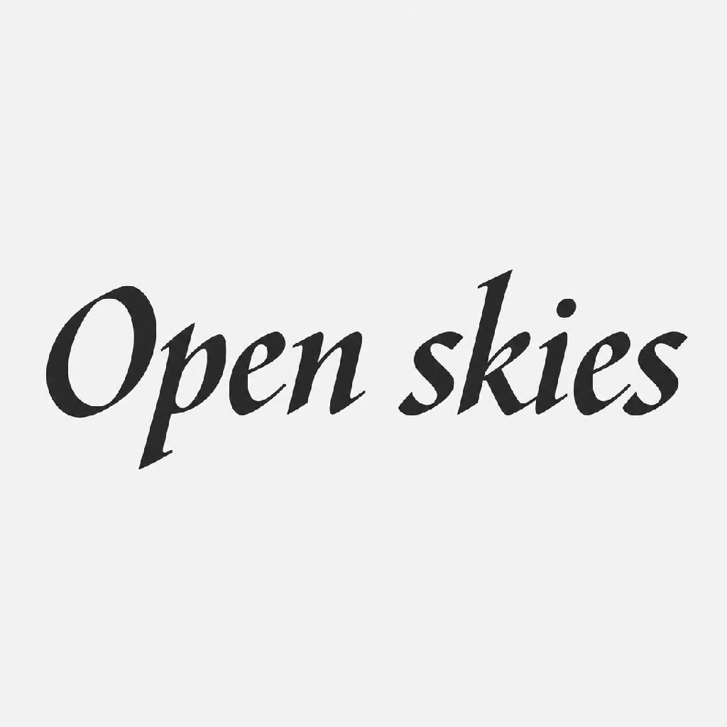
Open skies · Broad-Pen Italic
A single-line italic lettering study demonstrating fixed-nib contrast, wedge entries and branching shoulders.
Open skies · Broad-Pen Italic
- Form language
- Use broad-pen italic abstraction in a local writing frame: horizontal runs left to right and upright points toward form tops. Let U be median main-body height, excluding projecting strokes and detached marks. Lean stem tops rightward 8–12° from upright. Retain openings and branches; use elongated curves, angular branch roots and distinct curved shoulders. Omit incidental detail below 2–3% U; add no ornamental extensions.
- Contour
- Let U be median main-body height, excluding extensions and detached marks. Structural bands form their own contours: broad portions are 0.14–0.20U and narrow portions 0.03–0.06U, measured across the path. Curves change width continuously; branch joins remain angular and flush. Entries and exits end in oblique cuts with wedges 0.08–0.15U long. Add no separate outline or rounded pressure-swollen caps.
- Mark-making
- Use solid broad-nib ink deposits. In the local writing frame, horizontal runs left to right and upright points toward form tops. U is median main-body height excluding extensions and detached marks; nib width is 0.18–0.22U. Hold the nib edge rising left to right at 40–45° above horizontal throughout each path. Contrast follows path direction without pressure swelling. Curved shoulders branch through a short narrow neck before widening. Keep openings clean; hatching, bristle trails and stray marks are absent.
- Surface rendering
- Use exactly two flat interior tonal states, deposited and unfilled, with uniform interiors and no grain. Let U be median main-body height excluding extensions and detached marks. Confine smooth edge interpolation to a 0.5–1% U transition measured perpendicular to each boundary. Preserve sharp wedge tips and uninterrupted edges; exclude interior gradients, ink pooling, bleed halos and modeled relief.
Priority
Preserve fixed-nib contrast, angular branch roots and obliquely cut terminals.
What to avoid & what to check
Avoid pressure-driven swelling, rounded monoline bands and brush texture.
Broad and narrow bands alternate through curves; branch roots and wedge tips stay distinct.
Exact prompt for this example
MODULE OWNERSHIP
subject: Subject count, type, stable proportions and landmarks, resting face geometry, hair shape, physical materials, garment construction and permanent marks. No emotion, movement, color assignment or rendering recipe.
expression: Facial soft-tissue displacement and pupil direction, muscle coordination, regional intensity, asymmetry and onset/peak/release. No head/body pose, stable appearance, skin color or rendering.
gesture: Head/neck/body/limb orientation, joint movement, support, contact and pose-caused occlusion using existing anatomy. No eye/pupil movement, emotion, identity, props inventory or camera.
props: Prop count, type, construction, physical material and scale relative to the subject. Holding/contact belongs to gesture, position to composition, color to palette.
scene: Environment elements, terrain, backdrop/floor presence and structural detail. No canvas positions, camera, lighting, assigned colors or render texture.
camera: Projection, focal-length impression, camera elevation/yaw/roll, viewing distance and crop. No actor pose, world placement, lighting or canvas aspect ratio.
composition: Normalized 0-100% canvas positions, scale in frame, depth/overlap, focal hierarchy and margins. No joint pose, camera projection, rendering, subject/prop inventory or emotion.
palette: Color anchors, hue/saturation/value ranges, colors assigned to parts and approximate color coverage. No illumination direction, shading algorithm, physical material or layout.
lighting: Light-source direction/softness/intensity, ambient illumination, physical shadow direction/length and highlight position. Absence of directional illumination is allowed. No shading technique, palette or material changes.
style: Reusable form abstraction, contour weight/taper/edge quality, medium and mark scale/density/direction, surface rendering and tonal transition technique. No fixed subject proportions, anatomy, identity, expression, pose, palette, light-source direction, camera or layout.
output: Image count, aspect ratio, size, file/alpha requirements and global lettering/logo/watermark restrictions. No background scenery, crop, style, identity or pose.

SUBJECT
inventory: Include exactly one English lettering study: nine letters in reading order O, p, e, n, s, k, i, e, s, with one word space and exactly one detached dot belonging to i. Preserve case and letter order; use no ligatures, substitutions or pictorial subjects.
geometry: Read "Open skies" exactly. H is lowercase body height, measured bottom to top without ascenders, descenders or dots. O is a closed oval 1.5–1.6H high and 0.9–1.1H wide. k is 1.5–1.6H high; p extends 0.6–0.7H below its body. All lowercase bodies are H high.
geometry: Measure body width between its outermost left and right edges within the H-high body, excluding projections and dots. Widths are 0.55–0.70H for p, e, n and k; 0.45–0.60H for s; and 0.28–0.40H for i. Both occurrences of e and s retain the same respective ranges.
geometry: With H defined as lowercase body height, preserve p's enclosed bowl, both e counters and apertures, n's single shoulder and k's distinct arms. Openings are 0.12–0.22H wide between opposing boundaries. Keep letters structurally separate.
geometry: Let H be lowercase body height. The i dot has width and height each 0.14–0.20H, measured between its outermost edges. Its lower edge is 0.12–0.18H above the stem's upper edge. Align its horizontal center with the center of the stem's upper terminal within ±0.04H; retain a detached dot.
appearance: The written forms consist of a thin deposited ink film, without built-up layers, embossed relief, carved cavities or attached components. They have no permanent identifying marks beyond their required glyph structures.

PRIORITY
Preserve exact glyph identity, separate letters and readable openings.

AVOID
Avoid substituted letters, missing dots and closed apertures.

CHECK
Nine correctly cased letters retain their counters and one detached dot.

PROPS
inventory: The prop inventory is empty: include exactly zero accessories, tools, containers or supplementary objects. There is no separate writing instrument or demonstration equipment.
construction: With zero props, there is no prop construction target. Include no separate backing plate, removable mounting hardware, detached supporting stand or removable supplementary attachment.

PRIORITY
Keep the supplementary object inventory empty.

AVOID
Avoid mounting hardware and demonstration accessories.

CHECK
No separate accessory or support object is present.

SCENE
inventory: Include one plain illustrated backdrop field and no floor. Exclude buildings, terrain, furniture, vegetation, decorative motifs, lighting fixtures and environmental objects; the backdrop is the complete environment inventory.
structure: The backdrop is one uninterrupted plane without a horizon, architectural divisions, surface joints or repeated elements. It has no represented depth or structural relief and introduces no additional boundaries.

PRIORITY
Maintain one structurally uninterrupted backdrop.

AVOID
Avoid floor divisions and environmental decoration.

CHECK
The backdrop contains no horizon or structural subdivisions.

CAMERA
projection: Use orthographic projection of the planar illustration, explicitly without focal-length perspective or depth-dependent magnification. Preserve the existing geometry without lens distortion, converging lines or apparent thickness.
viewpoint: View perpendicular to the upright writing plane, with yaw and elevation offsets of 0°±2° from its normal. Set roll to 0°±2° relative to the plane's upright vertical. Viewing distance does not change scale under orthographic projection.
crop: Show the complete written forms, including every terminal, enclosed counter and detached component. Cut through none of their outer boundaries; no reverse side or thickness edge is visible in this perpendicular view.

PRIORITY
Keep every complete written form available for inspection.

AVOID
Avoid oblique distortion and clipped stroke terminals.

CHECK
All outer boundaries and enclosed counters remain visible.

COMPOSITION
placement: Use top-left normalized coordinates. Center the existing lettering group at (50%,50%)±5 percentage points. Its full width targets 80% of canvas width, allowed 70–90%; derive its height by uniform scaling. The backdrop covers x=0–100%, y=0–100%.
depth: Use one borderless panel with the existing lettering as the sole focal layer over the backdrop. Openings expose the backdrop. Preserve intrinsic connections and self-overlap, but introduce no independently placed obstruction or additional foreground layer.
spacing: Arrange one line on a straight body baseline. Let H be median body height: intraword gaps are 0.08–0.18H and the word gap is 0.5–0.7H, measured between nearest letter bounds. Keep all bounds inside x=5–95%, y=5–95%; uniform-scale containment overrides nominal fill. Derive margins from these bounds.

PRIORITY
Prioritize complete containment and readable word spacing.

AVOID
Avoid stretched forms, staggered baselines and decorative borders.

CHECK
One contained line has visibly wider word gaps than intraword gaps.

PALETTE
colors: Use two achromatic anchors, #262626 and #F2F2F2. Permit derived mixtures between them with equal red, green and blue values in the closed range 38–242. Introduce no chromatic hue family or third independent anchor.
assignment: Assign every deposited stroke and any coincident contour to #262626. Assign the backdrop, enclosed openings and gaps between forms to #F2F2F2. Boundary mixtures inherit these two roles; no visible region receives an independent accent color.
balance: Coverage follows the actual deposited and unfilled region areas and totals 100%. Mixtures inherit their contributing roles rather than forming a third region class. Preserve both anchor roles without separately colored accents or regional tint shifts.

PRIORITY
Preserve the two assigned achromatic color roles.

AVOID
Avoid colored accents and independently tinted regions.

CHECK
Every region and boundary mixture inherits one of the two anchor roles.

LIGHTING
sources: Use deliberately unlit flat artwork with zero physical light sources. Illumination has no directional or depth variation; no key light, fill light or ambient intensity gradient is represented.
shadows: Directional cast shadows and contact shadows are absent. No region receives a physical shadow offset, reach or penumbra, and no detached shadow shape suggests elevation above a support surface.
highlights: Physical highlights are absent across the entire motif and backdrop. Include no specular point, reflective streak, rim illumination or luminous hotspot; no region gains brightness from a represented light source.

PRIORITY
Keep physical illumination uniformly absent.

AVOID
Avoid cast shadows, rim light and reflective hotspots.

CHECK
No directional shadow or physical highlight is visible.

STYLE GUIDE
form-language: Use broad-pen italic abstraction in a local writing frame: horizontal runs left to right and upright points toward form tops. Let U be median main-body height, excluding projecting strokes and detached marks. Lean stem tops rightward 8–12° from upright. Retain openings and branches; use elongated curves, angular branch roots and distinct curved shoulders. Omit incidental detail below 2–3% U; add no ornamental extensions.
contour: Let U be median main-body height, excluding extensions and detached marks. Structural bands form their own contours: broad portions are 0.14–0.20U and narrow portions 0.03–0.06U, measured across the path. Curves change width continuously; branch joins remain angular and flush. Entries and exits end in oblique cuts with wedges 0.08–0.15U long. Add no separate outline or rounded pressure-swollen caps.
mark-making: Use solid broad-nib ink deposits. In the local writing frame, horizontal runs left to right and upright points toward form tops. U is median main-body height excluding extensions and detached marks; nib width is 0.18–0.22U. Hold the nib edge rising left to right at 40–45° above horizontal throughout each path. Contrast follows path direction without pressure swelling. Curved shoulders branch through a short narrow neck before widening. Keep openings clean; hatching, bristle trails and stray marks are absent.
surface-rendering: Use exactly two flat interior tonal states, deposited and unfilled, with uniform interiors and no grain. Let U be median main-body height excluding extensions and detached marks. Confine smooth edge interpolation to a 0.5–1% U transition measured perpendicular to each boundary. Preserve sharp wedge tips and uninterrupted edges; exclude interior gradients, ink pooling, bleed halos and modeled relief.

PRIORITY
Preserve fixed-nib contrast, angular branch roots and obliquely cut terminals.

AVOID
Avoid pressure-driven swelling, rounded monoline bands and brush texture.

CHECK
Broad and narrow bands alternate through curves; branch roots and wedge tips stay distinct.

OUTPUT
format: Deliver exactly one raster image as a PNG file, 1024×1024 pixels with a 1:1 aspect ratio. Use an opaque image with no alpha channel or transparent pixels; provide no additional image variants.
restrictions: Permit primary lettering; prohibit all additional text, signatures, seals, logos and watermarks. Exclude interface controls, metadata labels and embedded reference sheets.

PRIORITY
Deliver one opaque PNG at the specified dimensions.

AVOID
Avoid additional text, seals and extra image variants.

CHECK
One 1024×1024 opaque PNG permits primary lettering and excludes additional text and watermarks.

FINAL INTEGRATION
subject + output: For the final image, the sole permitted primary lettering is "Open skies". This exact phrase is the complete text whitelist; all additional text remains prohibited.
Model information comes from image provenance. The same prompt may produce a different result.