Text to imageIllustrationStyle guide
One Paper Zigzag · Alternating Fold Values
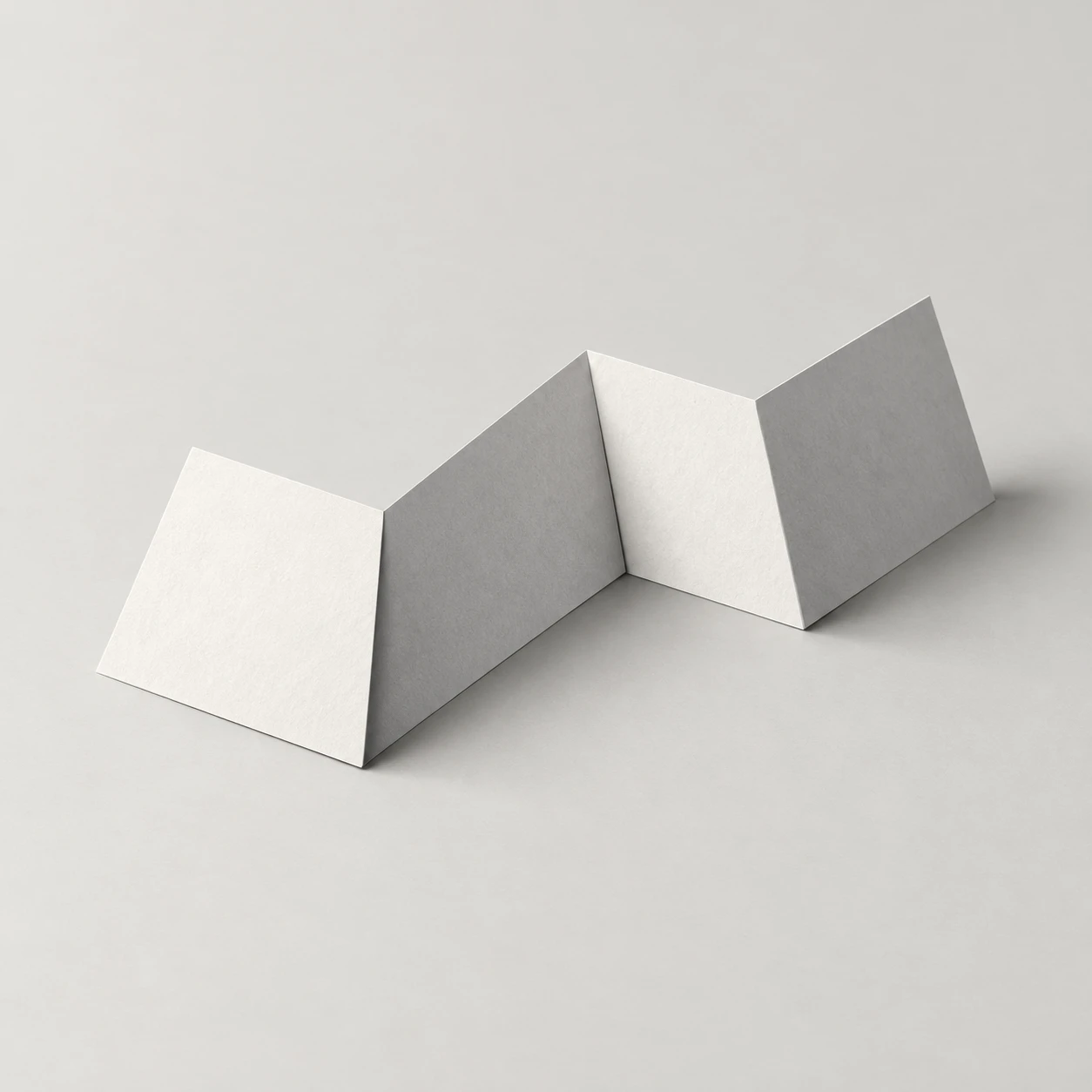
An illustration that makes a folded white paper strip read in depth through alternating light and dark values on connected flat panels.
One Paper Zigzag · Alternating Fold Values
- Shape & line
- Construct each panel as a flat quadrilateral, joining adjacent panels along one shared straight crease; alternate rising and falling slopes so the visible side edge forms a continuous zigzag without gaps or rounded bends.
- Color & light
- Place the key light above image-left; give panels facing that side a pale ivory value and panels facing image-right a noticeably darker cool gray value. Keep each panel's main value nearly uniform, with crisp changes exactly at the creases.
- Texture & material
- Render the strip as matte paper with restrained fine grain and thin exposed edges. Add a narrow dark accent inside each valley crease while keeping ridge creases clean, so folds gain depth without looking like thick boards.
- Composition
- Keep the complete strip near the center with clear space around its silhouette. Show its lowest fold edges touching the surface, with tight contact shadows beneath them and a subdued cast shadow extending toward image-right; keep the shadow lighter than the valley accents.
Priority
Prioritize connected planar folds and readable alternating values.
What to avoid & what to check
Avoid rounded corrugations, detached panels, and glossy highlights.
Check that all four panels connect and every value boundary follows a visible crease.
Exact prompt for this example
SUBJECT
One broad white paper strip folded into an accordion with four connected rectangular panels and three straight creases, resting on a pale neutral surface. Its successive folds form a readable zigzag profile.

COMPOSITION
Use an elevated three-quarter view that reveals the strip's broad panel surfaces and zigzag side edge. Let the accordion extend from image-left foreground toward image-right background, keeping all four panels visible and separated in projection.

STYLE GUIDE
1. Shape & line
Construct each panel as a flat quadrilateral, joining adjacent panels along one shared straight crease; alternate rising and falling slopes so the visible side edge forms a continuous zigzag without gaps or rounded bends.

2. Color & light
Place the key light above image-left; give panels facing that side a pale ivory value and panels facing image-right a noticeably darker cool gray value. Keep each panel's main value nearly uniform, with crisp changes exactly at the creases.

3. Texture & material
Render the strip as matte paper with restrained fine grain and thin exposed edges. Add a narrow dark accent inside each valley crease while keeping ridge creases clean, so folds gain depth without looking like thick boards.

4. Composition
Keep the complete strip near the center with clear space around its silhouette. Show its lowest fold edges touching the surface, with tight contact shadows beneath them and a subdued cast shadow extending toward image-right; keep the shadow lighter than the valley accents.

PRIORITY
Preserve the requested identity, count, action, composition and output settings. Apply the style rules within those constraints; a style reference must not replace the subject or layout. Within the style: Prioritize connected planar folds and readable alternating values.

AVOID
Avoid rounded corrugations, detached panels, and glossy highlights.

OUTPUT
Create one square illustration with generous empty margins and no text, labels, arrows, or watermark.

SELF-CHECK
Check that all four panels connect and every value boundary follows a visible crease.
Model information comes from image provenance. The same prompt may produce a different result.