Text to imageCafe & brandStyle guide
Local Clock Repair · Broken-Contour Closure
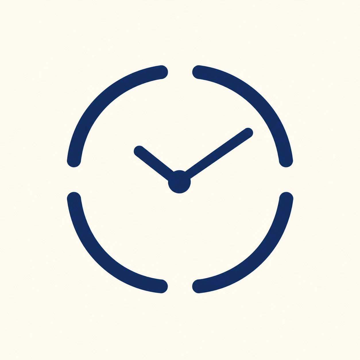
A brand mark using four separated arcs and two hands so the eye completes the missing contour into one clock.
Local Clock Repair · Broken-Contour Closure
- Shape & line
- Build the outer contour from four equal quarter-positioned arcs on the same implied circle, leaving a short open gap at the top, right, bottom, and left. Give every arc the same substantial stroke width and rounded ends; align their curvature so the eye can smoothly continue the circle across each gap.
- Color & light
- Render all arcs and both hands in one deep navy ink on a warm ivory background. Use solid, evenly colored shapes with strong figure–ground contrast so the missing segments remain plainly visible.
- Texture & material
- Use clean vector-like edges and a smooth matte printed appearance. Keep the interior of each stroke fully opaque and uniform, allowing the open contour itself to carry the visual effect without grain or surface distress.
- Composition
- Join the hands visibly at the circle's center: point the shorter hand toward image upper-left and the longer hand toward image upper-right. Keep both tips well inside the arc ring, and leave the four outer gaps unobstructed so the centered clock reads as one complete emblem.
Priority
Prioritize a clearly implied circular clock despite the four visible breaks.
What to avoid & what to check
Avoid connecting the outer arcs or letting the hands touch the ring.
Check that all four gaps remain visible and the mark reads immediately as one clock.
Exact prompt for this example
SUBJECT
Create one original brand symbol for a small neighborhood clock-repair shop: one front-facing circular clock suggested by four disconnected outer arcs, with two hands joined at its center.

COMPOSITION
Center the clock symbol on a plain square field, viewed straight on. Keep the complete implied circle comfortably inside the frame, with generous empty space around it.

STYLE GUIDE
1. Shape & line
Build the outer contour from four equal quarter-positioned arcs on the same implied circle, leaving a short open gap at the top, right, bottom, and left. Give every arc the same substantial stroke width and rounded ends; align their curvature so the eye can smoothly continue the circle across each gap.

2. Color & light
Render all arcs and both hands in one deep navy ink on a warm ivory background. Use solid, evenly colored shapes with strong figure–ground contrast so the missing segments remain plainly visible.

3. Texture & material
Use clean vector-like edges and a smooth matte printed appearance. Keep the interior of each stroke fully opaque and uniform, allowing the open contour itself to carry the visual effect without grain or surface distress.

4. Composition
Join the hands visibly at the circle's center: point the shorter hand toward image upper-left and the longer hand toward image upper-right. Keep both tips well inside the arc ring, and leave the four outer gaps unobstructed so the centered clock reads as one complete emblem.

PRIORITY
Preserve the requested identity, count, action, composition and output settings. Apply the style rules within those constraints; a style reference must not replace the subject or layout. Within the style: Prioritize a clearly implied circular clock despite the four visible breaks.

AVOID
Avoid connecting the outer arcs or letting the hands touch the ring.

OUTPUT
Produce one square image of a flat graphic brand mark. Include no lettering, numerals, captions, or watermark.

SELF-CHECK
Check that all four gaps remain visible and the mark reads immediately as one clock.
Model information comes from image provenance. The same prompt may produce a different result.