Text to imageArt stylesStyle guide
One Lemon · Aquatint Tonal Fields
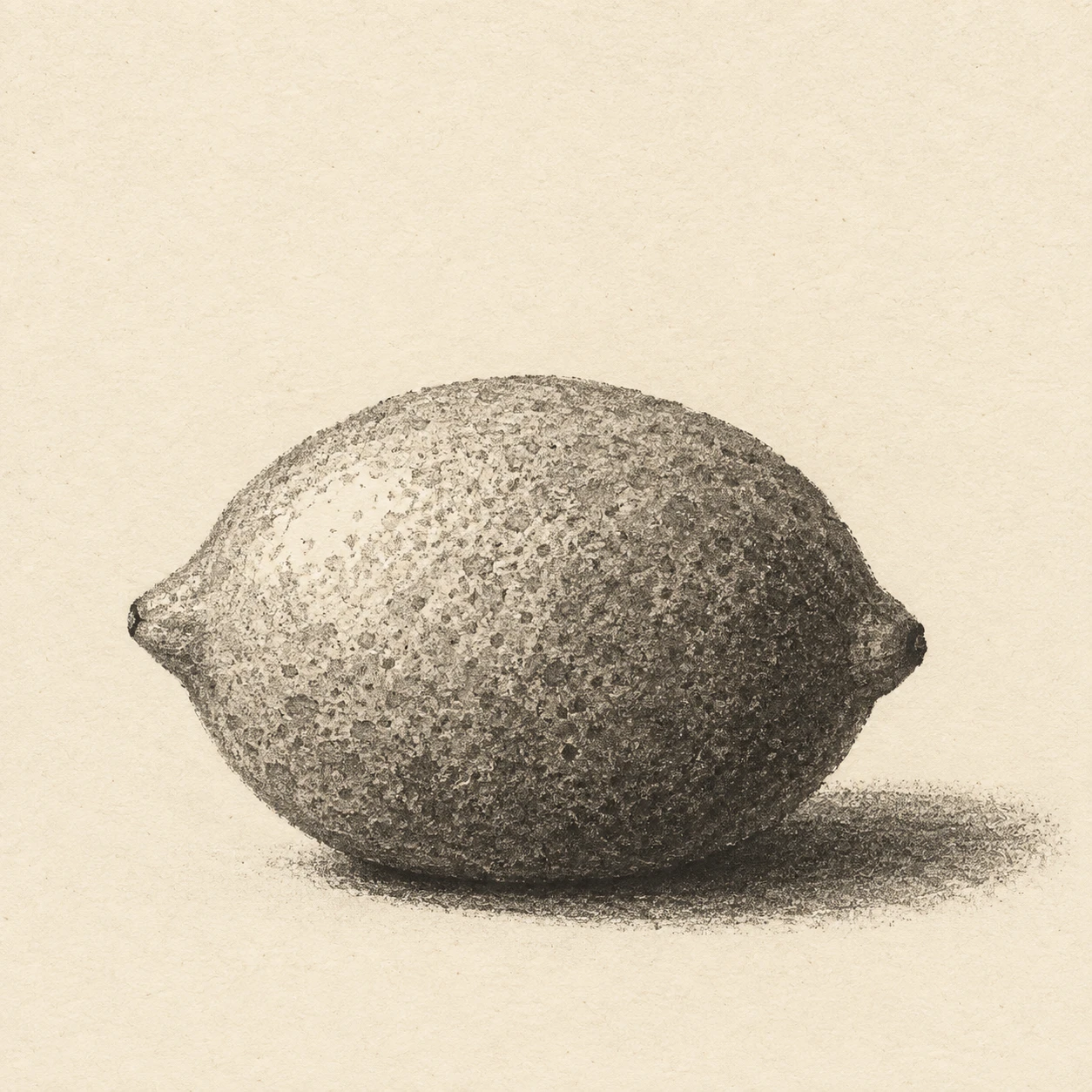
An aquatint print style that builds a lemon’s rounded volume with fine grain and stepped gray fields.
One Lemon · Aquatint Tonal Fields
- Shape & line
- Build the lemon from a gently uneven oval with two short tapered tips, defining its outline through adjoining tonal fields; use only a few brief dark marks at the tips instead of a continuous heavy contour.
- Color & light
- Use warm ivory paper and charcoal-gray ink, reserving a pale highlight on the image-left upper shoulder; step through light, middle and dark gray toward the image-right underside, and place the darkest contact shadow directly beneath the fruit.
- Texture & material
- Give each gray field a fine, irregular aquatint grain with tiny paper-colored gaps between ink deposits; deepen darker fields through greater ink coverage while keeping the grain visible, and let gently curved tonal boundaries describe the volume without smooth airbrushed blending.
- Composition
- Keep the fruit large enough for the tonal grain to read, with clear space beyond both tips; extend a low oval cast shadow from its base toward image-right, and leave the upper background largely unprinted so the lemon remains the single focal shape.
Priority
Prioritize visibly grained tonal fields that describe a rounded lemon.
What to avoid & what to check
Avoid smooth digital gradients, decorative hatching and yellow color fills.
Check that the pale upper-left shoulder, darker lower-right body and attached base shadow read clearly.
Exact prompt for this example
SUBJECT
One whole lemon with a small pointed tip at each end, resting horizontally on a plain surface; no cut sections or additional fruit.

COMPOSITION
A close, slightly elevated three-quarter view, with the lemon centered below the image midpoint and its long axis running horizontally; leave generous empty paper around the silhouette.

STYLE GUIDE
1. Shape & line
Build the lemon from a gently uneven oval with two short tapered tips, defining its outline through adjoining tonal fields; use only a few brief dark marks at the tips instead of a continuous heavy contour.

2. Color & light
Use warm ivory paper and charcoal-gray ink, reserving a pale highlight on the image-left upper shoulder; step through light, middle and dark gray toward the image-right underside, and place the darkest contact shadow directly beneath the fruit.

3. Texture & material
Give each gray field a fine, irregular aquatint grain with tiny paper-colored gaps between ink deposits; deepen darker fields through greater ink coverage while keeping the grain visible, and let gently curved tonal boundaries describe the volume without smooth airbrushed blending.

4. Composition
Keep the fruit large enough for the tonal grain to read, with clear space beyond both tips; extend a low oval cast shadow from its base toward image-right, and leave the upper background largely unprinted so the lemon remains the single focal shape.

PRIORITY
Preserve the requested identity, count, action, composition and output settings. Apply the style rules within those constraints; a style reference must not replace the subject or layout. Within the style: Prioritize visibly grained tonal fields that describe a rounded lemon.

AVOID
Avoid smooth digital gradients, decorative hatching and yellow color fills.

OUTPUT
One square image in an aquatint print style on warm ivory paper, with no lettering, captions, signatures or watermarks.

SELF-CHECK
Check that the pale upper-left shoulder, darker lower-right body and attached base shadow read clearly.
Model information comes from image provenance. The same prompt may produce a different result.