Text to imageCafe & brandStyle guide
Local Bagel Shop · Optical Letter Spacing
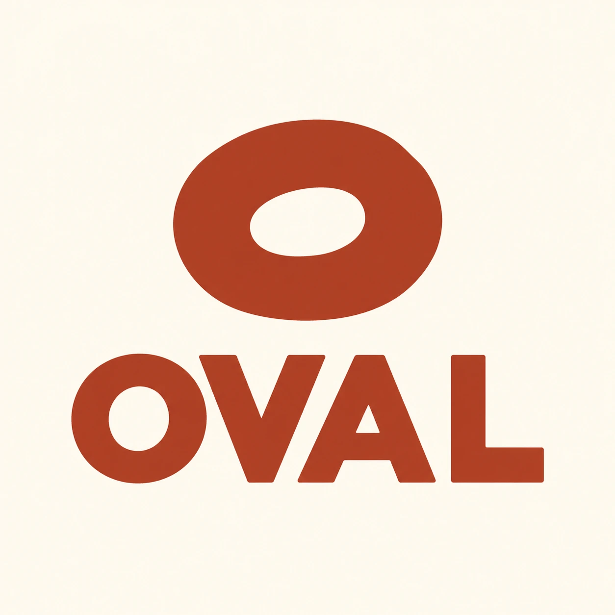
A bagel symbol and OVAL wordmark demonstrate spacing letters by the visible shapes of the gaps between them.
Local Bagel Shop · Optical Letter Spacing
- Shape & line
- Draw the bagel as a slightly irregular oval ring with one open oval hole, using a solid silhouette without decorative toppings. Construct OVAL in bold uppercase sans-serif letters with rounded O, pointed V and A, and a plain L; preserve these contrasting letter shapes so their different neighboring gaps can be seen.
- Color & light
- Use one deep rust ink for both symbol and letters against a warm cream background. Keep every ink area equally flat and opaque, with crisp boundaries and no lighting gradients, so color and shading do not distract from the spacing.
- Texture & material
- Give the artwork the clean surface of a solid spot-color print on smooth uncoated paper. Keep the paper texture faint and confined to the background; leave letter edges and the bagel hole clean enough that texture cannot appear to widen or close a gap.
- Composition
- Set all four letters on one horizontal baseline. Move V toward O and A toward V so the sloping sides nest into the neighboring open spaces; give A–L a visibly roomier interval where their lower strokes would otherwise crowd. Judge the three gaps by their apparent white area and rhythm rather than equal bounding-box distances, keeping every letter separate and readable.
Priority
Make the optically balanced letter gaps the defining feature of the identity.
What to avoid & what to check
Avoid mechanically equal spacing, touching letters, and distressed edges.
Check that OVAL reads immediately and its three gaps feel balanced despite visibly different widths.
Exact prompt for this example
SUBJECT
Create one original identity for a neighborhood bagel shop named OVAL: one simple bagel symbol above one uppercase OVAL wordmark. Keep the symbol separate from the letters so the wordmark's optical spacing remains clearly visible.

COMPOSITION
Present the identity straight on in a square frame, with the bagel symbol centered above the larger wordmark. Leave generous cream margins and enough separation between symbol and lettering to read both immediately.

STYLE GUIDE
1. Shape & line
Draw the bagel as a slightly irregular oval ring with one open oval hole, using a solid silhouette without decorative toppings. Construct OVAL in bold uppercase sans-serif letters with rounded O, pointed V and A, and a plain L; preserve these contrasting letter shapes so their different neighboring gaps can be seen.

2. Color & light
Use one deep rust ink for both symbol and letters against a warm cream background. Keep every ink area equally flat and opaque, with crisp boundaries and no lighting gradients, so color and shading do not distract from the spacing.

3. Texture & material
Give the artwork the clean surface of a solid spot-color print on smooth uncoated paper. Keep the paper texture faint and confined to the background; leave letter edges and the bagel hole clean enough that texture cannot appear to widen or close a gap.

4. Composition
Set all four letters on one horizontal baseline. Move V toward O and A toward V so the sloping sides nest into the neighboring open spaces; give A–L a visibly roomier interval where their lower strokes would otherwise crowd. Judge the three gaps by their apparent white area and rhythm rather than equal bounding-box distances, keeping every letter separate and readable.

PRIORITY
Preserve the requested identity, count, action, composition and output settings. Apply the style rules within those constraints; a style reference must not replace the subject or layout. Within the style: Make the optically balanced letter gaps the defining feature of the identity.

AVOID
Avoid mechanically equal spacing, touching letters, and distressed edges.

OUTPUT
Produce one square image of flat vector-style brand artwork. Include only the exact word OVAL; add no captions, measurements, guides, mockup objects, or other text.

SELF-CHECK
Check that OVAL reads immediately and its three gaps feel balanced despite visibly different widths.
Model information comes from image provenance. The same prompt may produce a different result.