Text to imageArt stylesStyle guide
One Artichoke · Ink Stippling
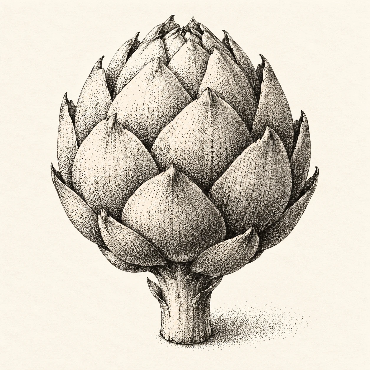
A monochrome stippling style that models overlapping artichoke bracts and shadows through irregular ink-dot density.
One Artichoke · Ink Stippling
- Shape & line
- Draw the rounded head from overlapping pointed bract shapes, using fine black outlines that stop where another bract covers them. Give each bract a gently bulging center and a tapered tip, keeping the outer silhouette crisp and readable.
- Color & light
- Use black ink and exposed ivory paper only. Place the light at the upper image-left: leave the upper-left bract faces sparsely dotted, increase dot density toward their lower-right edges, and collect the darkest dots beneath overlapping tips.
- Texture & material
- Build every shaded area from separate, irregularly spaced pen dots, varying density more than dot size. Let ivory gaps remain visible through the midtones and retain a subtle paper grain; make the surface read as deposited ink rather than a smooth gray fill.
- Composition
- Keep the artichoke as the single central focus, with its head occupying most of the middle of the frame. Beneath the stem, add a compact stippled contact shadow that extends toward image-right and becomes more sparsely dotted at its outer edge.
Priority
Prioritize readable bract overlaps and volume created by changes in dot density.
What to avoid & what to check
Avoid regular dot grids, crosshatching, and smooth gray shading.
Check that individual dots remain visible and that the darkest clusters sit beneath overlapping bracts.
Exact prompt for this example
SUBJECT
One whole artichoke with a short attached stem and tightly overlapping pointed bracts. The lower bracts overlap the bases of those above them, forming a compact rounded head.

COMPOSITION
Show the entire artichoke upright in a slightly elevated three-quarter view, centered on a plain ivory background. Keep its stem and outer tips fully visible, with generous space around the silhouette.

STYLE GUIDE
1. Shape & line
Draw the rounded head from overlapping pointed bract shapes, using fine black outlines that stop where another bract covers them. Give each bract a gently bulging center and a tapered tip, keeping the outer silhouette crisp and readable.

2. Color & light
Use black ink and exposed ivory paper only. Place the light at the upper image-left: leave the upper-left bract faces sparsely dotted, increase dot density toward their lower-right edges, and collect the darkest dots beneath overlapping tips.

3. Texture & material
Build every shaded area from separate, irregularly spaced pen dots, varying density more than dot size. Let ivory gaps remain visible through the midtones and retain a subtle paper grain; make the surface read as deposited ink rather than a smooth gray fill.

4. Composition
Keep the artichoke as the single central focus, with its head occupying most of the middle of the frame. Beneath the stem, add a compact stippled contact shadow that extends toward image-right and becomes more sparsely dotted at its outer edge.

PRIORITY
Preserve the requested identity, count, action, composition and output settings. Apply the style rules within those constraints; a style reference must not replace the subject or layout. Within the style: Prioritize readable bract overlaps and volume created by changes in dot density.

AVOID
Avoid regular dot grids, crosshatching, and smooth gray shading.

OUTPUT
One square image of an ink drawing on ivory paper, with no text, labels, signature, or watermark.

SELF-CHECK
Check that individual dots remain visible and that the darkest clusters sit beneath overlapping bracts.
Model information comes from image provenance. The same prompt may produce a different result.