Text to imageCafe & brandStyle guide
Local Pear Orchard · Counterchange Emblem
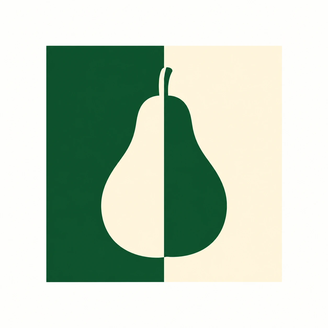
Swap the light and dark halves of a pear silhouette against its background to create a clear orchard emblem using only two colors.
Local Pear Orchard · Counterchange Emblem
- Shape & line
- Build the pear as one continuous silhouette with a narrow rounded neck, a broad lower body and a short upright stem. Keep its outer curves smooth and recognizable; let the central color change divide the fill without cutting a gap through the pear.
- Color & light
- Fill the square's image-left half with deep green and its image-right half with warm ivory. Make the pear ivory over the green half and green over the ivory half, with both reversals meeting at the same straight vertical boundary. Use solid colors so the pear remains visible on both sides.
- Texture & material
- Render the emblem as clean vector-like artwork with opaque, even fills and crisp edges. Keep the surface visually flat and untextured, allowing the shared boundary and reversed colors to carry the design without shading or an added outline.
- Composition
- Place the pear's stem and body axis on the square's central dividing line, leaving open background around the entire silhouette. Balance the pear's broad base with clear space beneath it, and keep the surrounding canvas quiet so the color reversal reads at a glance.
Priority
Prioritize a recognizable pear and a single aligned counterchange boundary.
What to avoid & what to check
Avoid a central gap, extra outlines or gradients that weaken the color reversal.
Check that the pear reads as one whole shape and reverses color exactly where the background changes.
Exact prompt for this example
SUBJECT
Create one original brand emblem for a small pear orchard: one upright pear silhouette with a short stem, centered inside one square field. The pear crosses the field's vertical midpoint, where its fill reverses against the two background halves.

COMPOSITION
Show the complete emblem straight on, centered on a plain warm-white canvas. Keep the square field large enough to read the pear immediately, with generous clear margins on all four sides.

STYLE GUIDE
1. Shape & line
Build the pear as one continuous silhouette with a narrow rounded neck, a broad lower body and a short upright stem. Keep its outer curves smooth and recognizable; let the central color change divide the fill without cutting a gap through the pear.

2. Color & light
Fill the square's image-left half with deep green and its image-right half with warm ivory. Make the pear ivory over the green half and green over the ivory half, with both reversals meeting at the same straight vertical boundary. Use solid colors so the pear remains visible on both sides.

3. Texture & material
Render the emblem as clean vector-like artwork with opaque, even fills and crisp edges. Keep the surface visually flat and untextured, allowing the shared boundary and reversed colors to carry the design without shading or an added outline.

4. Composition
Place the pear's stem and body axis on the square's central dividing line, leaving open background around the entire silhouette. Balance the pear's broad base with clear space beneath it, and keep the surrounding canvas quiet so the color reversal reads at a glance.

PRIORITY
Preserve the requested identity, count, action, composition and output settings. Apply the style rules within those constraints; a style reference must not replace the subject or layout. Within the style: Prioritize a recognizable pear and a single aligned counterchange boundary.

AVOID
Avoid a central gap, extra outlines or gradients that weaken the color reversal.

OUTPUT
Deliver one square 1:1 image of the finished flat graphic emblem, with no lettering, captions, watermarks or mockup setting.

SELF-CHECK
Check that the pear reads as one whole shape and reverses color exactly where the background changes.
Model information comes from image provenance. The same prompt may produce a different result.