Text to imageIllustrationStyle guide
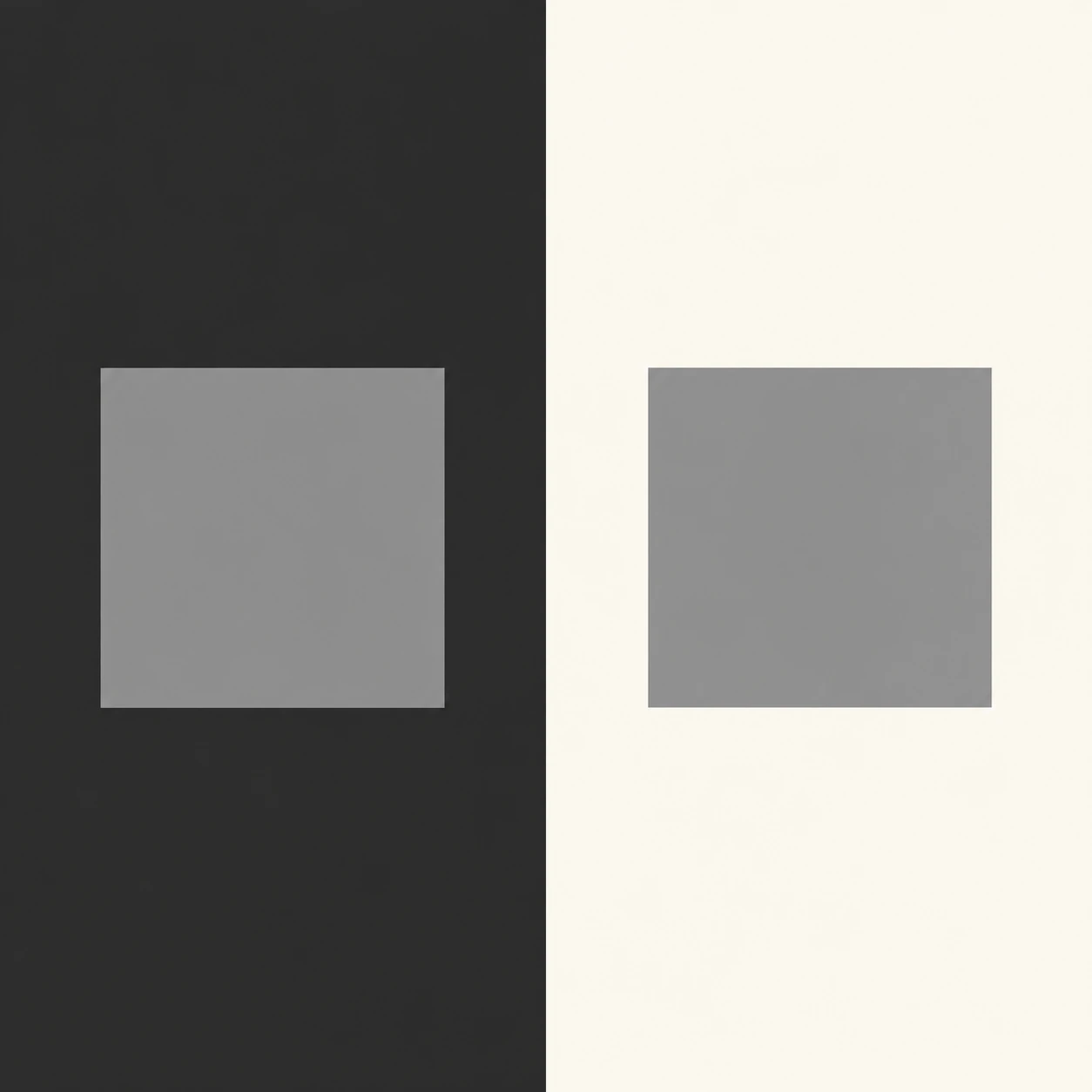
Two Gray Paper Tiles · Simultaneous Value Contrast
Identical gray tiles on light and dark fields show how surrounding values change perceived brightness.
Two Gray Paper Tiles · Simultaneous Value Contrast
- Shape & line
- Draw the two tiles as matching upright squares with crisp, straight edges and flat faces; use the boundary between each gray fill and its surrounding field to define the silhouette, without outlines or perspective.
- Color & light
- Fill the image-left field with deep charcoal and the image-right field with pale ivory, then apply exactly the same middle-gray fill to both tiles. Keep every fill evenly lit and uniform so the dark surround makes the left tile appear brighter while the pale surround makes the right tile appear darker.
- Texture & material
- Suggest matte paper through broad, unbroken color surfaces and clean cut edges. Keep the tile interiors smooth, with no grain, highlights, gradients, or cast shadows that could introduce a real brightness difference.
- Composition
- Give the dark and light fields equal width and extend them to the image edges. Place each tile at the center of its field with generous surrounding space, keeping a clear gap from the central division so viewers can compare the two apparent brightnesses immediately.
Priority
Prioritize identical tile values and clearly different surrounding values.
What to avoid & what to check
Avoid changing either tile's gray to exaggerate the illusion.
Check that both tiles use the same gray yet appear different against their respective fields.
Exact prompt for this example
SUBJECT
Exactly two identical square paper tiles, both filled with the same uniform middle gray. Place one on a dark background field and the other on a light background field to demonstrate simultaneous value contrast: the left tile should appear lighter and the right tile darker solely because of their surroundings.

COMPOSITION
A straight-on, square illustration with a vertical background division at the image center. Center one tile within the left half and one within the right half, aligned horizontally with equal size and matching margins. Keep both tiles fully inside their respective fields.

STYLE GUIDE
1. Shape & line
Draw the two tiles as matching upright squares with crisp, straight edges and flat faces; use the boundary between each gray fill and its surrounding field to define the silhouette, without outlines or perspective.

2. Color & light
Fill the image-left field with deep charcoal and the image-right field with pale ivory, then apply exactly the same middle-gray fill to both tiles. Keep every fill evenly lit and uniform so the dark surround makes the left tile appear brighter while the pale surround makes the right tile appear darker.

3. Texture & material
Suggest matte paper through broad, unbroken color surfaces and clean cut edges. Keep the tile interiors smooth, with no grain, highlights, gradients, or cast shadows that could introduce a real brightness difference.

4. Composition
Give the dark and light fields equal width and extend them to the image edges. Place each tile at the center of its field with generous surrounding space, keeping a clear gap from the central division so viewers can compare the two apparent brightnesses immediately.

PRIORITY
Preserve the requested identity, count, action, composition and output settings. Apply the style rules within those constraints; a style reference must not replace the subject or layout. Within the style: Prioritize identical tile values and clearly different surrounding values.

AVOID
Avoid changing either tile's gray to exaggerate the illusion.

OUTPUT
One square image, 1:1 aspect ratio, suitable as a clear visual reference. Include no text, labels, numbers, logos, or watermark.

SELF-CHECK
Check that both tiles use the same gray yet appear different against their respective fields.
Model information comes from image provenance. The same prompt may produce a different result.