Text to imageCafe & brandStyle guide
Local Bookshop · Closure Through Broken Contours
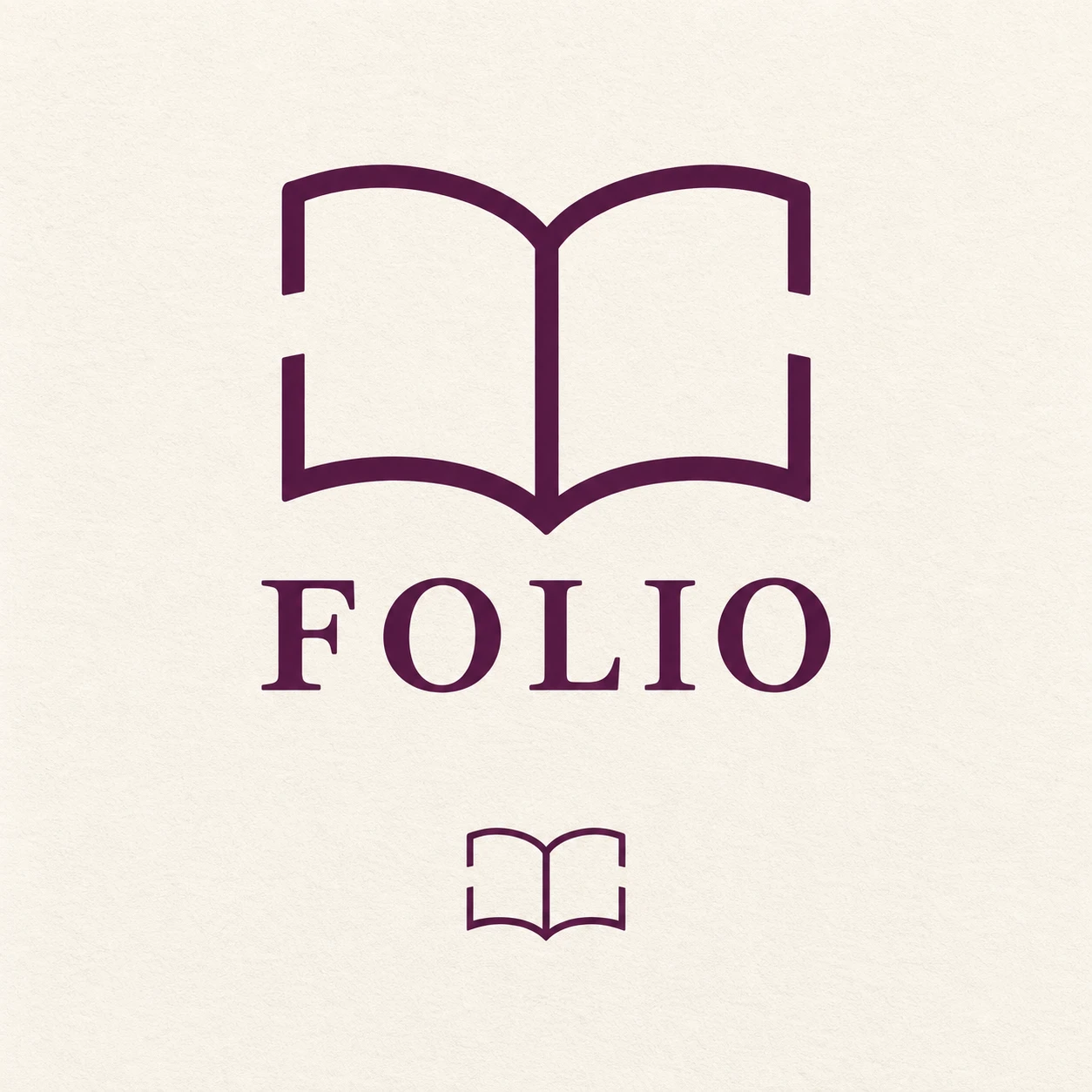
A bookshop logo reference that uses visual closure to make an open book readable despite deliberate gaps in its outline.
Local Bookshop · Closure Through Broken Contours
- Shape & line
- Draw the open book with smooth, uniform-weight strokes, two gently bowed page tops, and a continuous central gutter. Leave a broad gap midway along each outer side contour, keeping the stroke ends aligned with the same implied curve so the eye completes the missing edges.
- Color & light
- Use deep aubergine for every symbol stroke and the wordmark on a warm ivory background. Keep the ink color solid and the background evenly lit, allowing the ivory gaps to remain as clear as the drawn contours.
- Texture & material
- Render the identity as flat vector artwork on matte, uncoated paper with a faint, even paper grain. Preserve crisp stroke edges and clean gap boundaries so surface texture never supplies the missing book contours.
- Composition
- Center the main book symbol above a restrained uppercase serif FOLIO wordmark, leaving a clear interval between them. Repeat the same broken-contour symbol at a substantially smaller size below, preserving visible gaps and the two-page silhouette to demonstrate closure at both scales.
Priority
Prioritize an immediately recognizable open book whose missing outer edges are completed by visual closure.
What to avoid & what to check
Avoid scattered decorative dashes, closed gaps, page shading, and mockup perspective.
Check that both symbols read as open books and that their outer contour gaps remain visible.
Exact prompt for this example
SUBJECT
Create a brand reference for a fictional neighborhood bookshop named FOLIO: one open-book symbol above one FOLIO wordmark. The book has two facing pages joined at a central gutter; deliberate gaps interrupt the outer page contours while the remaining segments imply one complete book.

COMPOSITION
Use a square, front-facing identity sheet with a large primary logo centered in the upper two-thirds and one smaller repetition of the book symbol centered below. Give both generous surrounding space and keep the smaller symbol clearly subordinate.

STYLE GUIDE
1. Shape & line
Draw the open book with smooth, uniform-weight strokes, two gently bowed page tops, and a continuous central gutter. Leave a broad gap midway along each outer side contour, keeping the stroke ends aligned with the same implied curve so the eye completes the missing edges.

2. Color & light
Use deep aubergine for every symbol stroke and the wordmark on a warm ivory background. Keep the ink color solid and the background evenly lit, allowing the ivory gaps to remain as clear as the drawn contours.

3. Texture & material
Render the identity as flat vector artwork on matte, uncoated paper with a faint, even paper grain. Preserve crisp stroke edges and clean gap boundaries so surface texture never supplies the missing book contours.

4. Composition
Center the main book symbol above a restrained uppercase serif FOLIO wordmark, leaving a clear interval between them. Repeat the same broken-contour symbol at a substantially smaller size below, preserving visible gaps and the two-page silhouette to demonstrate closure at both scales.

PRIORITY
Preserve the requested identity, count, action, composition and output settings. Apply the style rules within those constraints; a style reference must not replace the subject or layout. Within the style: Prioritize an immediately recognizable open book whose missing outer edges are completed by visual closure.

AVOID
Avoid scattered decorative dashes, closed gaps, page shading, and mockup perspective.

OUTPUT
Produce one image in a 1:1 aspect ratio. Include only the word FOLIO beneath the primary symbol; add no captions, explanatory labels, guides, or other text.

SELF-CHECK
Check that both symbols read as open books and that their outer contour gaps remain visible.
Model information comes from image provenance. The same prompt may produce a different result.