Text to imageCafe & brandStyle guide
Neighborhood Bread Cooperative · Scoring-Cut Identity
Turn bread-scoring cuts into a repeatable identity that works across printed and physical materials.
Neighborhood Bread Cooperative · Scoring-Cut Identity
- 1
- Keep a consistent three-cut motif, angle, and rounded-end shape.
- 2
- Adapt motif scale and spacing to each application's size.
- 3
- Translate the same form credibly across die-cut paper, recessed surfaces, and flat digital graphics.
- 4
- Show a coherent family of applications without relying on text or color alone.
Priority
Preserve the four style rules when changing subject or composition.
What to avoid & what to check
Avoid unwanted lettering, logos and watermarks.
Check silhouette and composition at thumbnail size.
Build assets in this style
Shared style locked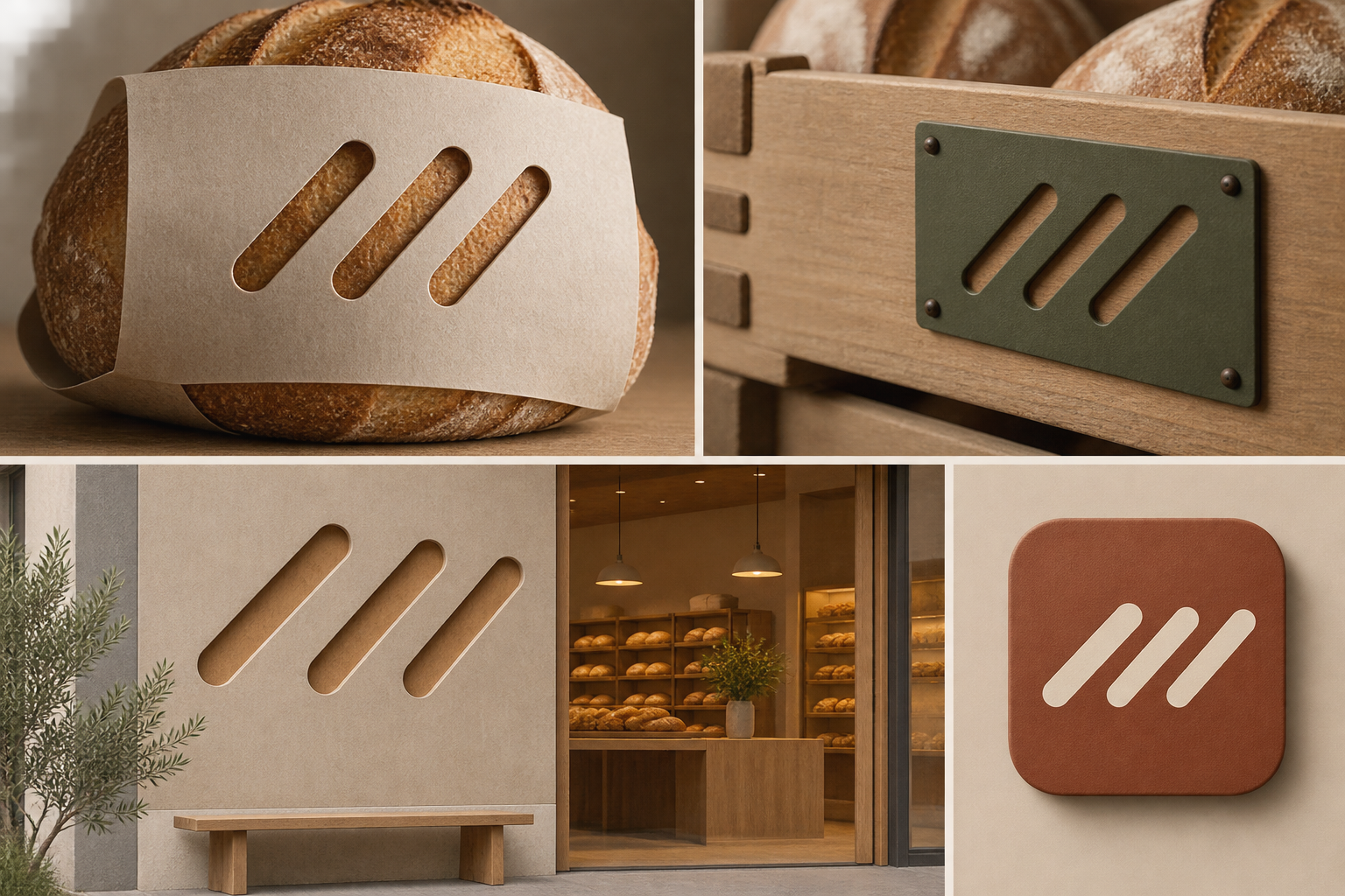
Exact prompt for this example
Exact prompt · Original
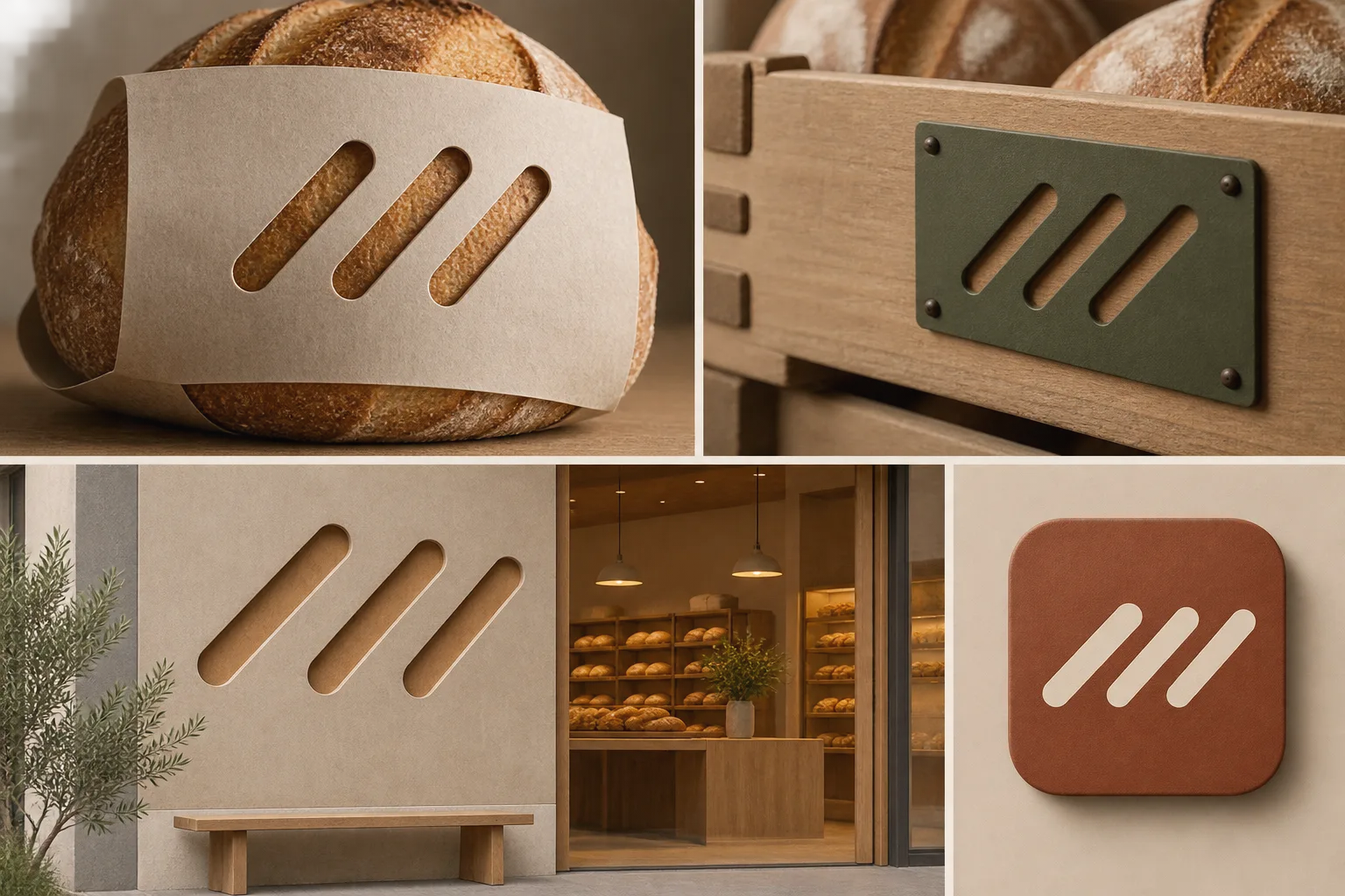
Design a cohesive visual identity presentation for an original neighborhood bread cooperative. Derive its signature motif from three short diagonal scoring cuts on a loaf: maintain the same cut angle and rounded ends as the motif appears on a bread sleeve, a reusable crate tag, a storefront panel, and a small digital tile. Vary spacing and scale to suit each surface while keeping the three-cut rhythm recognizable. On paper, use real die-cut slits that reveal the warm substrate beneath; on the crate tag and storefront, translate the same shape into shallow physical recesses; on the digital tile, use a flat graphic equivalent. Arrange the applications together as a clear brand system with restrained materials and no decorative wheat clichés. The three-cut motif is the intended identity mark. No wordmarks, letters, numbers, unrelated logos, or watermarks.
Model information comes from image provenance. The same prompt may produce a different result.