Text to imageCafe & brandStyle guide
Local Plant-Watering Service · Optical Centering
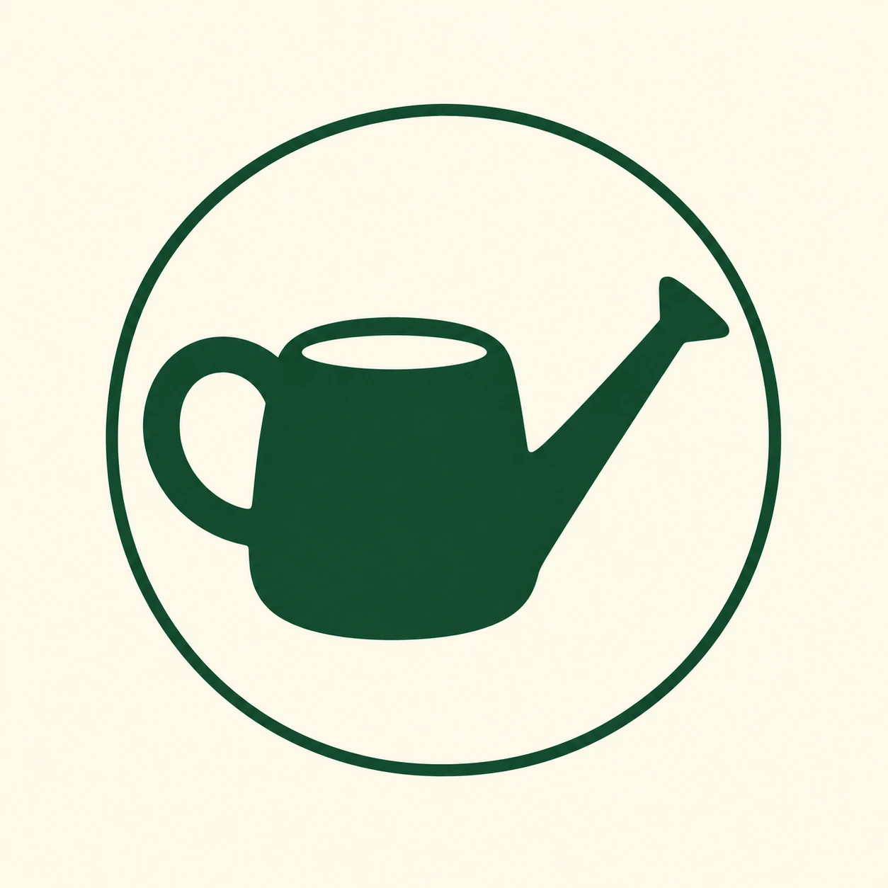
A watering-can symbol inside a circular badge demonstrates centering by visual weight rather than outer dimensions.
Local Plant-Watering Service · Optical Centering
- Shape & line
- Build the can from a broad rounded body, a thick loop handle on image-left, and a tapered spout rising toward image-right. Keep their joins smooth and simplify the spout opening to a short angled end so the silhouette stays legible at small size.
- Color & light
- Use deep forest green for the can and its enclosing circular outline on a warm cream field. Keep every green area equally dark, letting the cream opening in the handle separate its loop without gradients or lighting effects.
- Texture & material
- Render the mark as smooth, opaque printed ink with crisp edges and uninterrupted solid fills. Keep the circular outline visibly lighter in stroke weight than the handle so it frames the symbol without becoming the dominant shape.
- Composition
- Place the dense can body slightly image-left of the badge center to counter the long spout extending image-right. Allow the spout tip to sit closer to the right rim than the handle sits to the left rim; adjust the whole can until its filled green mass feels centered, while preserving a clear cream gap around every outer edge.
Priority
Prioritize a visually balanced watering can inside a quiet circular frame.
What to avoid & what to check
Avoid centering solely by the silhouette's bounding box or adding decorative detail.
Check that the body sits left of center while the complete mark still feels balanced at thumbnail size.
Exact prompt for this example
SUBJECT
Create one original brand mark for a local plant-watering service: one watering can inside one circular badge. The can has a rounded body, an open loop handle on image-left, and a long rising spout on image-right, all connected into one recognizable symbol.

COMPOSITION
Show the complete badge front-on at the center of a square canvas with generous plain margins. Make the watering can large enough to judge its balance against the surrounding circle.

STYLE GUIDE
1. Shape & line
Build the can from a broad rounded body, a thick loop handle on image-left, and a tapered spout rising toward image-right. Keep their joins smooth and simplify the spout opening to a short angled end so the silhouette stays legible at small size.

2. Color & light
Use deep forest green for the can and its enclosing circular outline on a warm cream field. Keep every green area equally dark, letting the cream opening in the handle separate its loop without gradients or lighting effects.

3. Texture & material
Render the mark as smooth, opaque printed ink with crisp edges and uninterrupted solid fills. Keep the circular outline visibly lighter in stroke weight than the handle so it frames the symbol without becoming the dominant shape.

4. Composition
Place the dense can body slightly image-left of the badge center to counter the long spout extending image-right. Allow the spout tip to sit closer to the right rim than the handle sits to the left rim; adjust the whole can until its filled green mass feels centered, while preserving a clear cream gap around every outer edge.

PRIORITY
Preserve the requested identity, count, action, composition and output settings. Apply the style rules within those constraints; a style reference must not replace the subject or layout. Within the style: Prioritize a visually balanced watering can inside a quiet circular frame.

AVOID
Avoid centering solely by the silhouette's bounding box or adding decorative detail.

OUTPUT
Produce one square image of a flat vector-style brand mark, with no lettering, numbers, captions, or watermark.

SELF-CHECK
Check that the body sits left of center while the complete mark still feels balanced at thumbnail size.
Model information comes from image provenance. The same prompt may produce a different result.