Text to imageArt stylesStyle guide
One Oak Leaf · Graphite Frottage
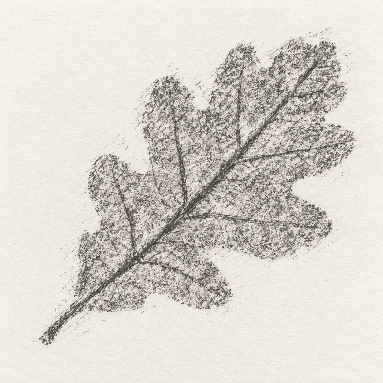
A graphite rubbing that reveals the raised veins and edges of a leaf beneath paper.
One Oak Leaf · Graphite Frottage
- Shape & line
- Build the leaf shape from broad rubbed patches, letting darker interrupted marks reveal the lobed edge and a connected branching vein network; keep small gaps in the perimeter instead of drawing a continuous outline.
- Color & light
- Use graphite gray on warm-white paper, making the central midrib and larger side veins darker than the softly rubbed areas between them; keep the surrounding sheet evenly lit so contrast comes from transferred graphite.
- Texture & material
- Show dry, granular graphite catching on paper grain, with short overlapping sideways rubbing strokes crossing several veins; concentrate graphite over the raised vein ridges while leaving scattered pale flecks between them.
- Composition
- Keep the complete diagonal leaf impression isolated within broad paper margins, allowing a few faint rubbing strokes to extend just beyond its edge; preserve enough open paper around the stem and tip to separate both clearly from the background.
Priority
Prioritize the vein relief revealed by rubbing and the broken graphite grain.
What to avoid & what to check
Avoid polished contour drawing, smooth tonal shading, and a visible leaf resting on top of the sheet.
Check that one complete leaf reads through darker connected veins, patchy rubbed areas, and generous paper margins.
Exact prompt for this example
SUBJECT
Show one graphite frottage impression of a lobed oak leaf with a short stem. A central midrib connects the stem to the tip, and branching side veins extend toward the lobes. The leaf itself sits beneath the paper; only its rubbed impression is visible.

COMPOSITION
Use a straight-on view of a single warm-white paper sheet. Center the leaf impression with its stem toward the lower left and its tip toward the upper right, leaving generous blank margins so the entire silhouette and branching vein structure remain readable.

STYLE GUIDE
1. Shape & line
Build the leaf shape from broad rubbed patches, letting darker interrupted marks reveal the lobed edge and a connected branching vein network; keep small gaps in the perimeter instead of drawing a continuous outline.

2. Color & light
Use graphite gray on warm-white paper, making the central midrib and larger side veins darker than the softly rubbed areas between them; keep the surrounding sheet evenly lit so contrast comes from transferred graphite.

3. Texture & material
Show dry, granular graphite catching on paper grain, with short overlapping sideways rubbing strokes crossing several veins; concentrate graphite over the raised vein ridges while leaving scattered pale flecks between them.

4. Composition
Keep the complete diagonal leaf impression isolated within broad paper margins, allowing a few faint rubbing strokes to extend just beyond its edge; preserve enough open paper around the stem and tip to separate both clearly from the background.

PRIORITY
Preserve the requested identity, count, action, composition and output settings. Apply the style rules within those constraints; a style reference must not replace the subject or layout. Within the style: Prioritize the vein relief revealed by rubbing and the broken graphite grain.

AVOID
Avoid polished contour drawing, smooth tonal shading, and a visible leaf resting on top of the sheet.

OUTPUT
Create one square image showing a finished graphite rubbing, with no text, labels, signature, or watermark.

SELF-CHECK
Check that one complete leaf reads through darker connected veins, patchy rubbed areas, and generous paper margins.
Model information comes from image provenance. The same prompt may produce a different result.