Text to imageCafe & brandStyle guide
Textile Exchange · Over-Under Bands
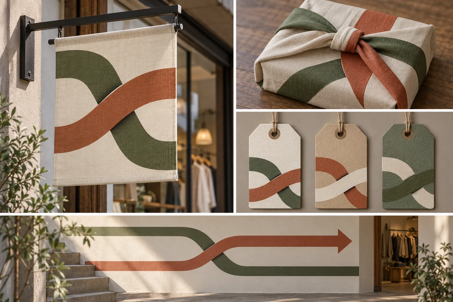
Turn the over-under logic of weaving into a flexible identity across physical touchpoints.
Textile Exchange · Over-Under Bands
- 1
- Use the same alternating over-under sequence at every band crossing.
- 2
- Clarify each crossing with one consistent shadow or cut-edge treatment.
- 3
- Adapt band width to each application while preserving recognizable spacing and rhythm.
- 4
- Leave open, unprinted areas for practical use and include no invented text.
Priority
Preserve the four style rules when changing subject or composition.
What to avoid & what to check
Avoid unwanted lettering, logos and watermarks.
Check silhouette and composition at thumbnail size.
Build assets in this style
Shared style locked
Exact prompt for this example
Exact prompt · Original
Create an original visual identity presentation for a neighborhood textile exchange. Center the system on two broad bands that alternately pass over and under one another, with a small, consistent shadow or cut edge making every crossing unambiguous. Apply the same crossing rule to a storefront hanging sign, a reusable fabric wrap, three sorting tags, and a simple directional wall graphic. Vary band width to suit each surface while preserving the same crossing rhythm and generous open space. Use tactile printed paper and woven cloth mockups, restrained earthy colors, and clear functional hierarchy. Leave all panels blank rather than inventing names, slogans, or pseudo-writing; the identity must read through form alone. No lettering, logos, or watermarks.
Model information comes from image provenance. The same prompt may produce a different result.