Text to imageCafe & brandStyle guide
Neighborhood Chess Club · Positive–Negative Inversion
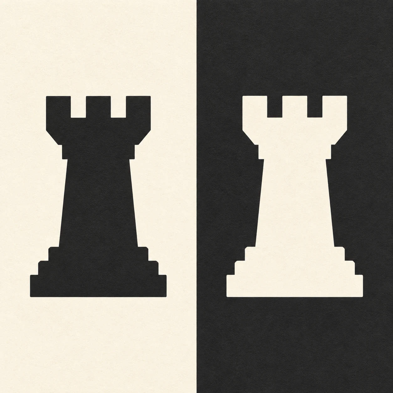
Reverse the same rook symbol across light and dark fields to demonstrate a consistent one-color brand identity.
Neighborhood Chess Club · Positive–Negative Inversion
- Shape & line
- Construct each rook as a solid silhouette with three broad battlements, two open rectangular notches, a gently narrowing tower, and a stepped base. Duplicate the exact contour for the second emblem so the reversal changes its polarity while preserving its shape.
- Color & light
- Use only warm ivory and deep charcoal. Fill the image-left panel with ivory and its rook with charcoal; fill the image-right panel with charcoal and its rook with ivory. Let both upper notches reveal their own panel background, making the reversal visible through the entire silhouette.
- Texture & material
- Render the fields and emblems as flat, opaque matte ink on smooth paper, with clean edges and only a faint, evenly distributed paper grain. Keep the ivory rook as unprinted paper within the charcoal field, without adding relief, gloss, or dimensional shading.
- Composition
- Place the two rooks on one shared horizontal baseline and give them matching clear space on all sides. Keep the vertical panel boundary straight and unobstructed, and make each emblem large enough that its two notches remain clearly separated at thumbnail size.
Priority
Prioritize identical contours and an immediately readable reversal of figure and ground.
What to avoid & what to check
Avoid outlines or shadows that weaken the solid silhouette reversal.
Check that both rooks match in shape and size and that every notch shows its surrounding field color.
Exact prompt for this example
SUBJECT
A brand reference for an original neighborhood chess club, featuring exactly two identical instances of one simplified rook emblem. The left instance is dark on a light field; the right instance is light on a dark field.

COMPOSITION
A straight-on, square identity sheet divided vertically into two equal panels. Center one rook in each panel at the same height and apparent size, with generous surrounding space.

STYLE GUIDE
1. Shape & line
Construct each rook as a solid silhouette with three broad battlements, two open rectangular notches, a gently narrowing tower, and a stepped base. Duplicate the exact contour for the second emblem so the reversal changes its polarity while preserving its shape.

2. Color & light
Use only warm ivory and deep charcoal. Fill the image-left panel with ivory and its rook with charcoal; fill the image-right panel with charcoal and its rook with ivory. Let both upper notches reveal their own panel background, making the reversal visible through the entire silhouette.

3. Texture & material
Render the fields and emblems as flat, opaque matte ink on smooth paper, with clean edges and only a faint, evenly distributed paper grain. Keep the ivory rook as unprinted paper within the charcoal field, without adding relief, gloss, or dimensional shading.

4. Composition
Place the two rooks on one shared horizontal baseline and give them matching clear space on all sides. Keep the vertical panel boundary straight and unobstructed, and make each emblem large enough that its two notches remain clearly separated at thumbnail size.

PRIORITY
Preserve the requested identity, count, action, composition and output settings. Apply the style rules within those constraints; a style reference must not replace the subject or layout. Within the style: Prioritize identical contours and an immediately readable reversal of figure and ground.

AVOID
Avoid outlines or shadows that weaken the solid silhouette reversal.

OUTPUT
One square image containing the complete two-panel brand study, with no lettering, numbers, captions, or watermark.

SELF-CHECK
Check that both rooks match in shape and size and that every notch shows its surrounding field color.
Model information comes from image provenance. The same prompt may produce a different result.