Text to imageCafe & brandStyle guide
Local Soap Shop · Parallel Inset Contours
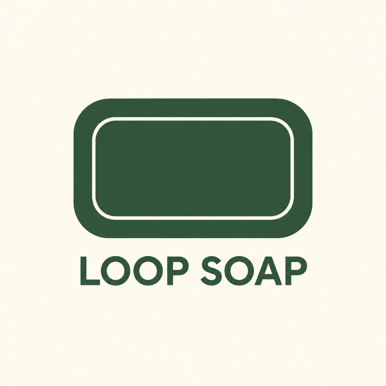
Maintain the gap between a soap icon’s outer contour and inset line through the curves to create a tidy, consistent brand mark.
Local Soap Shop · Parallel Inset Contours
- Shape & line
- Draw the soap as a wide rounded rectangle with a solid silhouette and one fine closed line inset from its edge. Follow each straight side at an even distance, then tighten the inner corner curves so the gap stays visually consistent around the bends; do not give both contours identical corner radii.
- Color & light
- Fill the soap silhouette with muted forest green on a warm ivory background, and draw the inset contour in that same ivory. Set the shop name in forest green so the interior line reads as a clean channel through a single flat color, without lighting or tonal modeling.
- Texture & material
- Render the mark and lettering as smooth vector-like artwork with crisp edges and uninterrupted color fills. Keep the inset line equally clean through every corner, making the design suitable for a simple printed soap wrapper.
- Composition
- Center the icon above LOOP SOAP in plainly drawn uppercase sans-serif letters. Keep the name slightly narrower than the icon, leave a clear gap between them, and surround the complete lockup with ample ivory space so the paired contours remain the visual focus.
Priority
Prioritize a visibly even contour gap through both straight sections and rounded corners.
What to avoid & what to check
Avoid swollen corner gaps, extra nested lines, and dimensional soap rendering.
Check that the inner corners tighten naturally and the logo remains readable at a small size.
Exact prompt for this example
SUBJECT
Create an original identity for a small soap shop named LOOP SOAP: one face-on rounded rectangular soap-bar icon with one closed inset contour, positioned above the shop name.

COMPOSITION
Show a single centered vertical logo lockup on a generous plain background. Make the soap icon large enough that the spacing between its outer edge and inner contour is immediately readable.

STYLE GUIDE
1. Shape & line
Draw the soap as a wide rounded rectangle with a solid silhouette and one fine closed line inset from its edge. Follow each straight side at an even distance, then tighten the inner corner curves so the gap stays visually consistent around the bends; do not give both contours identical corner radii.

2. Color & light
Fill the soap silhouette with muted forest green on a warm ivory background, and draw the inset contour in that same ivory. Set the shop name in forest green so the interior line reads as a clean channel through a single flat color, without lighting or tonal modeling.

3. Texture & material
Render the mark and lettering as smooth vector-like artwork with crisp edges and uninterrupted color fills. Keep the inset line equally clean through every corner, making the design suitable for a simple printed soap wrapper.

4. Composition
Center the icon above LOOP SOAP in plainly drawn uppercase sans-serif letters. Keep the name slightly narrower than the icon, leave a clear gap between them, and surround the complete lockup with ample ivory space so the paired contours remain the visual focus.

PRIORITY
Preserve the requested identity, count, action, composition and output settings. Apply the style rules within those constraints; a style reference must not replace the subject or layout. Within the style: Prioritize a visibly even contour gap through both straight sections and rounded corners.

AVOID
Avoid swollen corner gaps, extra nested lines, and dimensional soap rendering.

OUTPUT
Produce one square image showing flat brand artwork. Include only the exact words LOOP SOAP; add no captions, measurements, guides, or other text.

SELF-CHECK
Check that the inner corners tighten naturally and the logo remains readable at a small size.
Model information comes from image provenance. The same prompt may produce a different result.