Text to imagePortraitStyle guide
Older Adult · Wrinkle Value Hierarchy
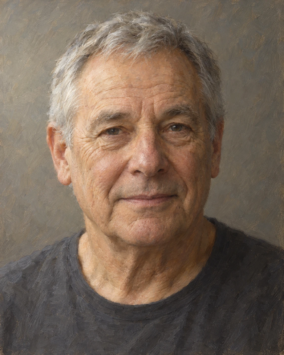
A portrait that distinguishes deep folds from fine creases through value contrast, revealing age while preserving facial volume.
Older Adult · Wrinkle Value Hierarchy
- Shape & line
- Build the forehead, cheeks, and jaw as rounded forms before adding wrinkles; curve forehead creases across the brow, fan crow’s feet outward from the eye corners, and let mouth-side folds follow the cheek without drawing every crease as a continuous outline.
- Color & light
- Use a broad soft light from the upper image-left, making the image-left forehead and cheek lighter and the image-right cheek gently darker. Give deeper folds a restrained dark trough and a subtle lighter lip on the side facing the light; keep fine creases much closer to the surrounding skin value.
- Texture & material
- Paint the skin with thin, softly blended oil layers and occasional broken brush marks on exposed cheek and forehead planes. Let shallow creases fade into this surface texture, reserving firmer edges for a few deeper folds; group gray hair into soft locks with sparse individual strands.
- Composition
- Keep the face large enough for the crease hierarchy to read, with the eyes and mouth more clearly resolved than the shirt. Set the head against a muted warm-gray background and soften shoulder edges so the strongest small contrasts stay within the face.
Priority
Preserve the large facial forms while making deep folds visibly stronger than fine creases.
What to avoid & what to check
Avoid uniformly dark wrinkle lines and smoothing that erases the skin’s age.
Check that fine creases recede, deeper folds remain readable, and the face still feels rounded.
Exact prompt for this example
SUBJECT
One older adult with short gray hair and a plain charcoal shirt, facing the viewer with a relaxed expression and closed lips; forehead creases, crow’s feet, and folds beside the mouth remain visible.

COMPOSITION
An eye-level, nearly frontal head-and-shoulders portrait in a vertical frame; include the entire hair silhouette, place the eyes above the midpoint, and leave quiet space around the head.

STYLE GUIDE
1. Shape & line
Build the forehead, cheeks, and jaw as rounded forms before adding wrinkles; curve forehead creases across the brow, fan crow’s feet outward from the eye corners, and let mouth-side folds follow the cheek without drawing every crease as a continuous outline.

2. Color & light
Use a broad soft light from the upper image-left, making the image-left forehead and cheek lighter and the image-right cheek gently darker. Give deeper folds a restrained dark trough and a subtle lighter lip on the side facing the light; keep fine creases much closer to the surrounding skin value.

3. Texture & material
Paint the skin with thin, softly blended oil layers and occasional broken brush marks on exposed cheek and forehead planes. Let shallow creases fade into this surface texture, reserving firmer edges for a few deeper folds; group gray hair into soft locks with sparse individual strands.

4. Composition
Keep the face large enough for the crease hierarchy to read, with the eyes and mouth more clearly resolved than the shirt. Set the head against a muted warm-gray background and soften shoulder edges so the strongest small contrasts stay within the face.

PRIORITY
Preserve the requested identity, count, action, composition and output settings. Apply the style rules within those constraints; a style reference must not replace the subject or layout. Within the style: Preserve the large facial forms while making deep folds visibly stronger than fine creases.

AVOID
Avoid uniformly dark wrinkle lines and smoothing that erases the skin’s age.

OUTPUT
One image in a 4:5 aspect ratio, rendered as a naturalistic oil-painted portrait, with no lettering, labels, signature, or watermark.

SELF-CHECK
Check that fine creases recede, deeper folds remain readable, and the face still feels rounded.
Model information comes from image provenance. The same prompt may produce a different result.